Work
Platforms, products and
systems we built.
Websites, platforms, mobile apps, AI systems and design work we did since 2018 — many of them we still run every month.
Selected work
93 projects
Projects

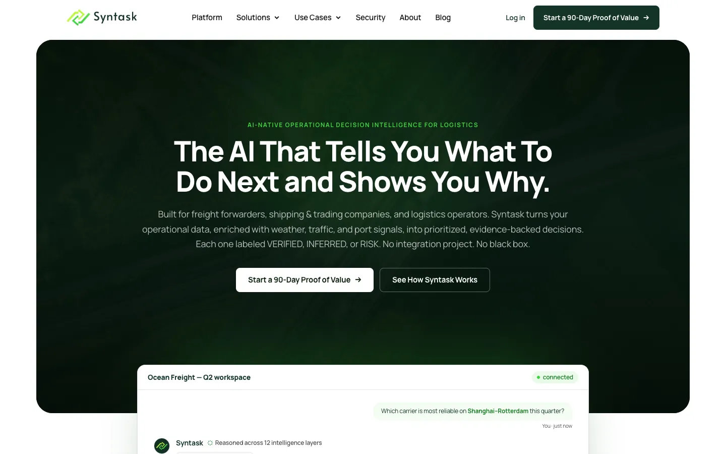

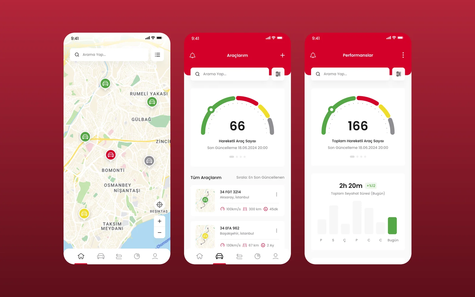
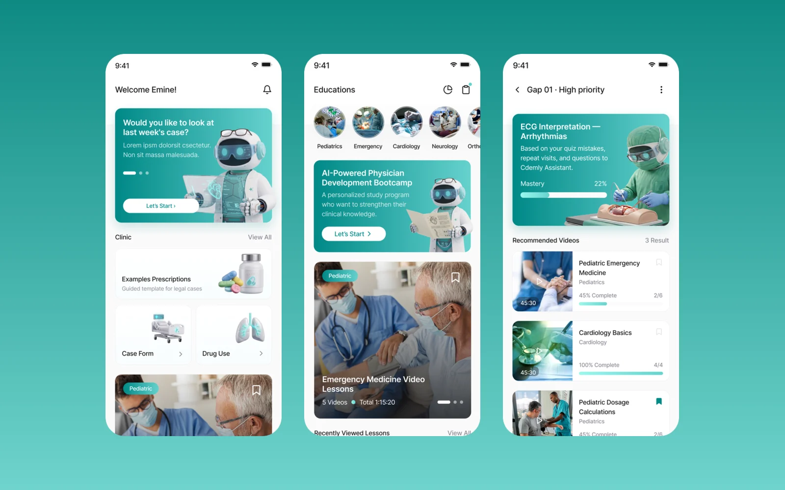
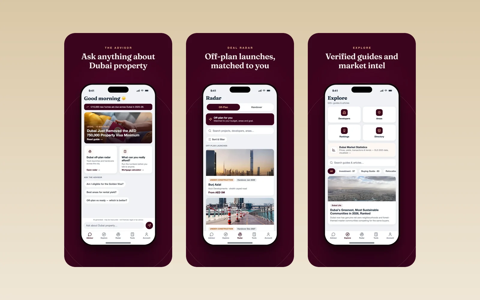






BNM Transport Inc
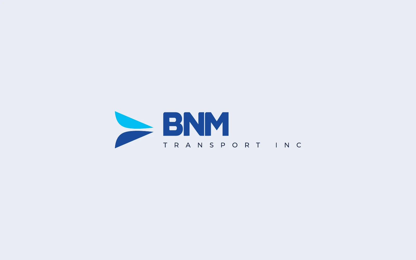
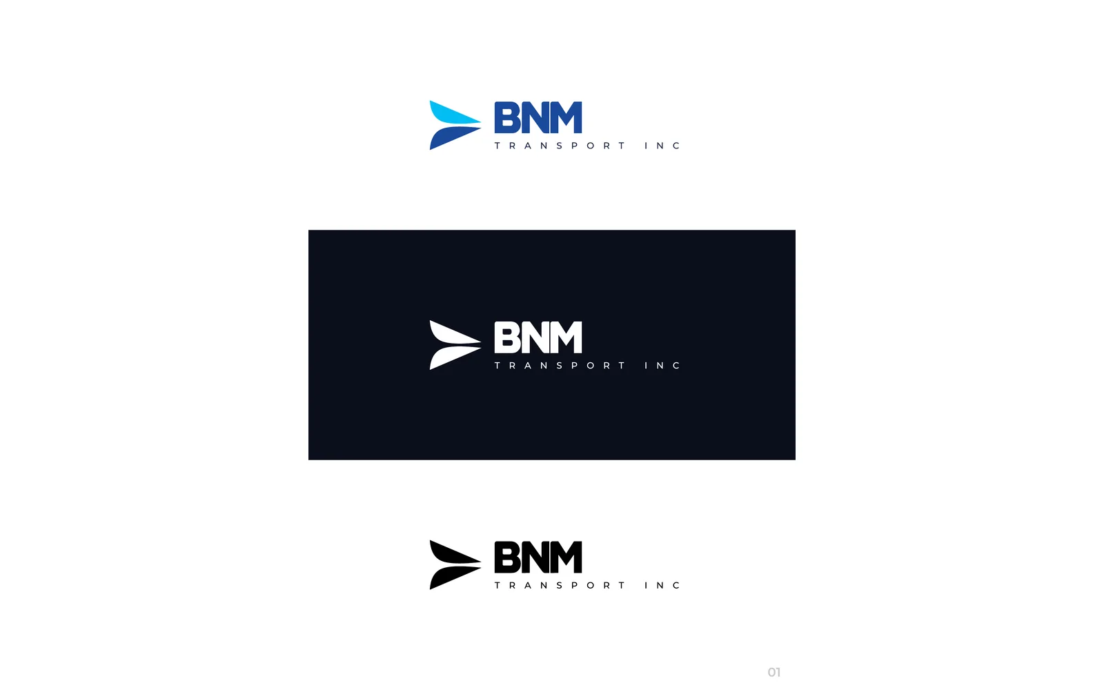
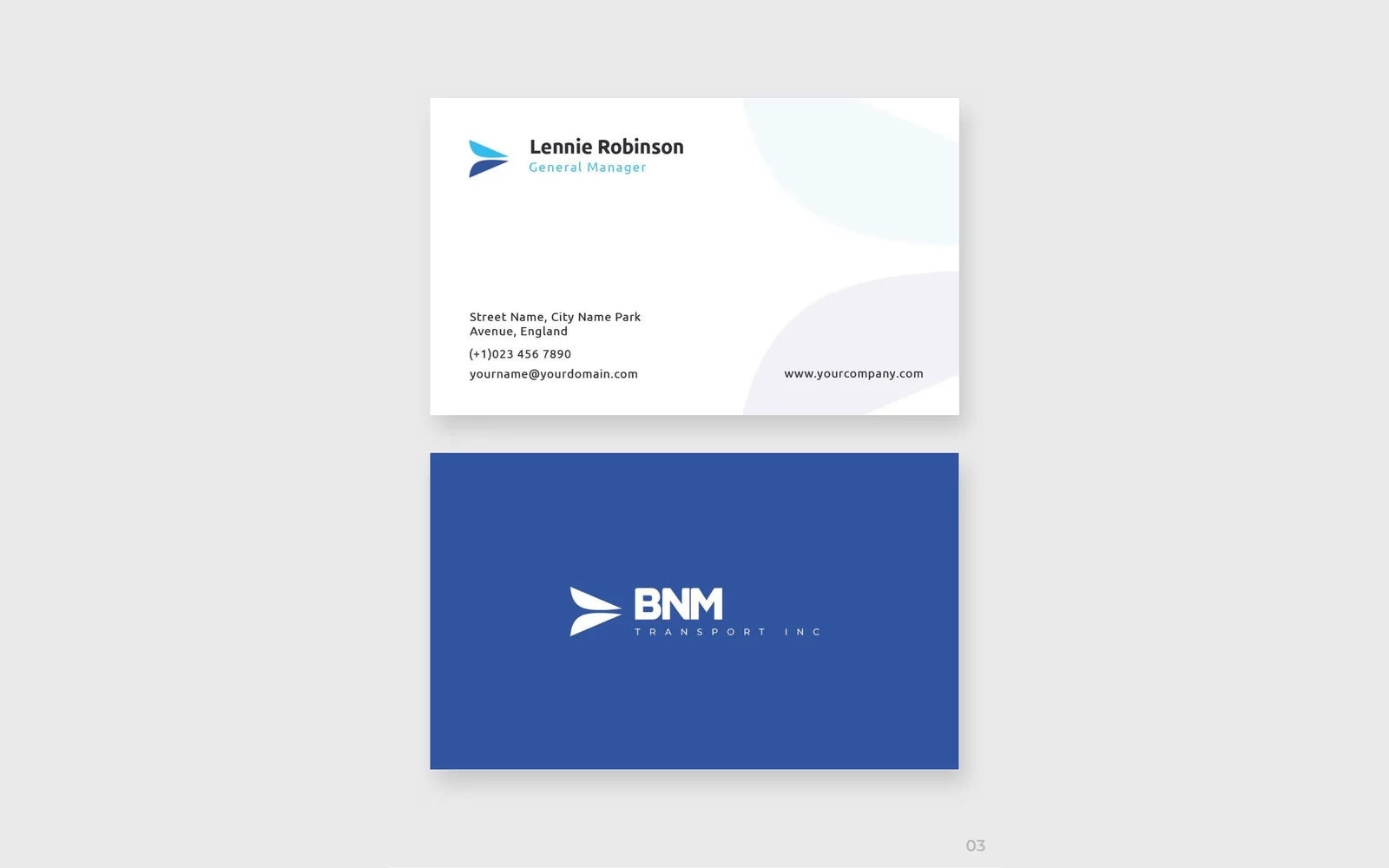
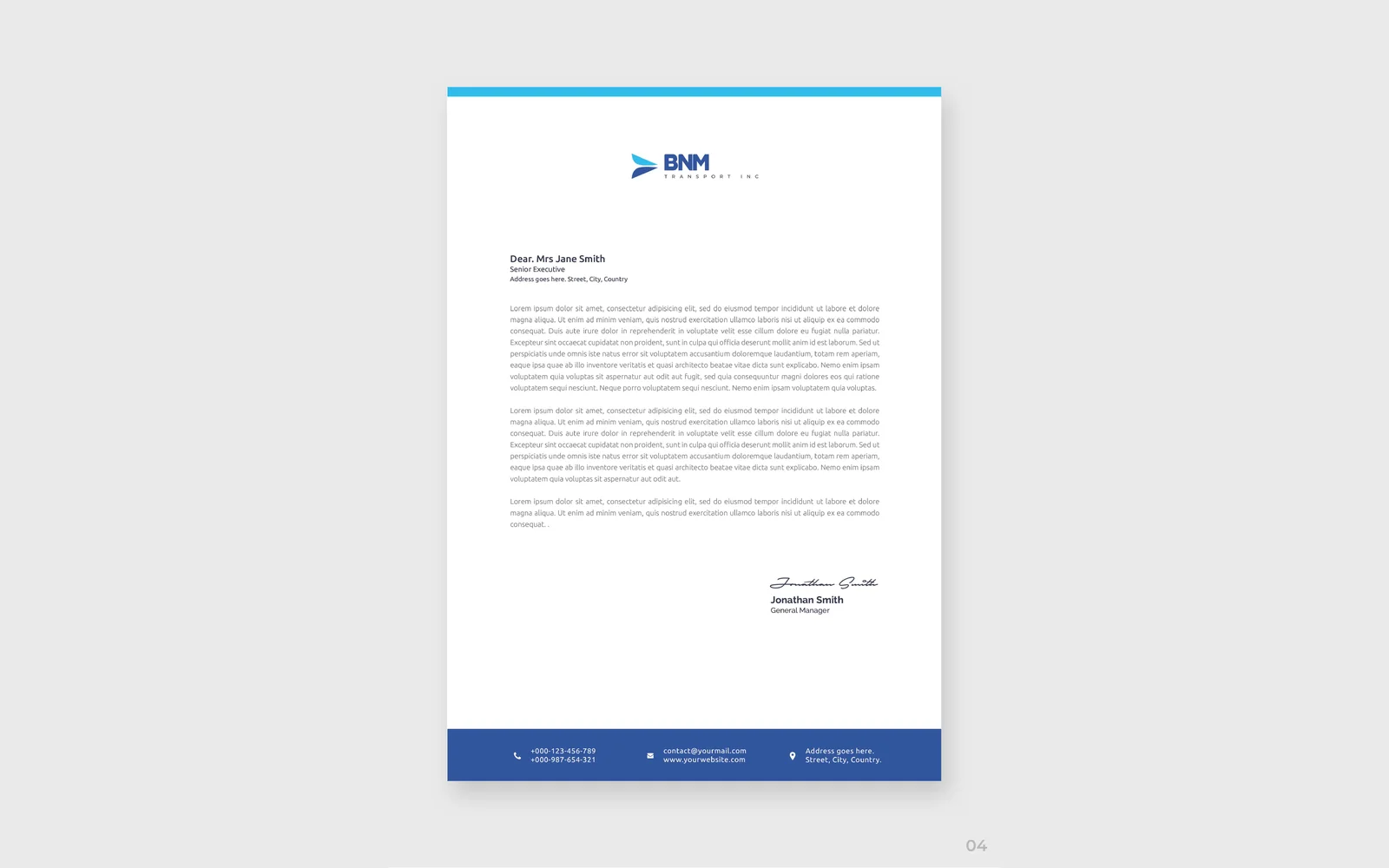
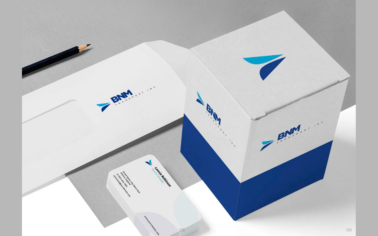
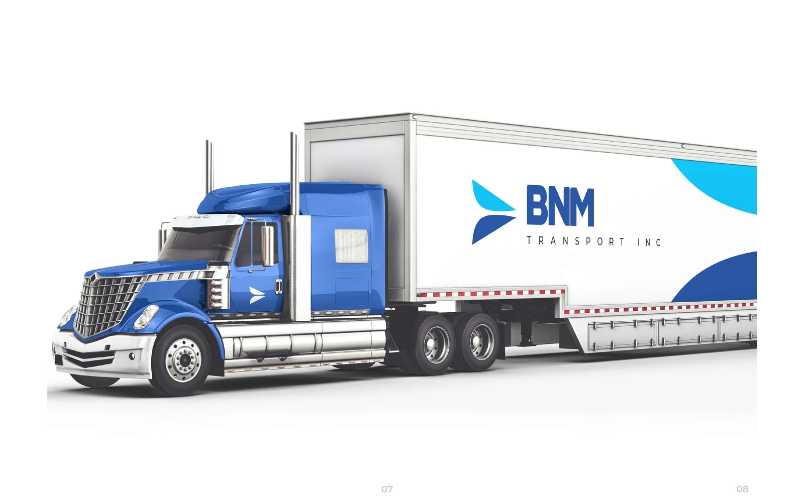
We designed the corporate identity for BNM Transport. The logo uses a swept, wing-like arrow icon, in royal blue and sky blue. We also designed business cards, a letterhead, an envelope, a packaging box and the design for a truck and trailer.
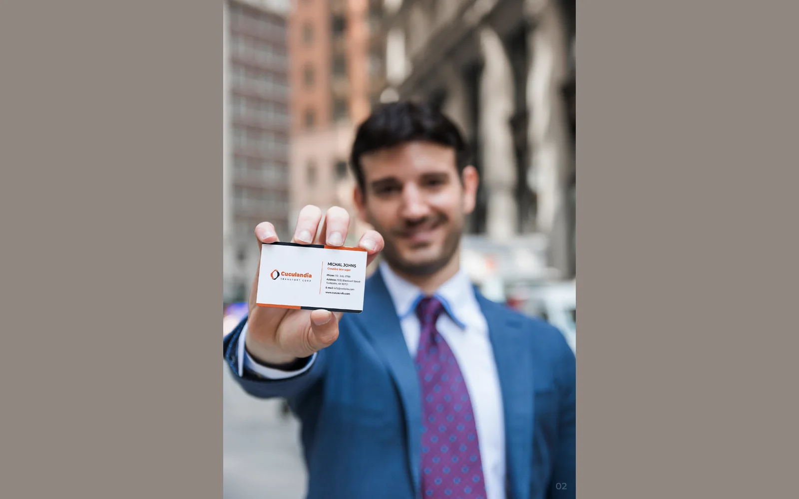
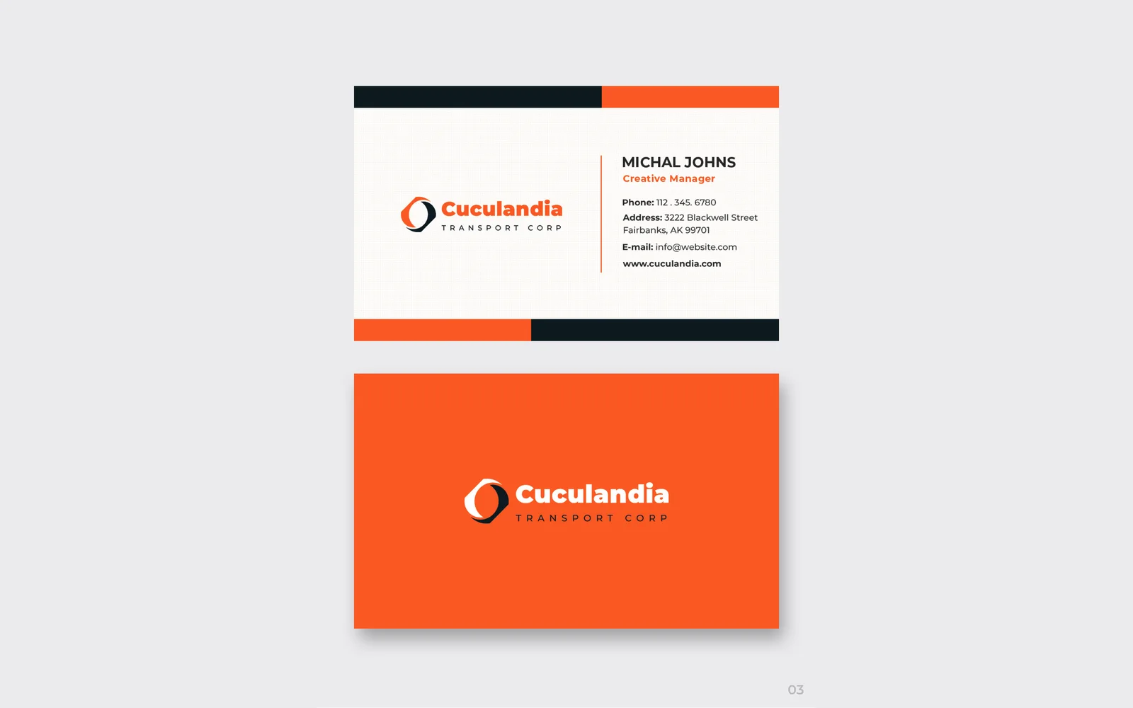
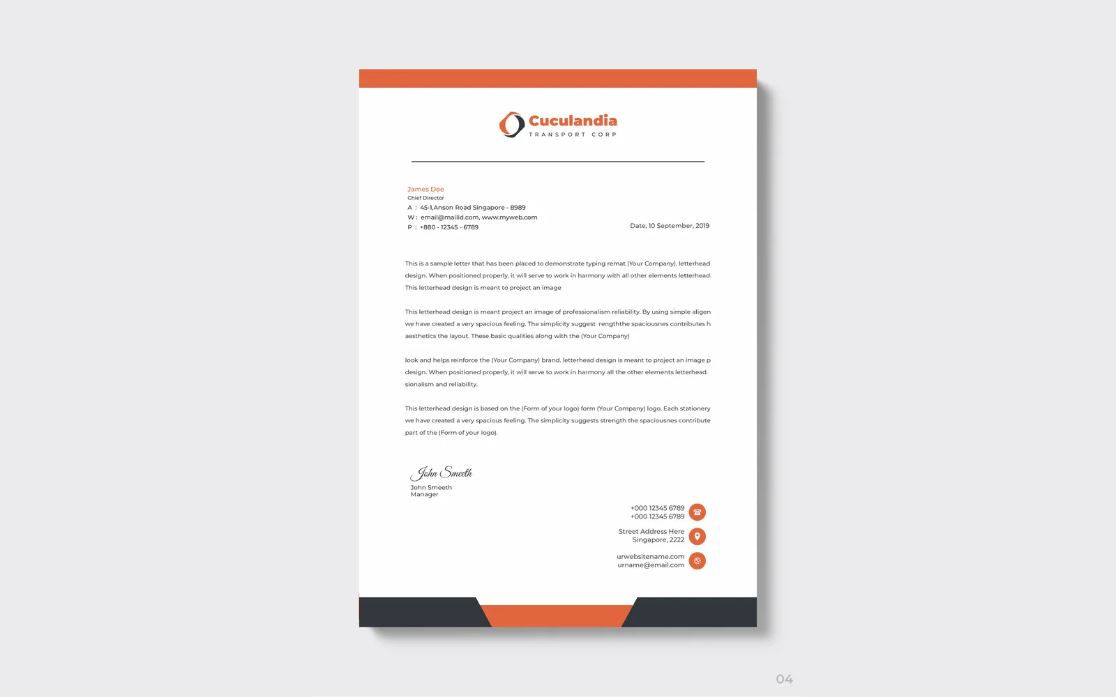
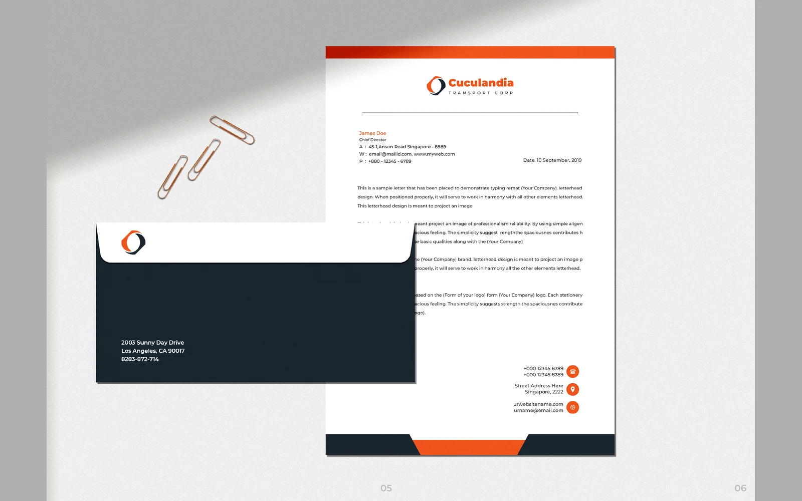


Cuculandia Transport Corp
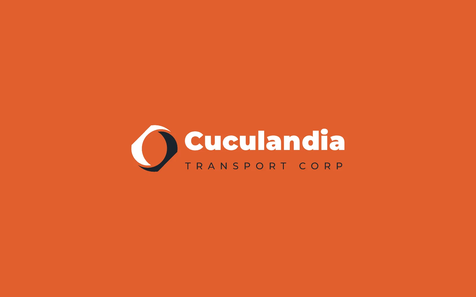
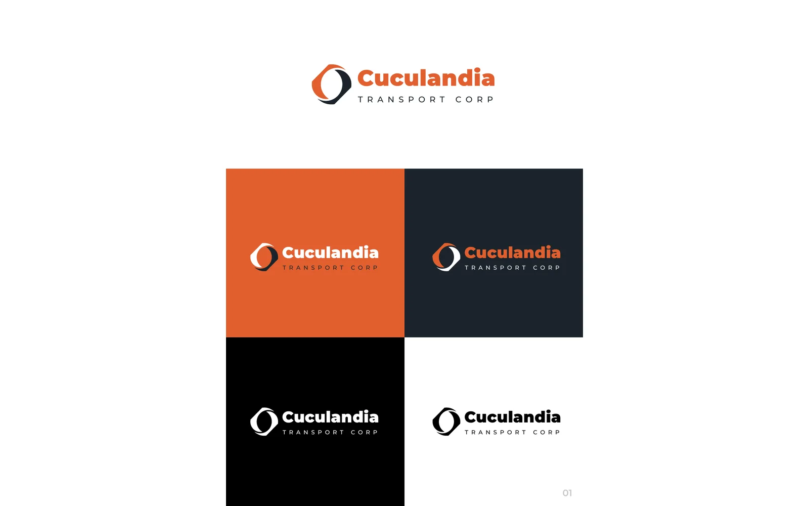
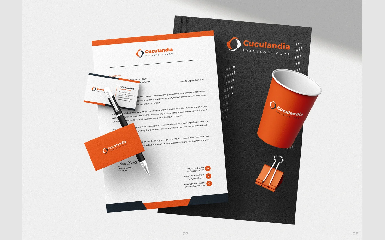
We designed the corporate identity for Cuculandia Transport. The logo uses a looped ring icon, in orange and charcoal. We also designed business cards, a letterhead, an envelope and a full stationery set.


E&L Logistic LLC
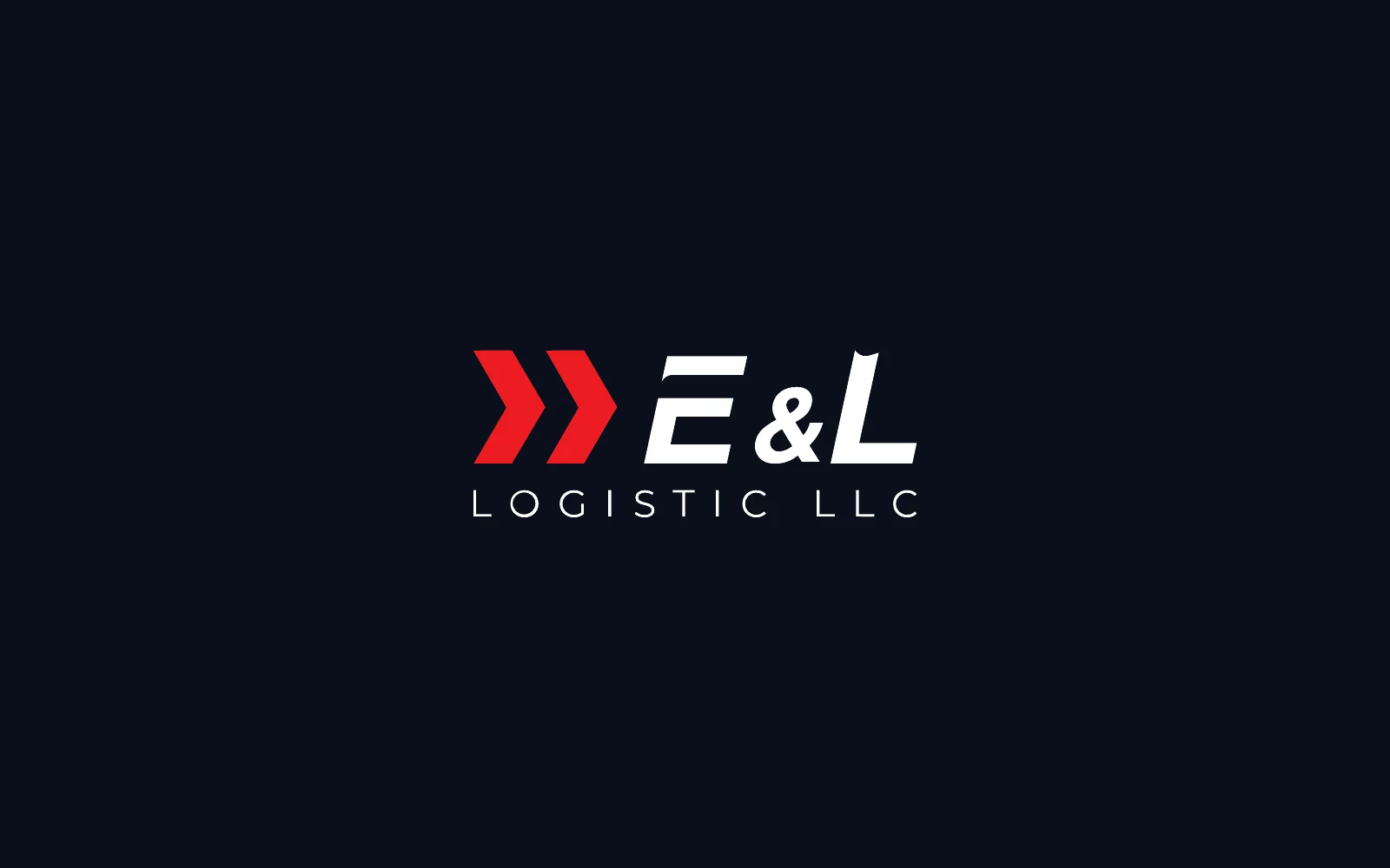
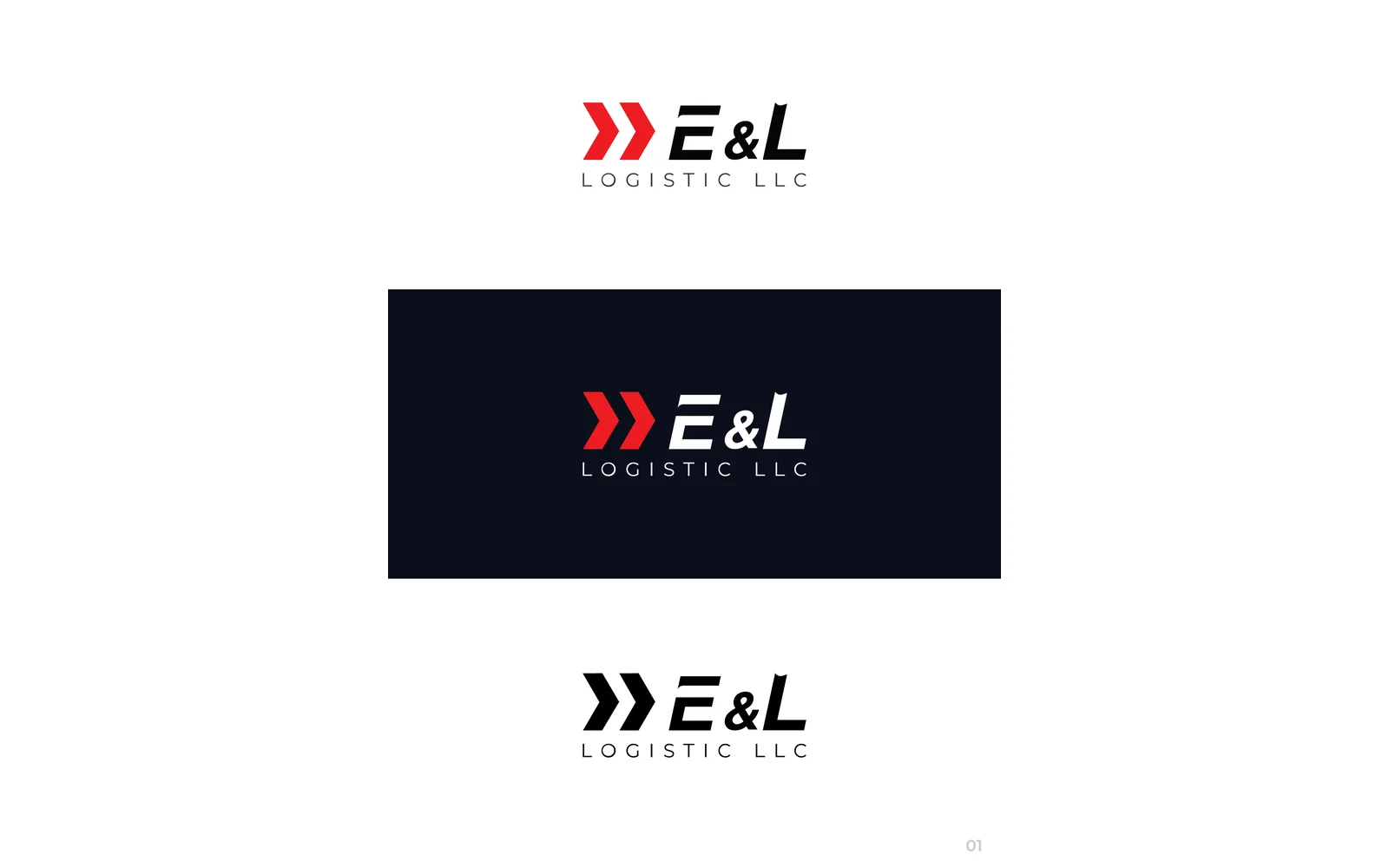
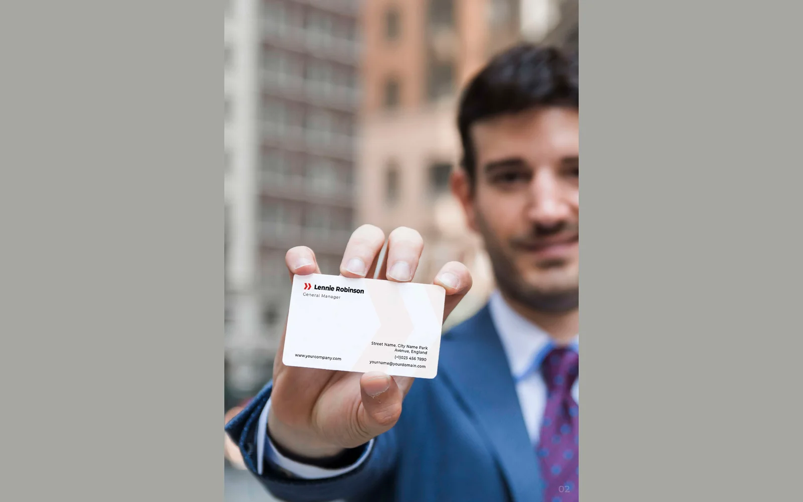
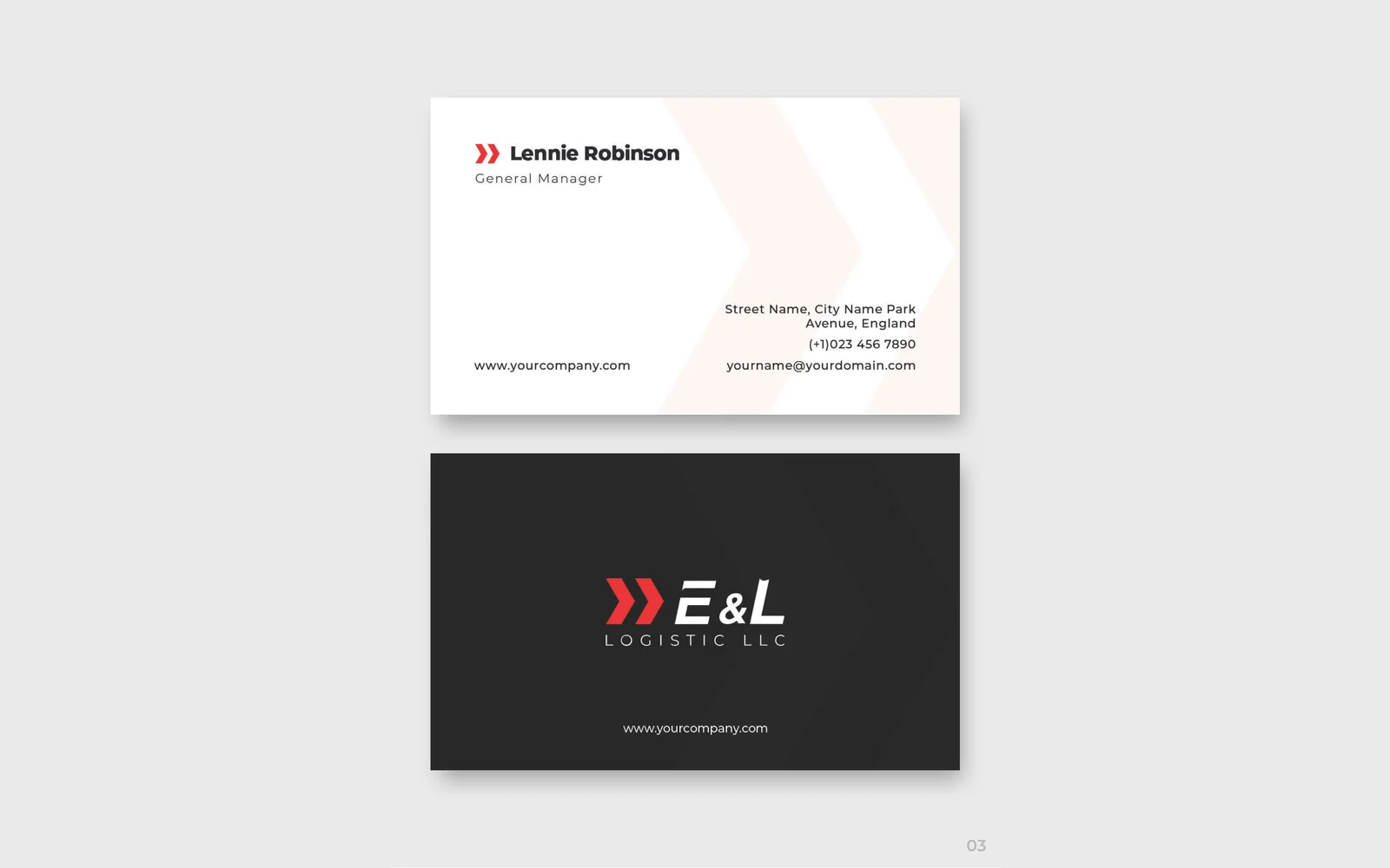
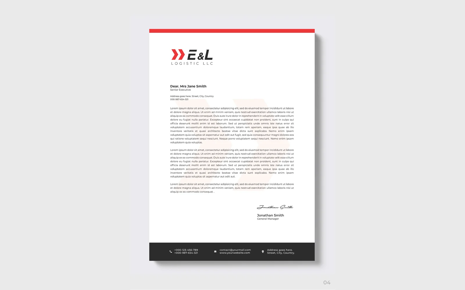
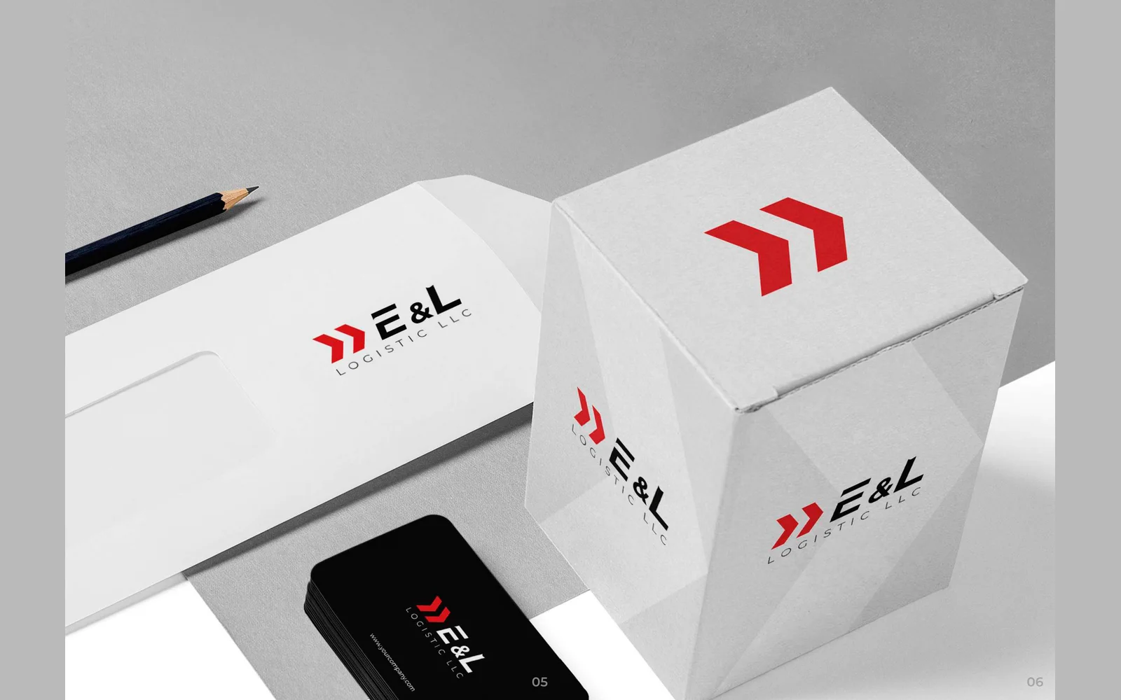
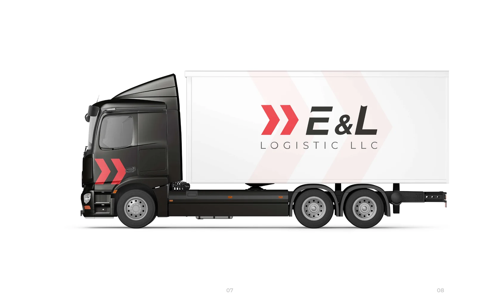
We designed the corporate identity for E&L Logistic. The logo uses a red double-chevron icon, in red, black and dark navy. We also designed business cards, a letterhead, an envelope, a packaging box and the design for a box truck.

El Kanario Logistics Inc
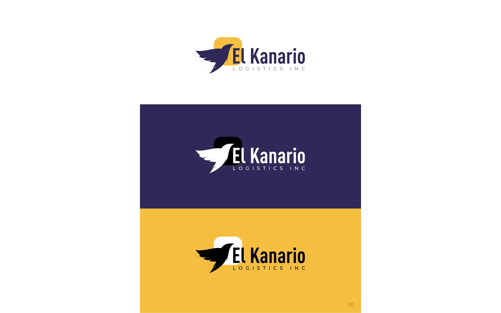
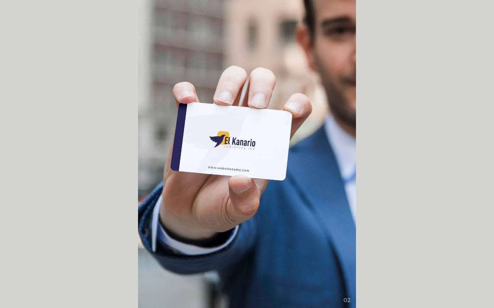
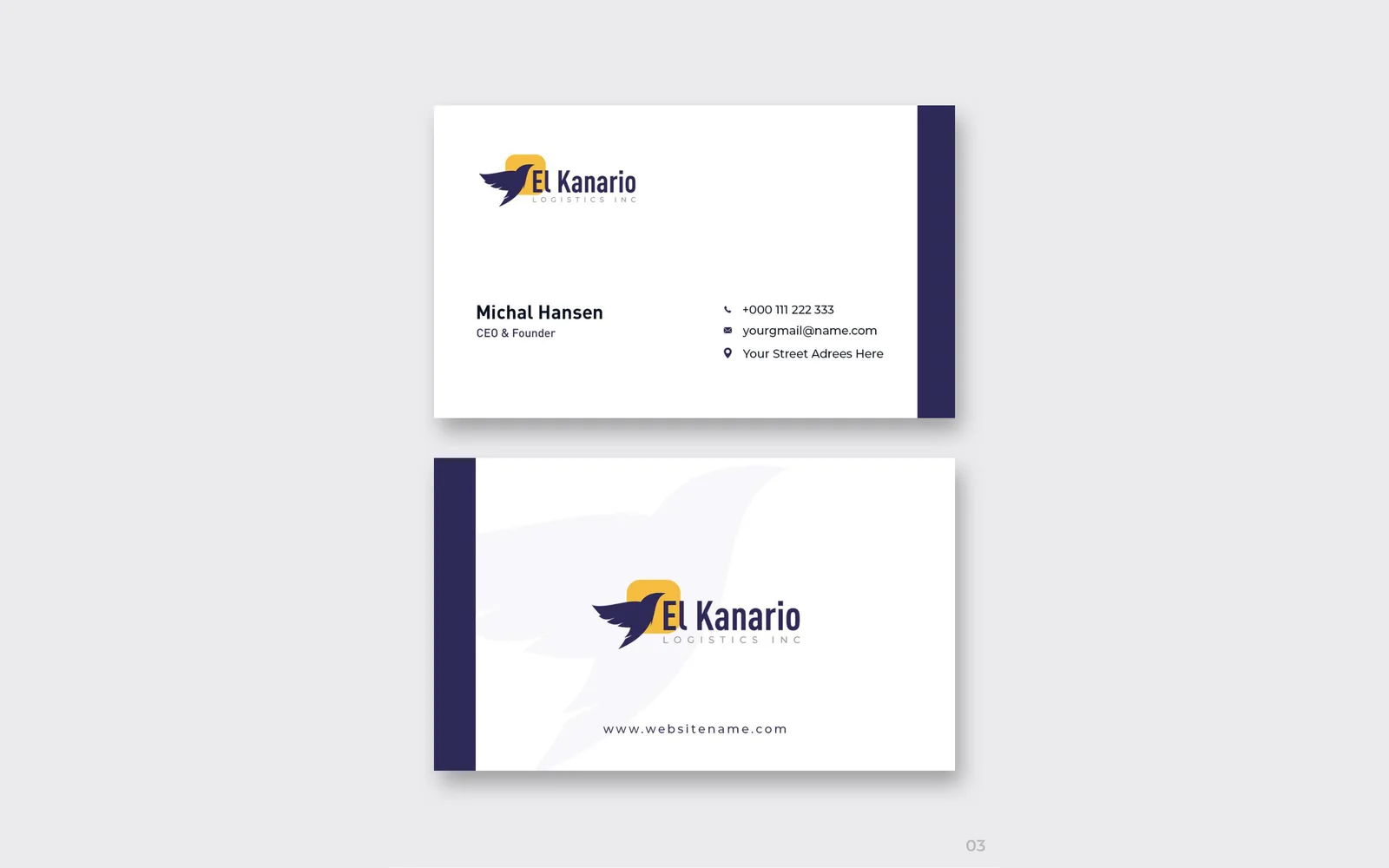
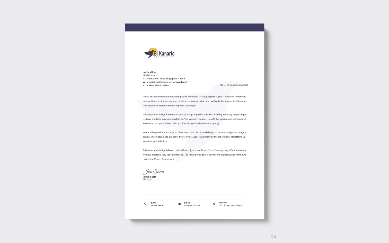
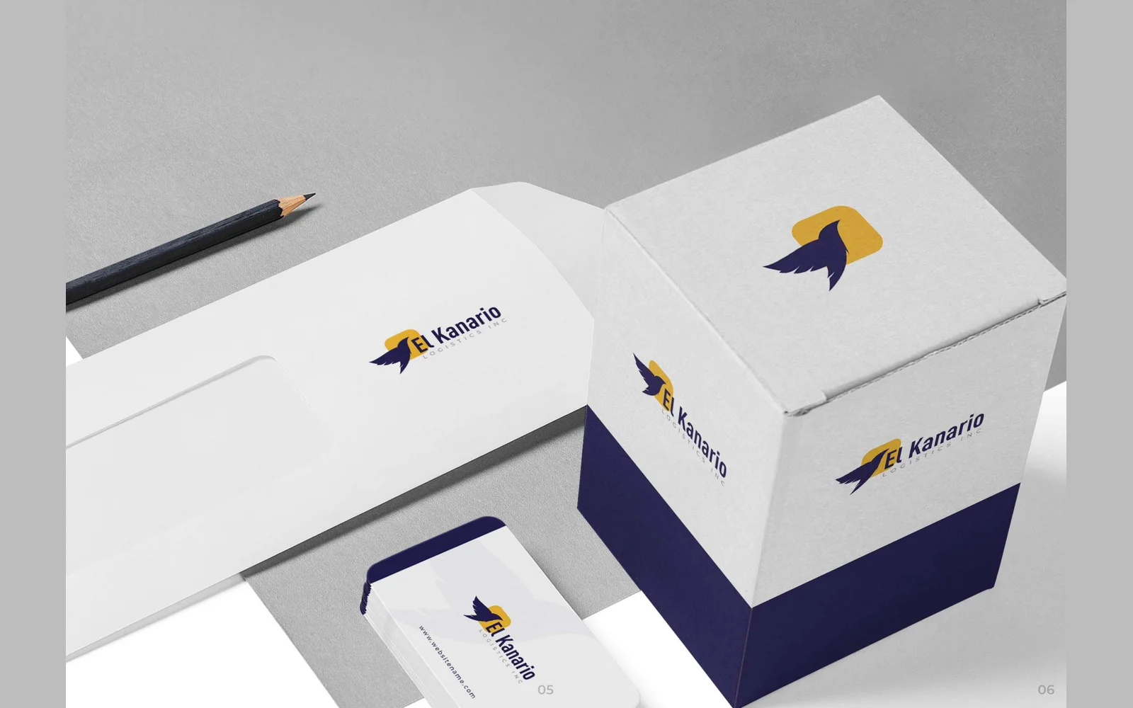
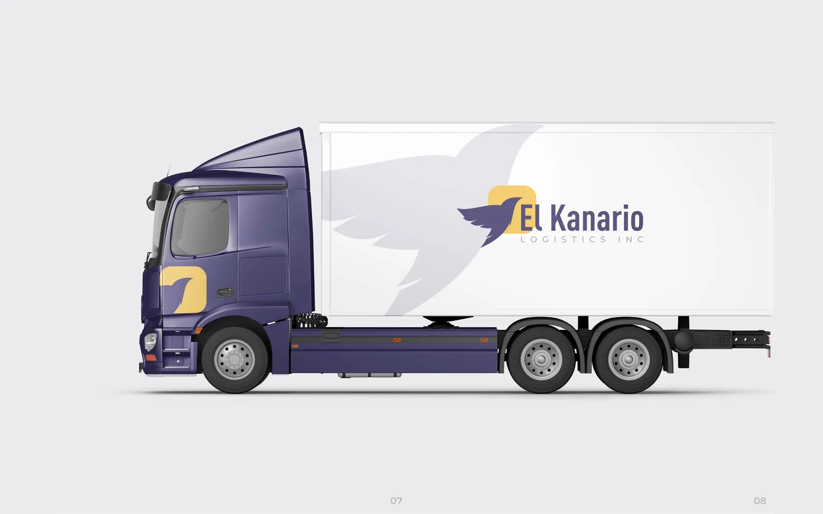
We designed the corporate identity for El Kanario Logistics. The logo uses a flying bird icon over a yellow rounded square, in deep indigo and yellow. We also designed business cards, a letterhead, an envelope, a packaging box and the design for a box truck.
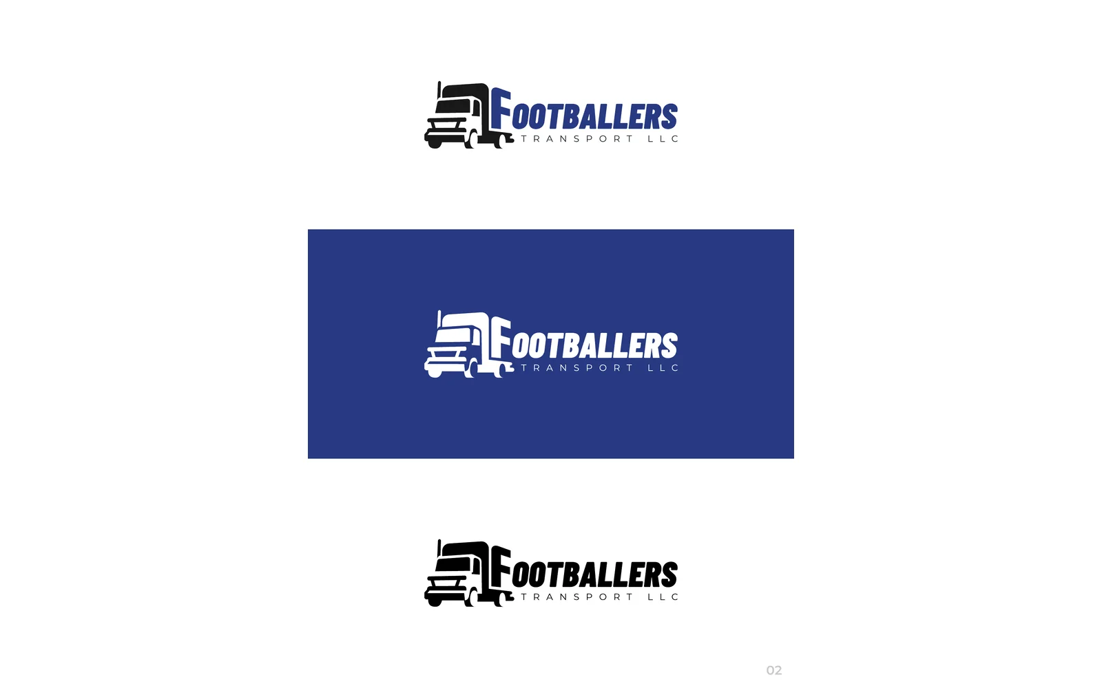
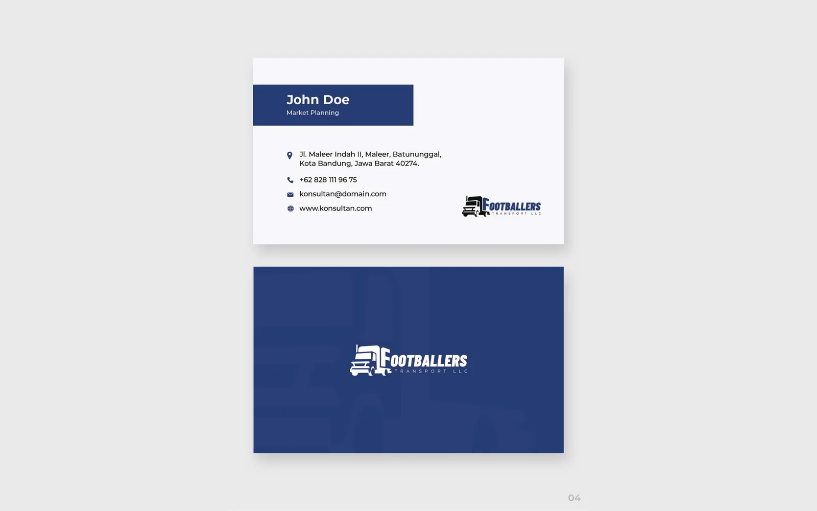
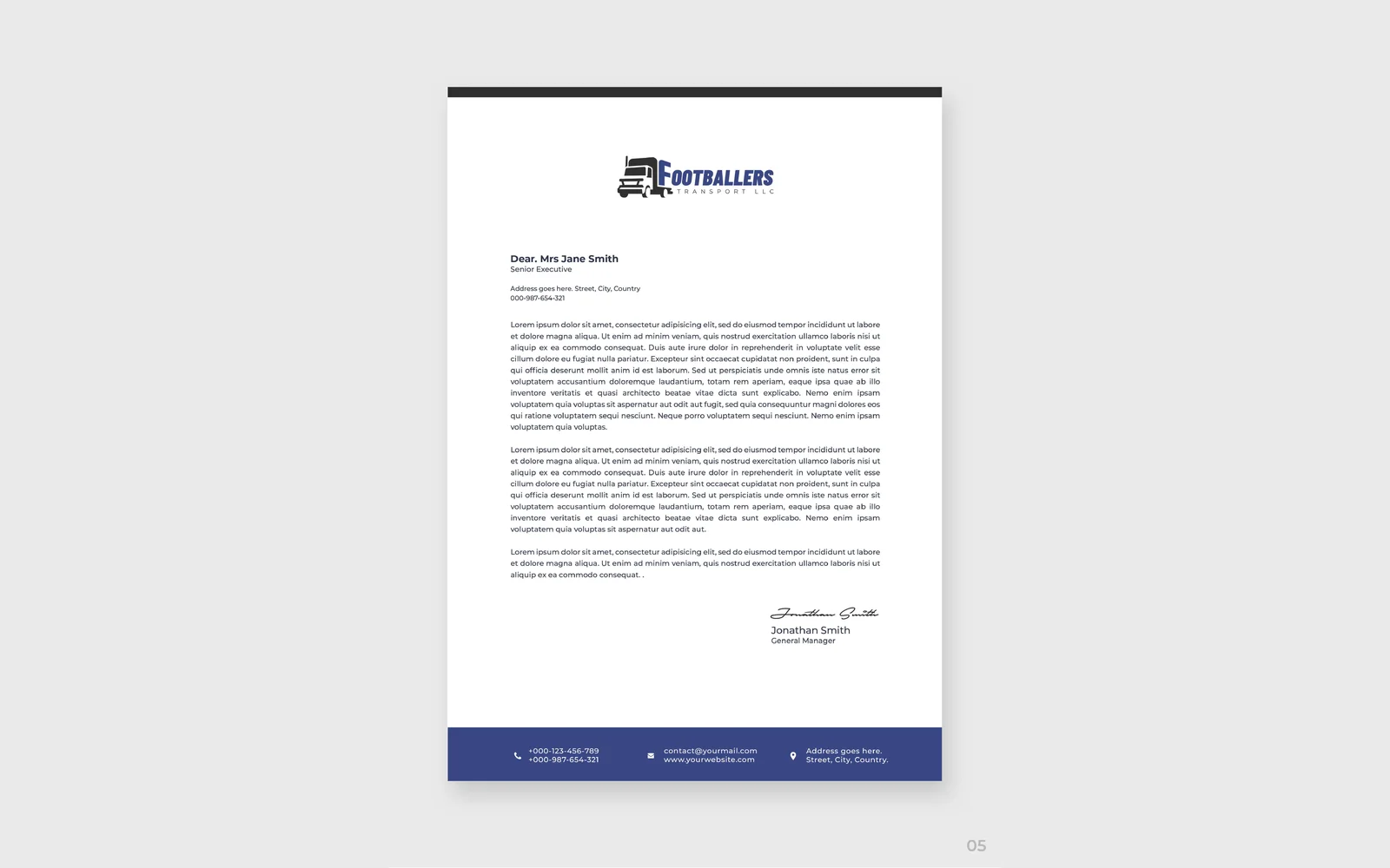
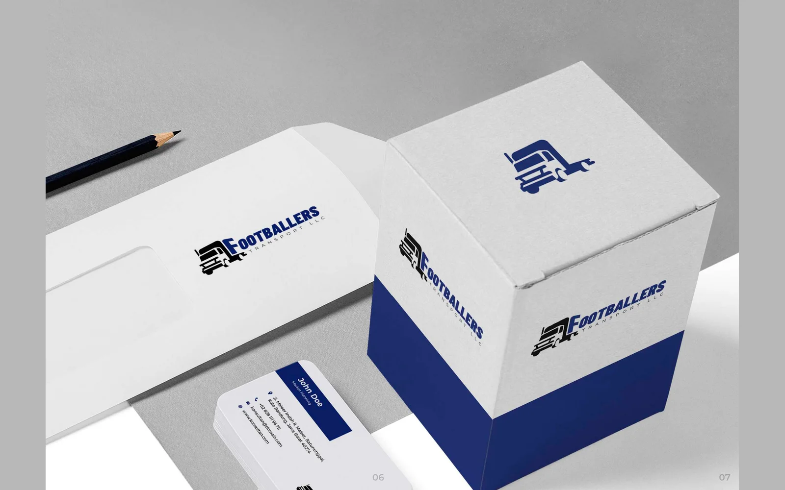
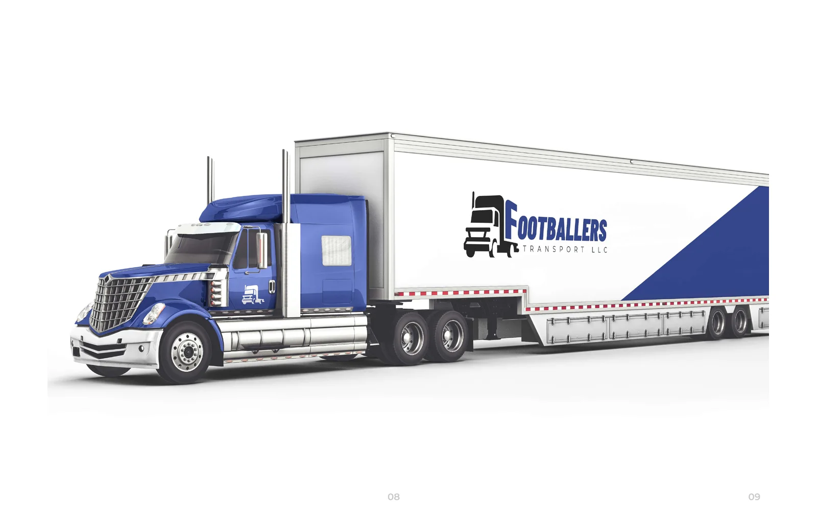

Footballers Transport LLC
We designed the corporate identity for Footballers Transport. The logo uses a truck silhouette joined to the first letter, in royal blue and black. We also designed business cards, a letterhead, an envelope, a packaging box and the design for a truck and trailer.

FR Infinity Power Corp
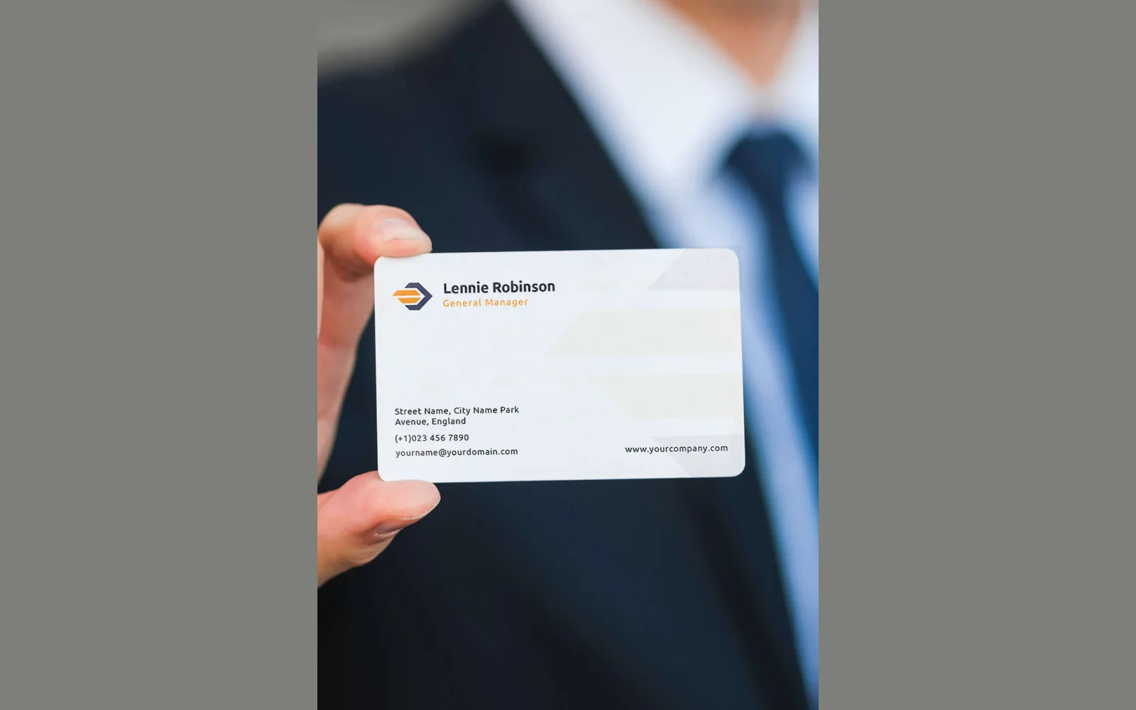
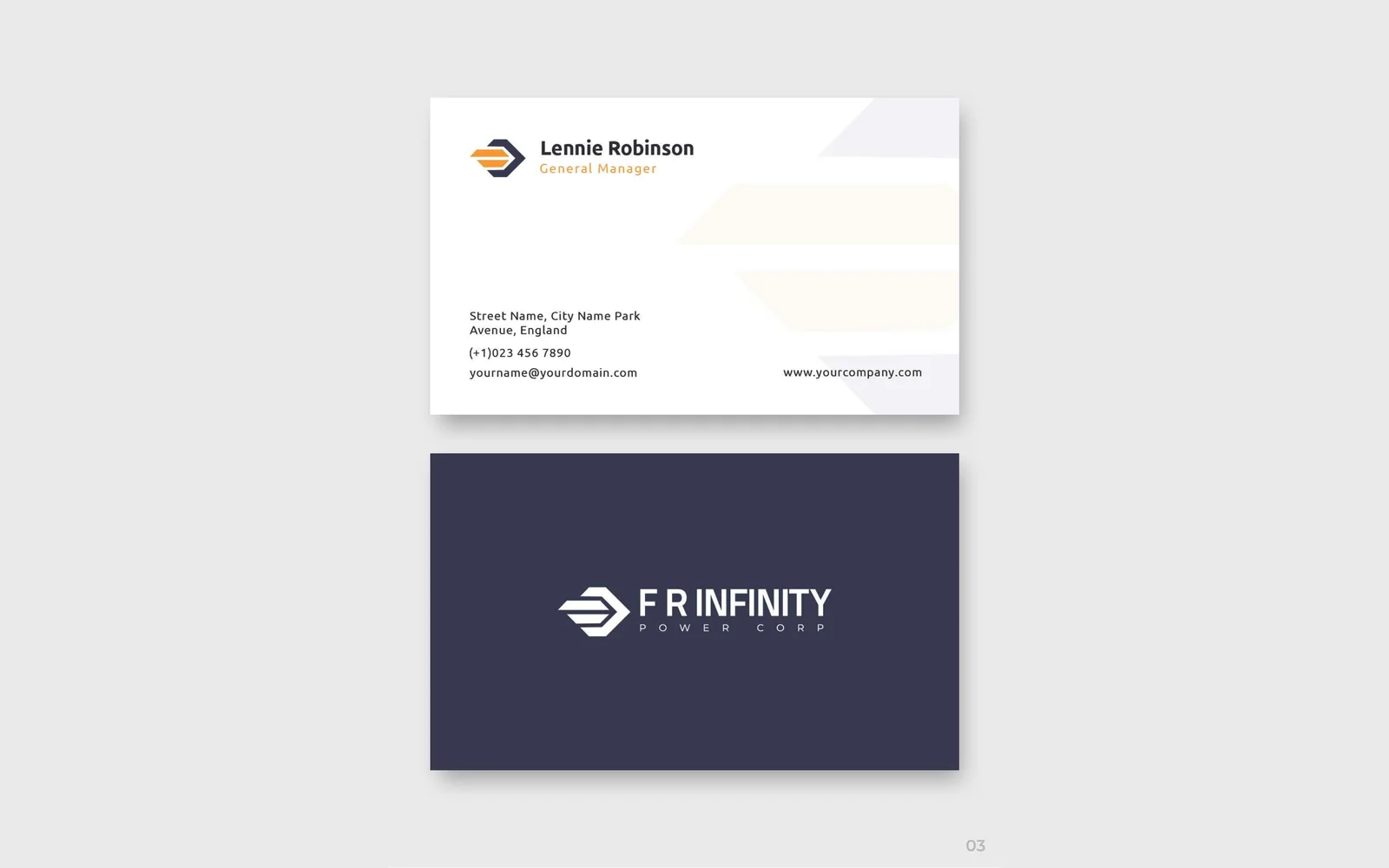
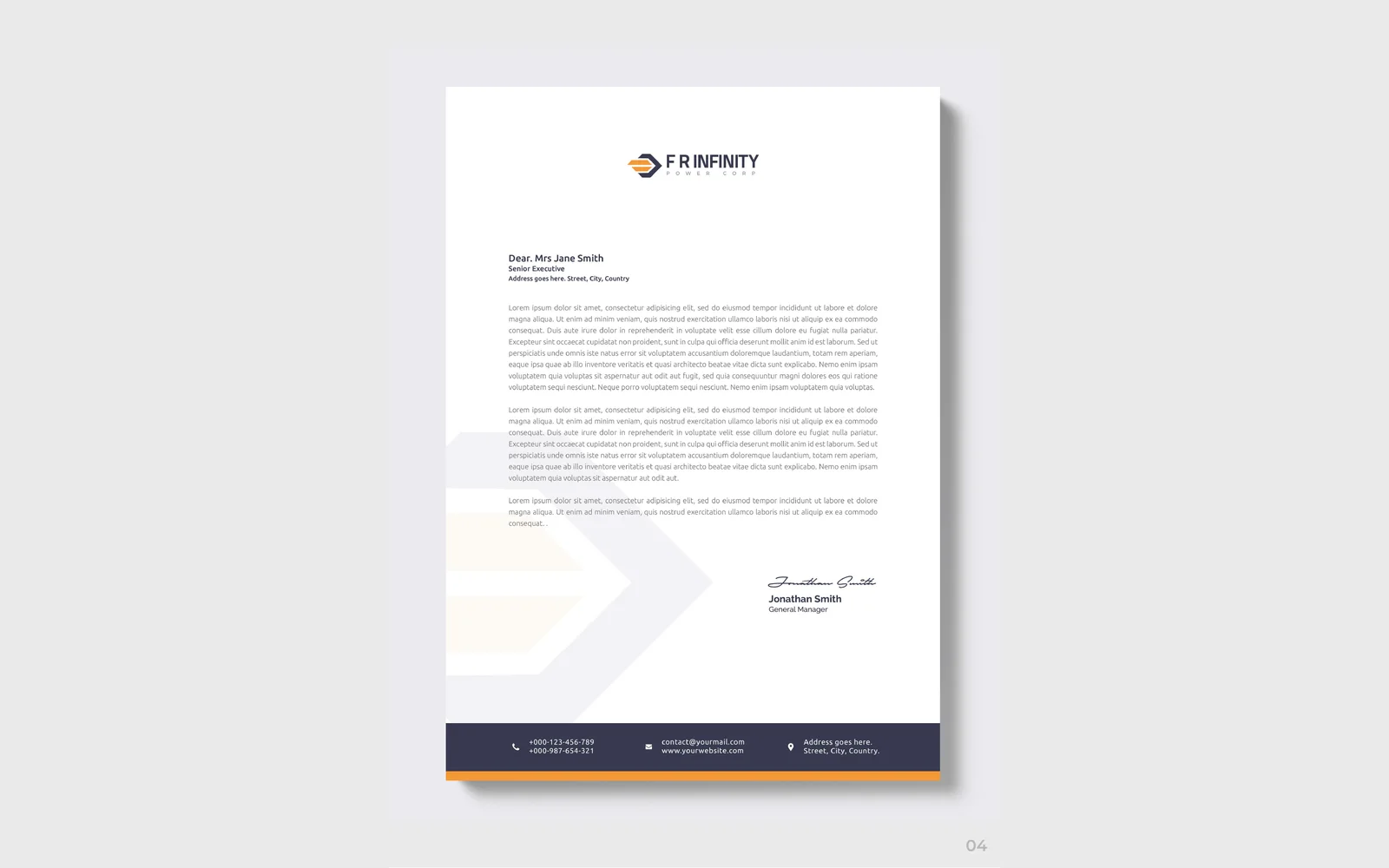
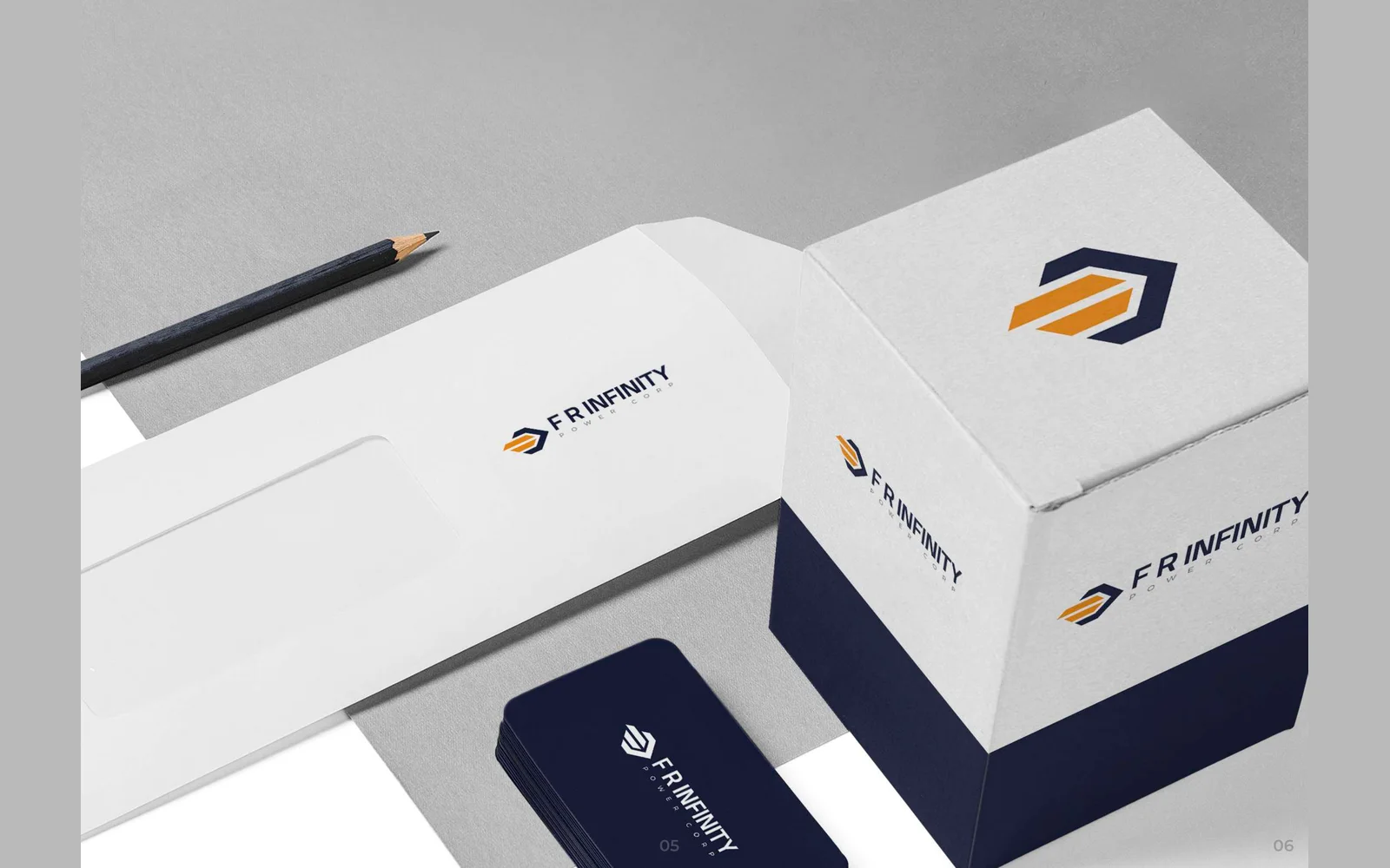
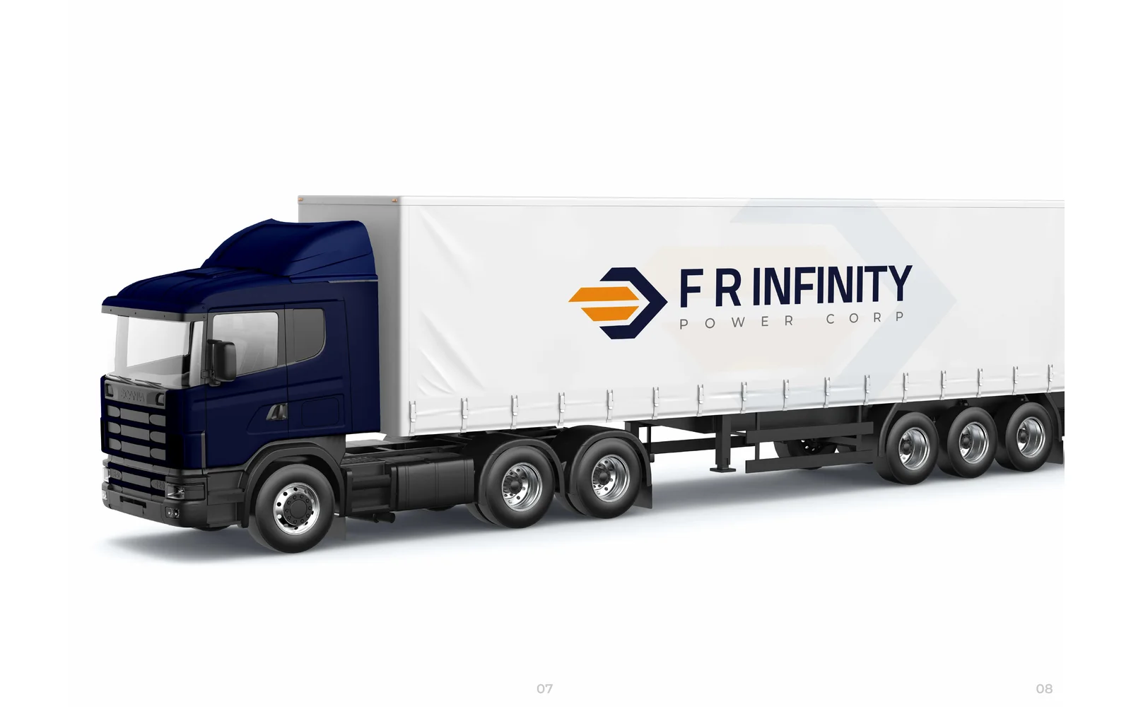
We designed the corporate identity for FR Infinity Power. The logo uses a six-sided arrow icon with orange stripes, in navy and orange. We also designed business cards, a letterhead, an envelope, a packaging box and the design for a truck and trailer.
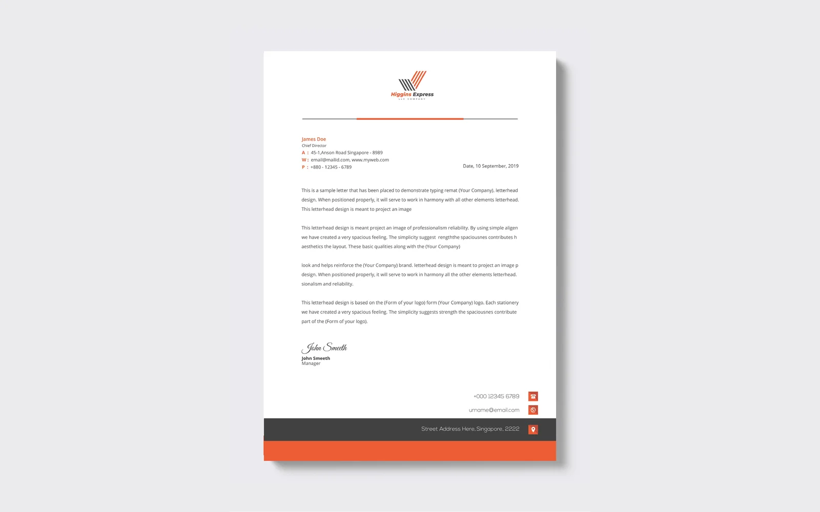
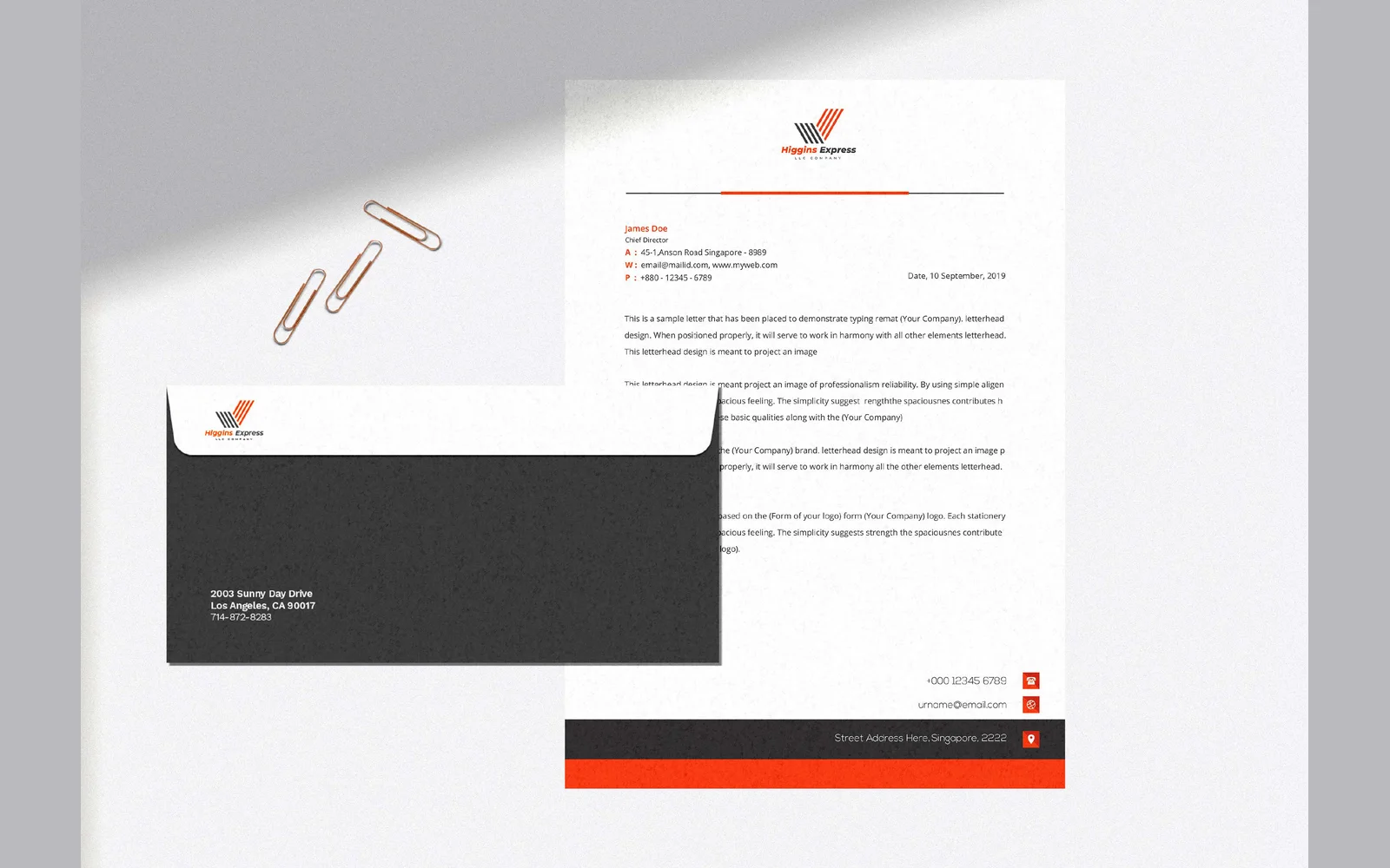
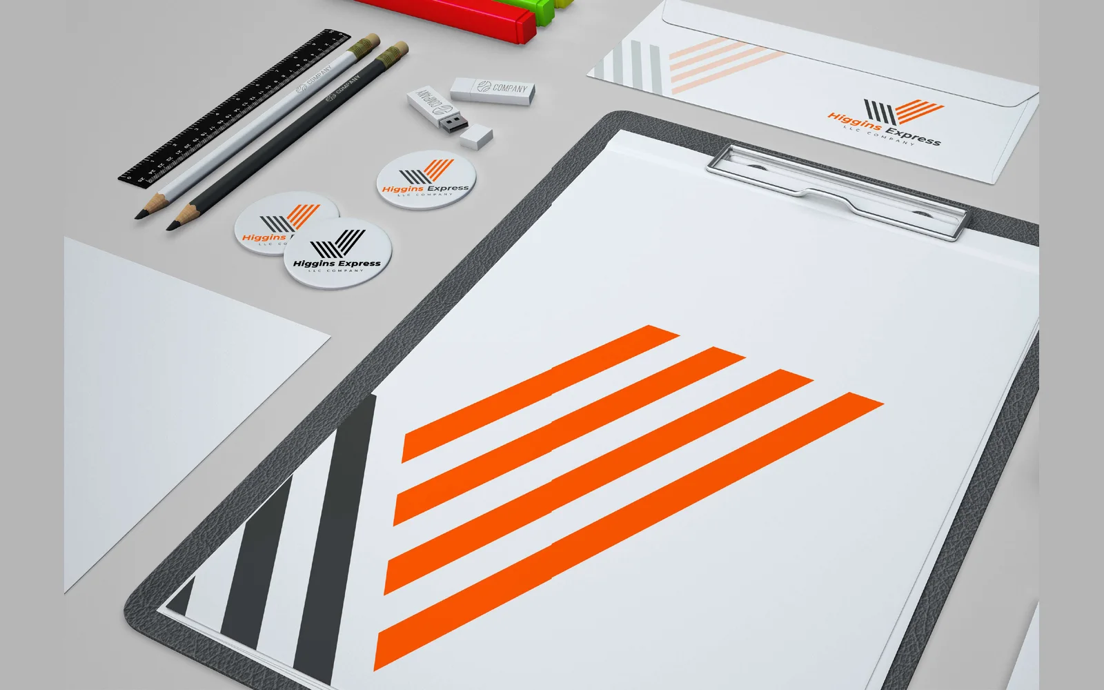


Higgins Express LLC
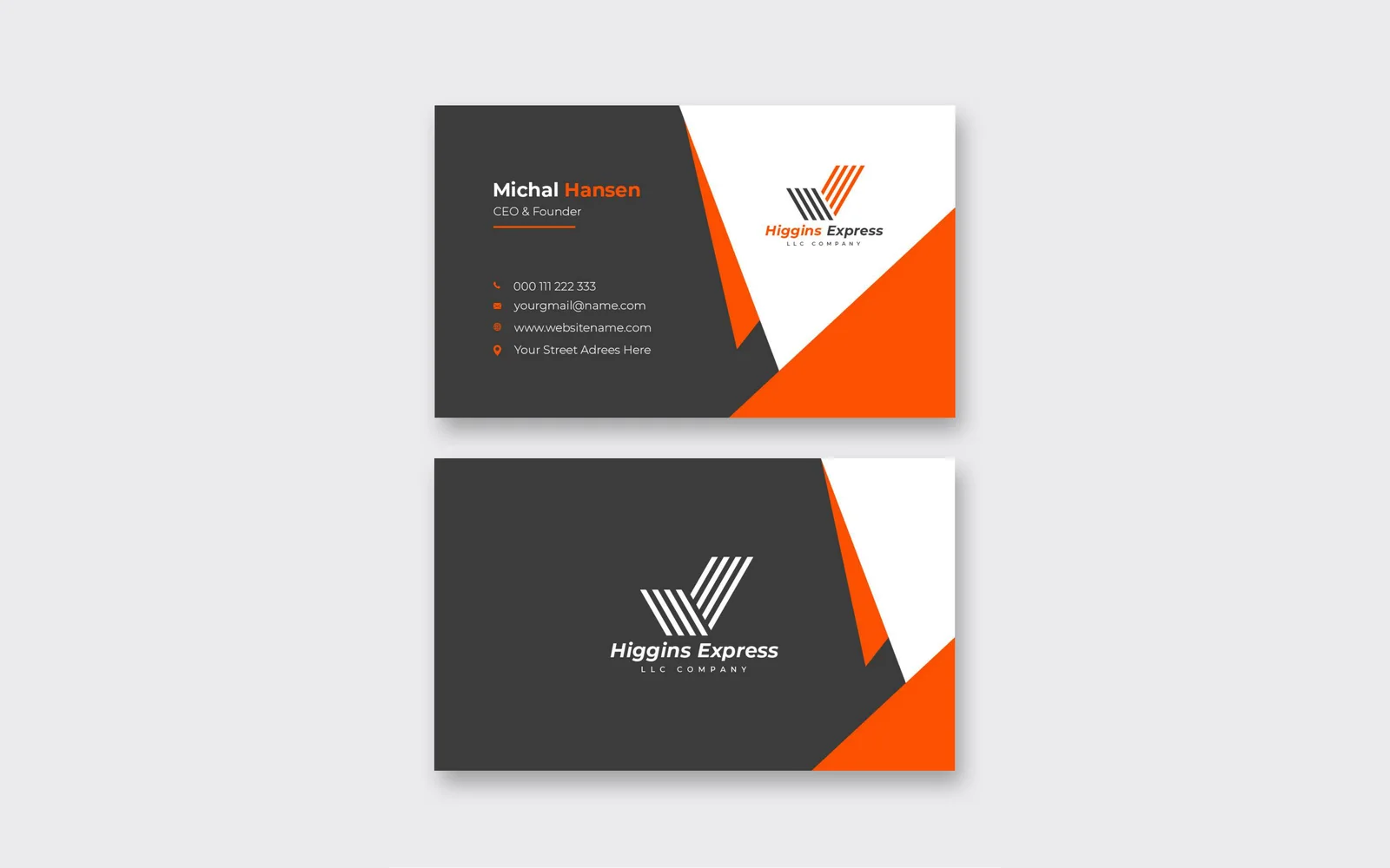
We designed the corporate identity for Higgins Express. The logo uses a check mark built from parallel stripes, in orange and charcoal. We also designed business cards, a letterhead, an envelope and a full stationery set.
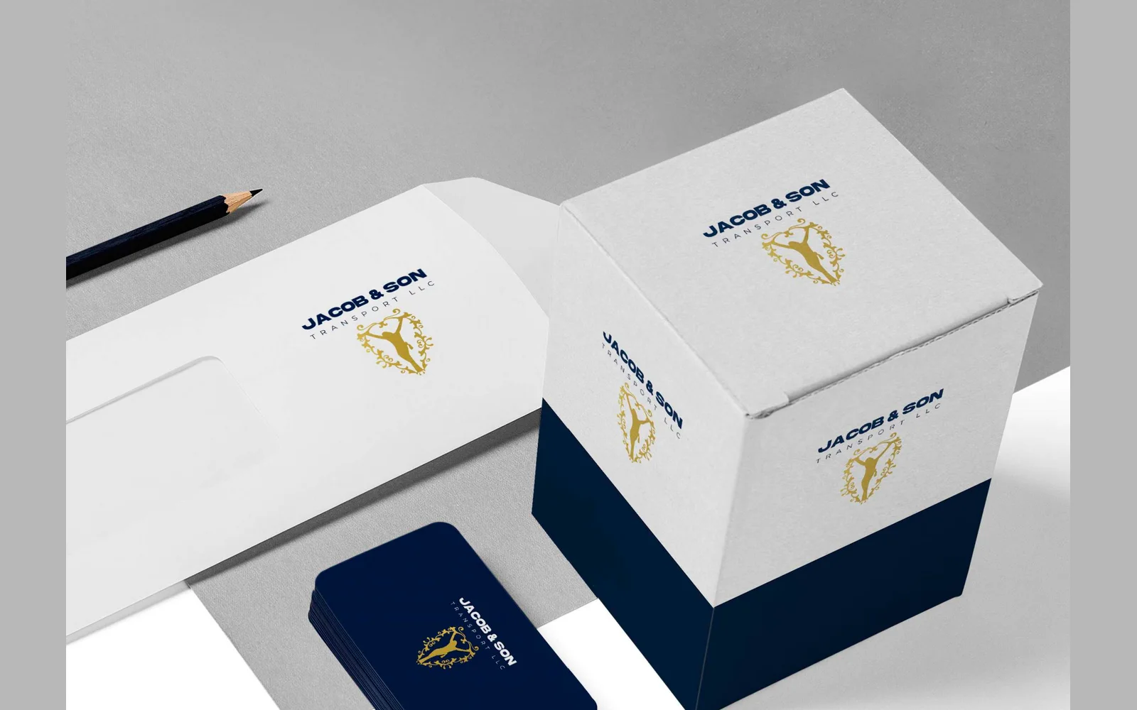
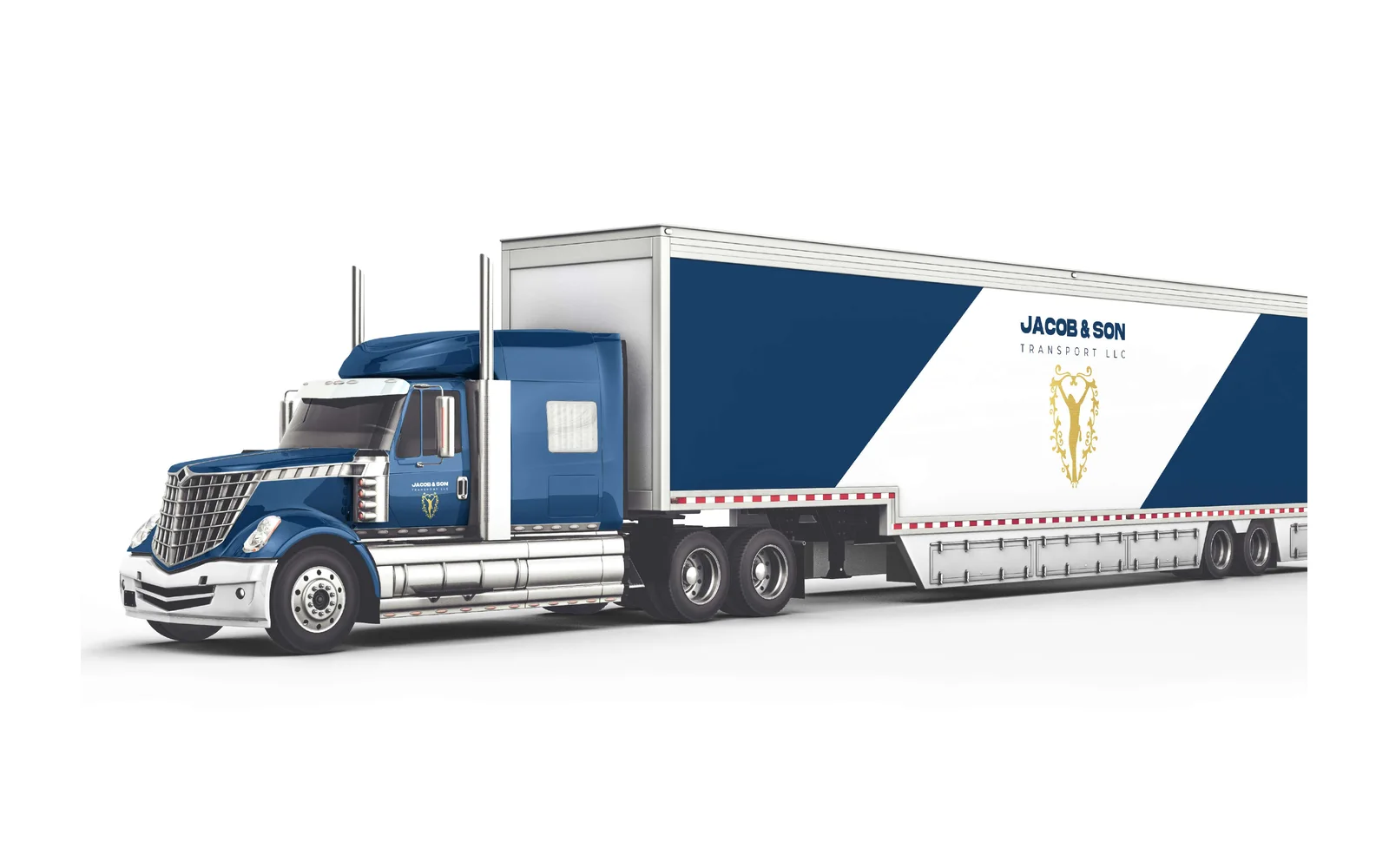

Jacob & Son Transport LLC
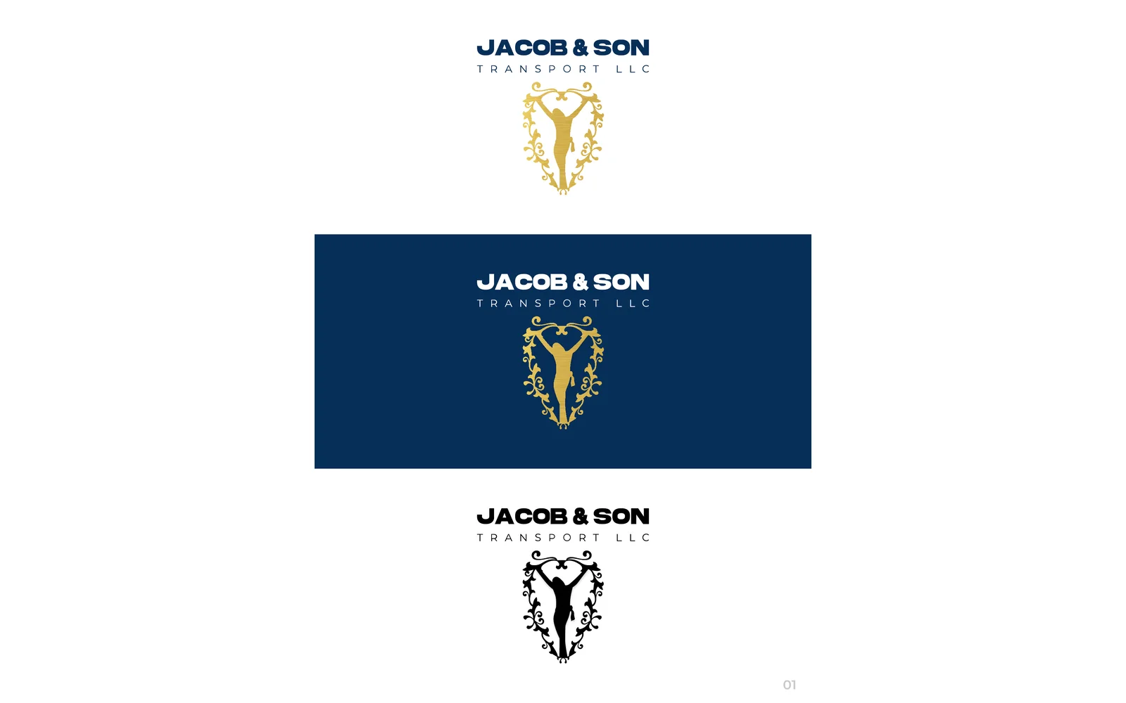
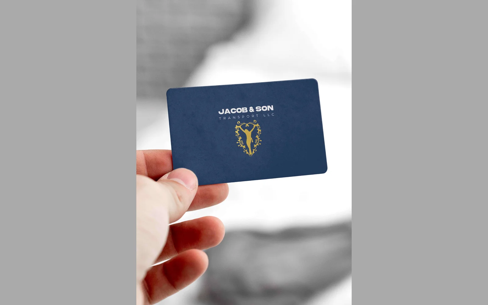
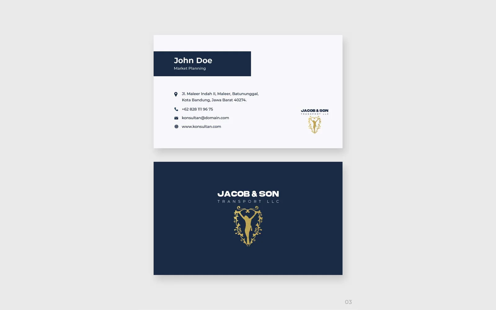
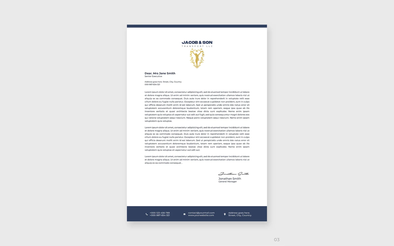
We designed the corporate identity for Jacob & Son Transport. The logo uses an ornamental gold crest, in navy and gold. We also designed business cards, a letterhead, an envelope, a packaging box and the design for a truck and trailer.

Lemo Transport LLC
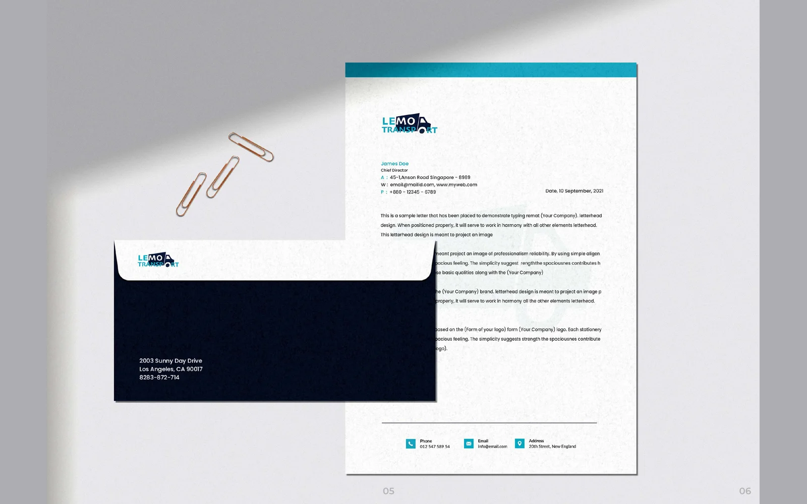
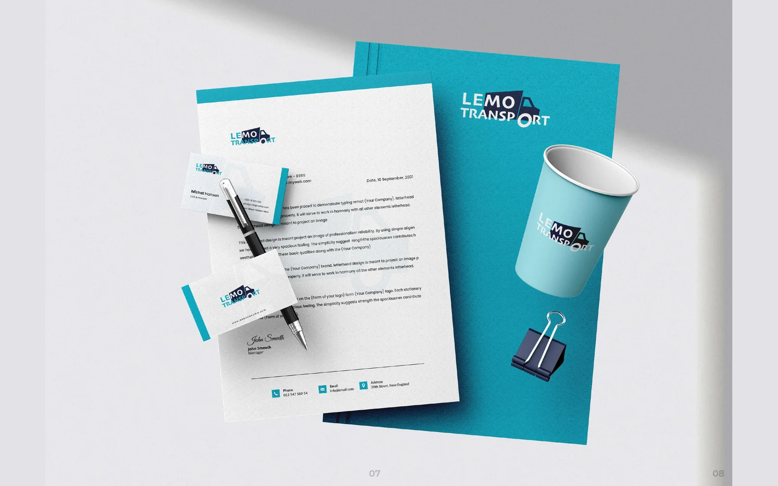
We designed the corporate identity for Lemo Transport. The logo uses a truck shape built into the lettering, in teal and navy. We also designed business cards, a letterhead, an envelope and a full stationery set.
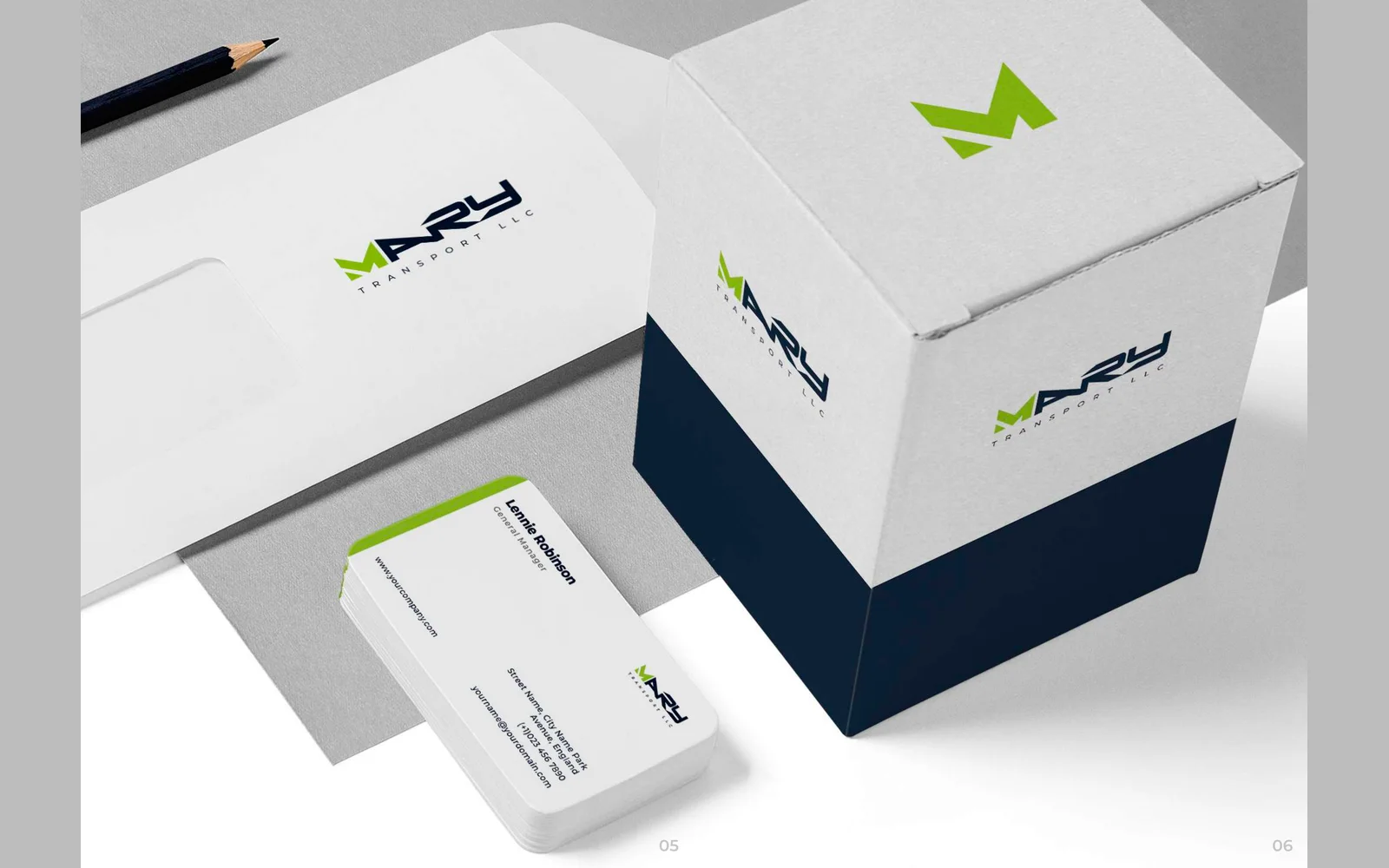
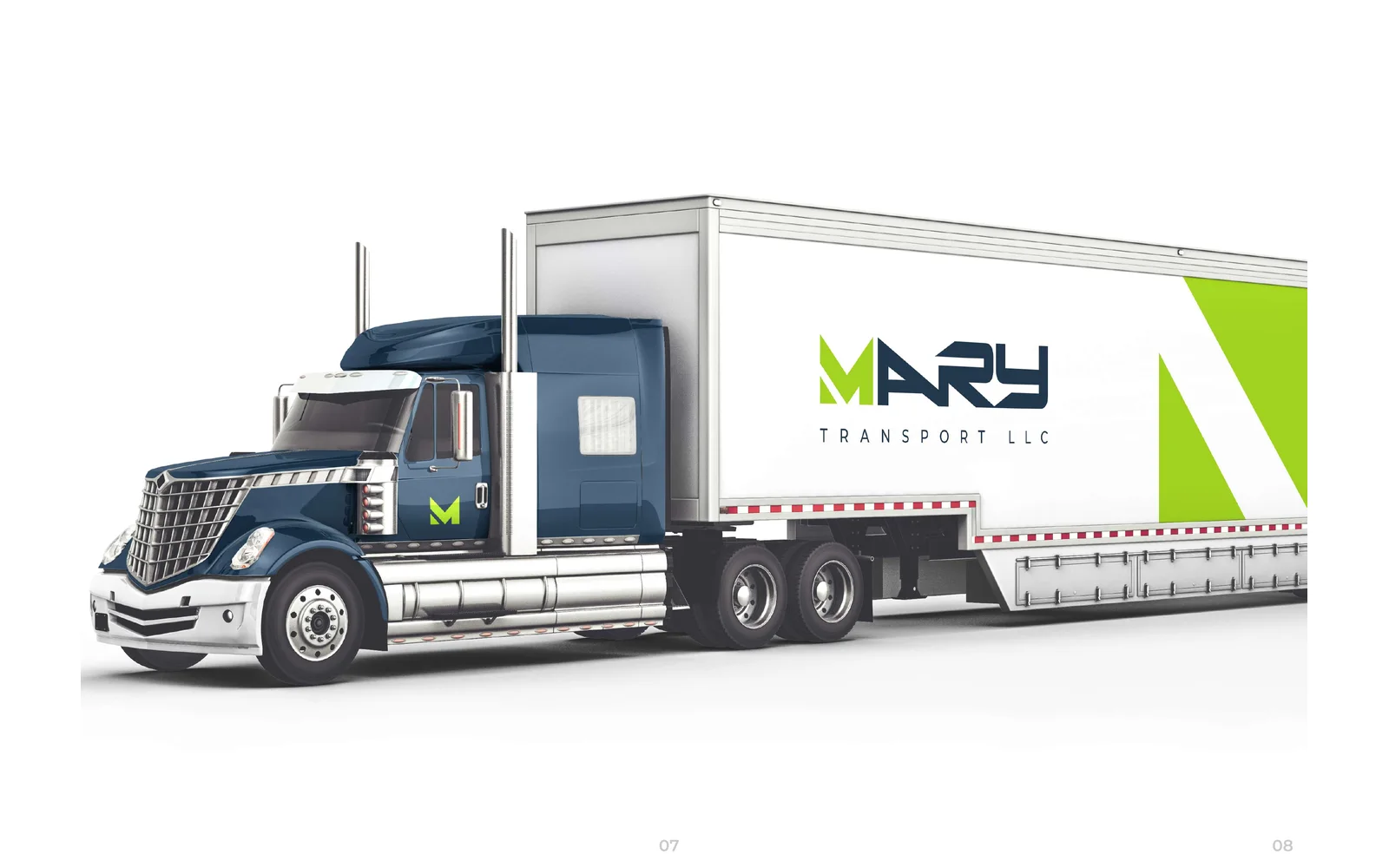

Mary Transport LLC
We designed the corporate identity for Mary Transport. The logo uses an angular M icon, in navy and lime green. We also designed business cards, a letterhead, an envelope, a packaging box and the design for a truck and trailer.

MB Transport
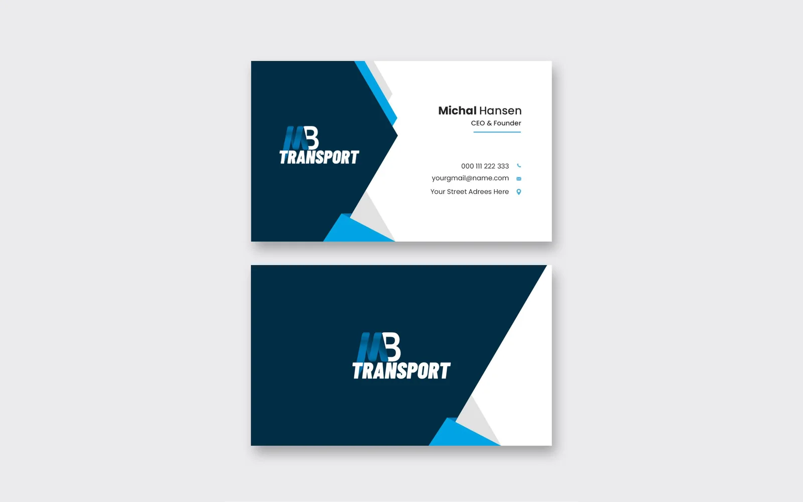
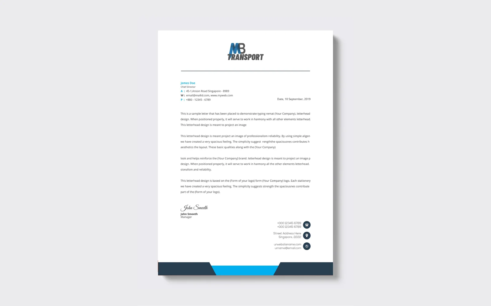
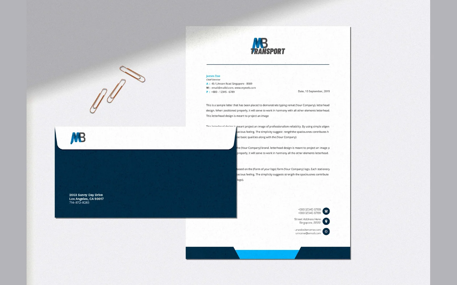
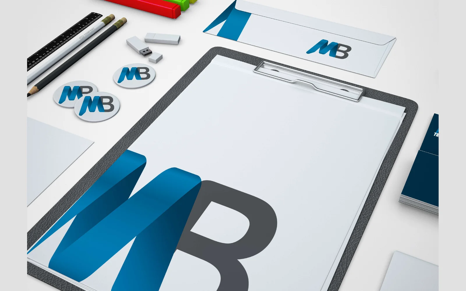
We designed the corporate identity for MB Transport. The logo uses a ribbon-style MB monogram, in navy and bright blue. We also designed business cards, a letterhead, an envelope and a full stationery set.

MMA Logistics
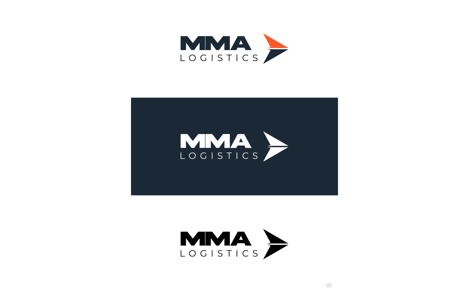
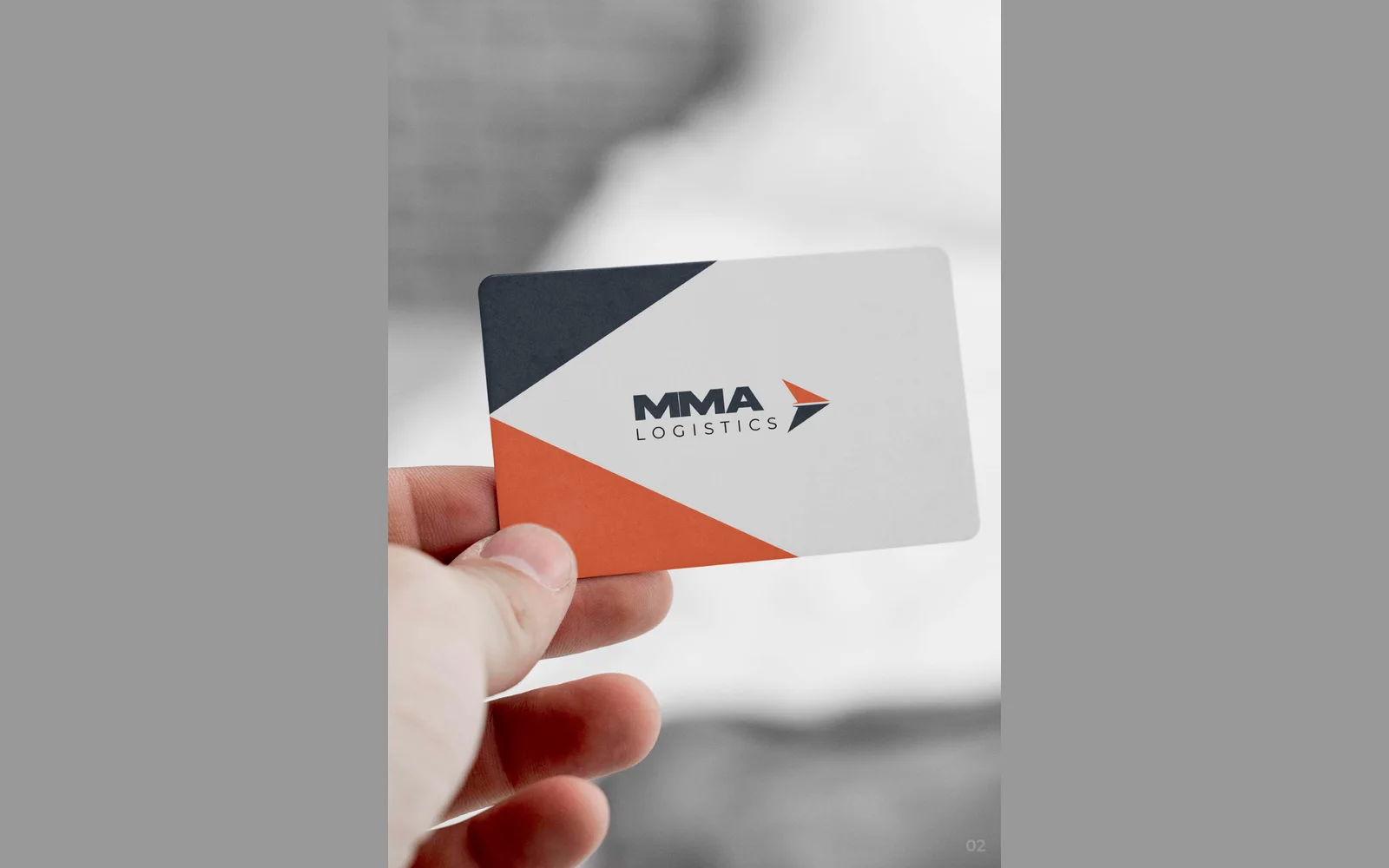
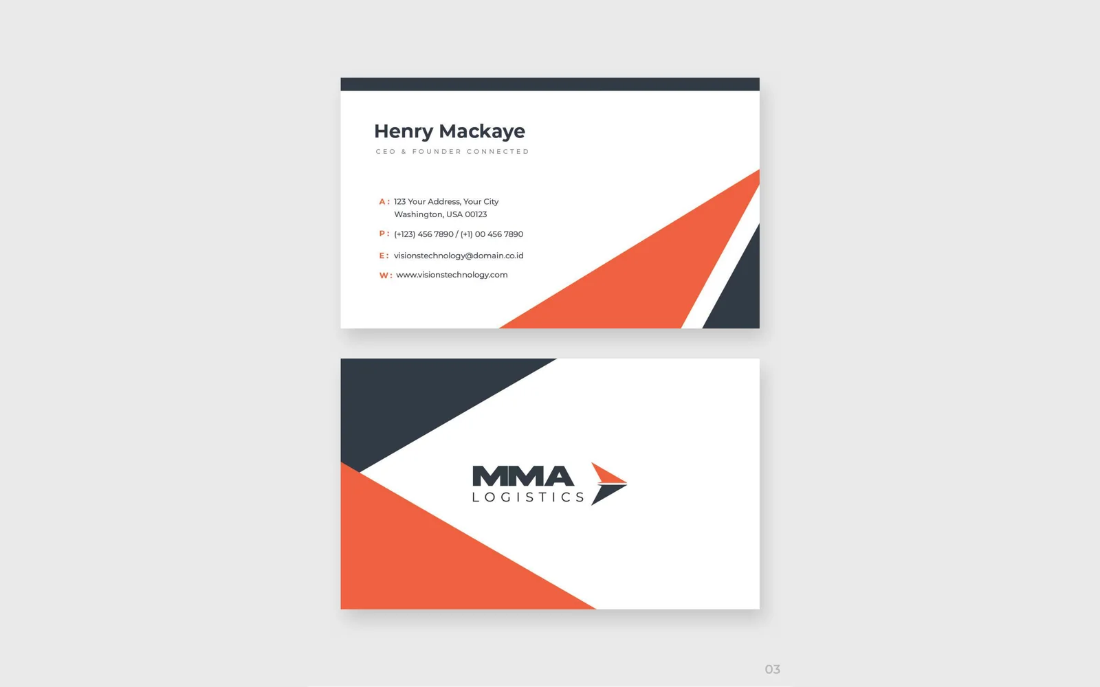
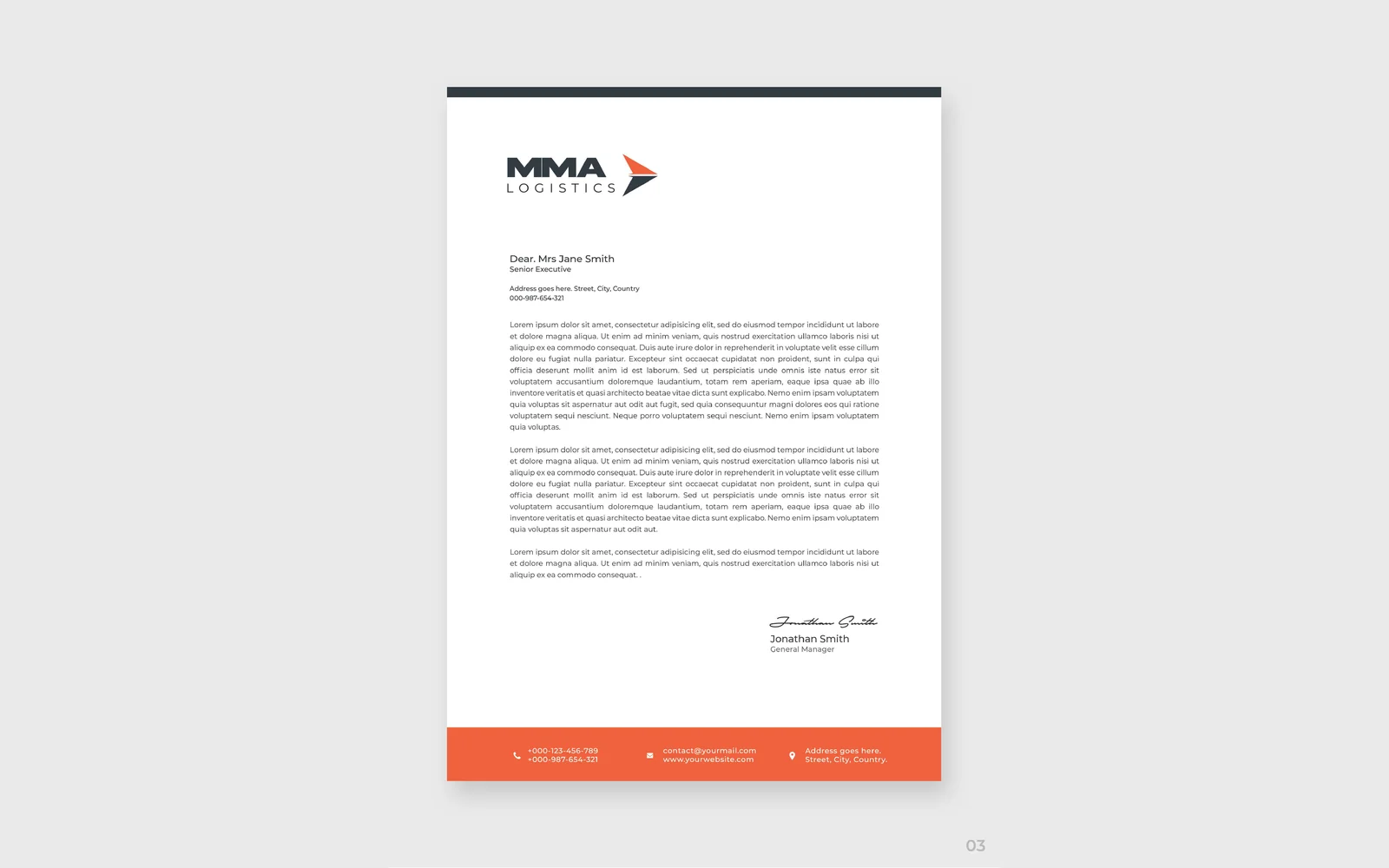
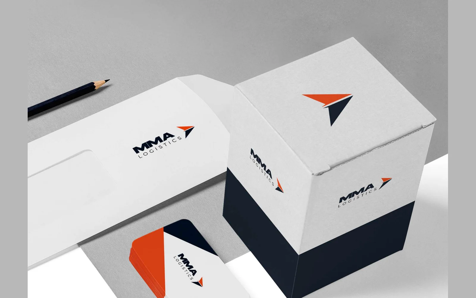
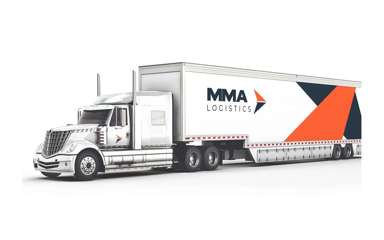
We designed the corporate identity for MMA Logistics. The logo uses an arrowhead icon, in navy and orange. We also designed business cards, a letterhead, an envelope, a packaging box and the design for a truck and trailer.
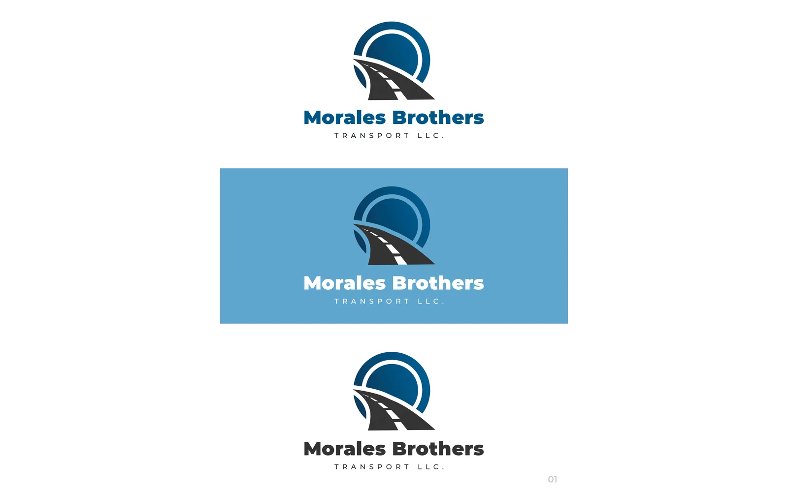
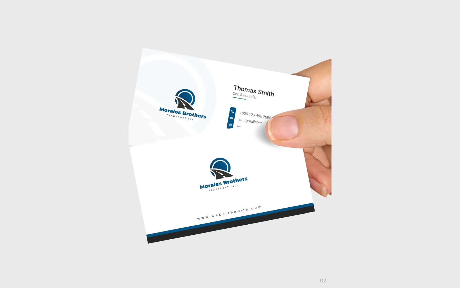
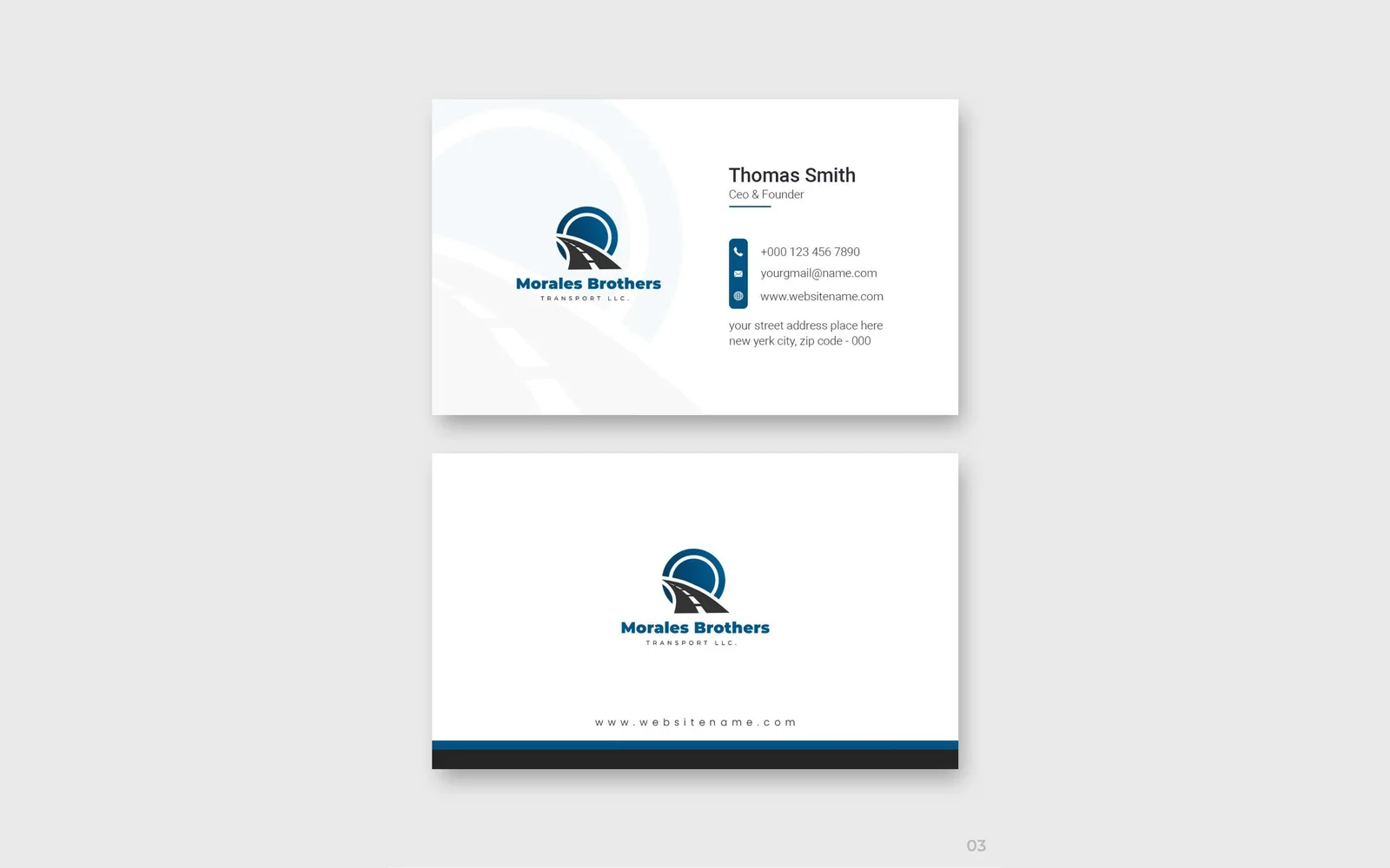
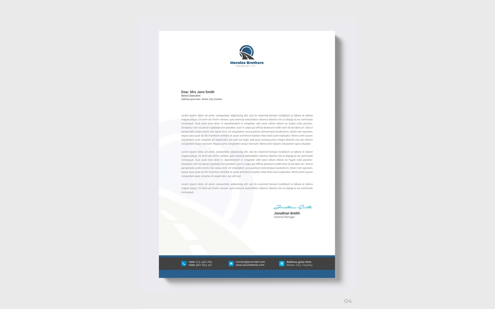

Morales Brothers Transport LLC
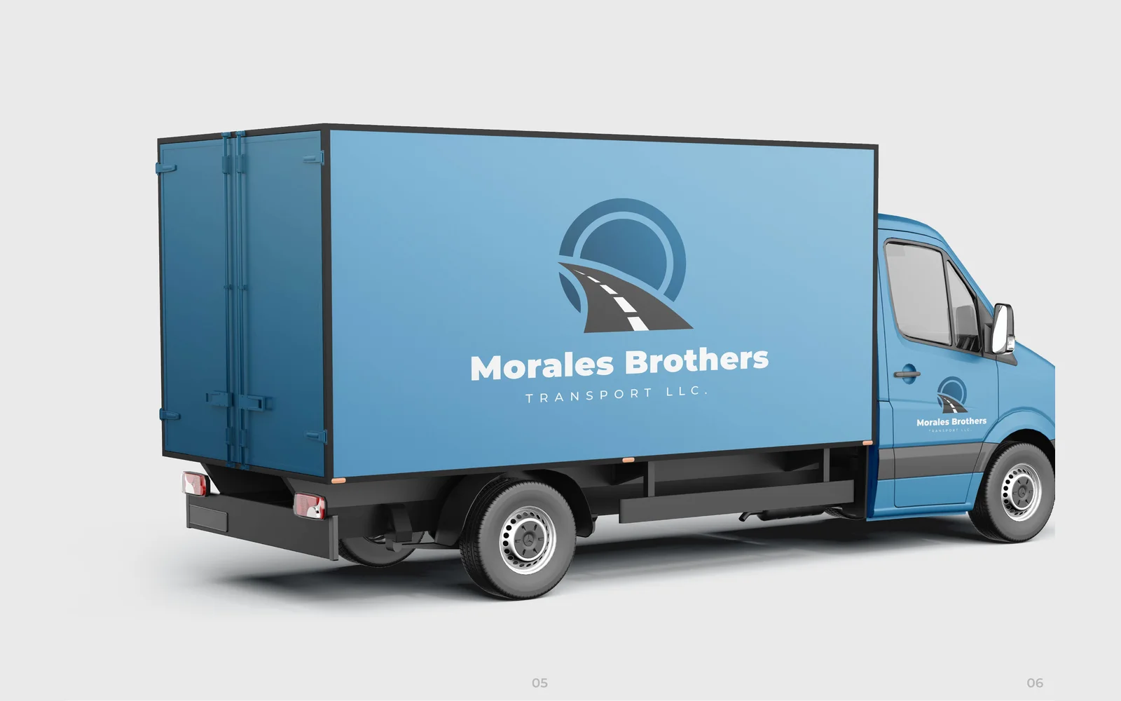
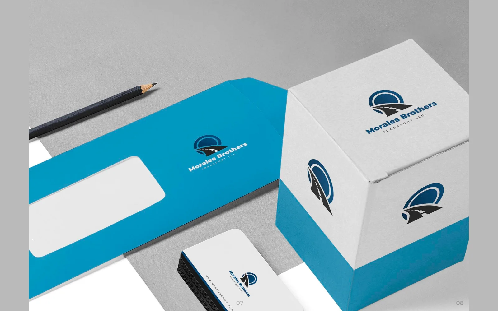
We designed the corporate identity for Morales Brothers Transport. The logo uses a road leading into a circle, in blue and dark grey. We also designed business cards, a letterhead, the design for a delivery van, an envelope and a packaging box.
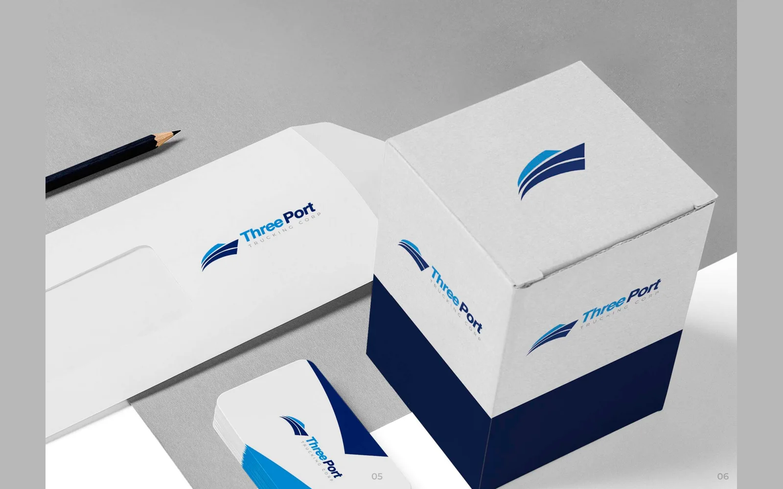
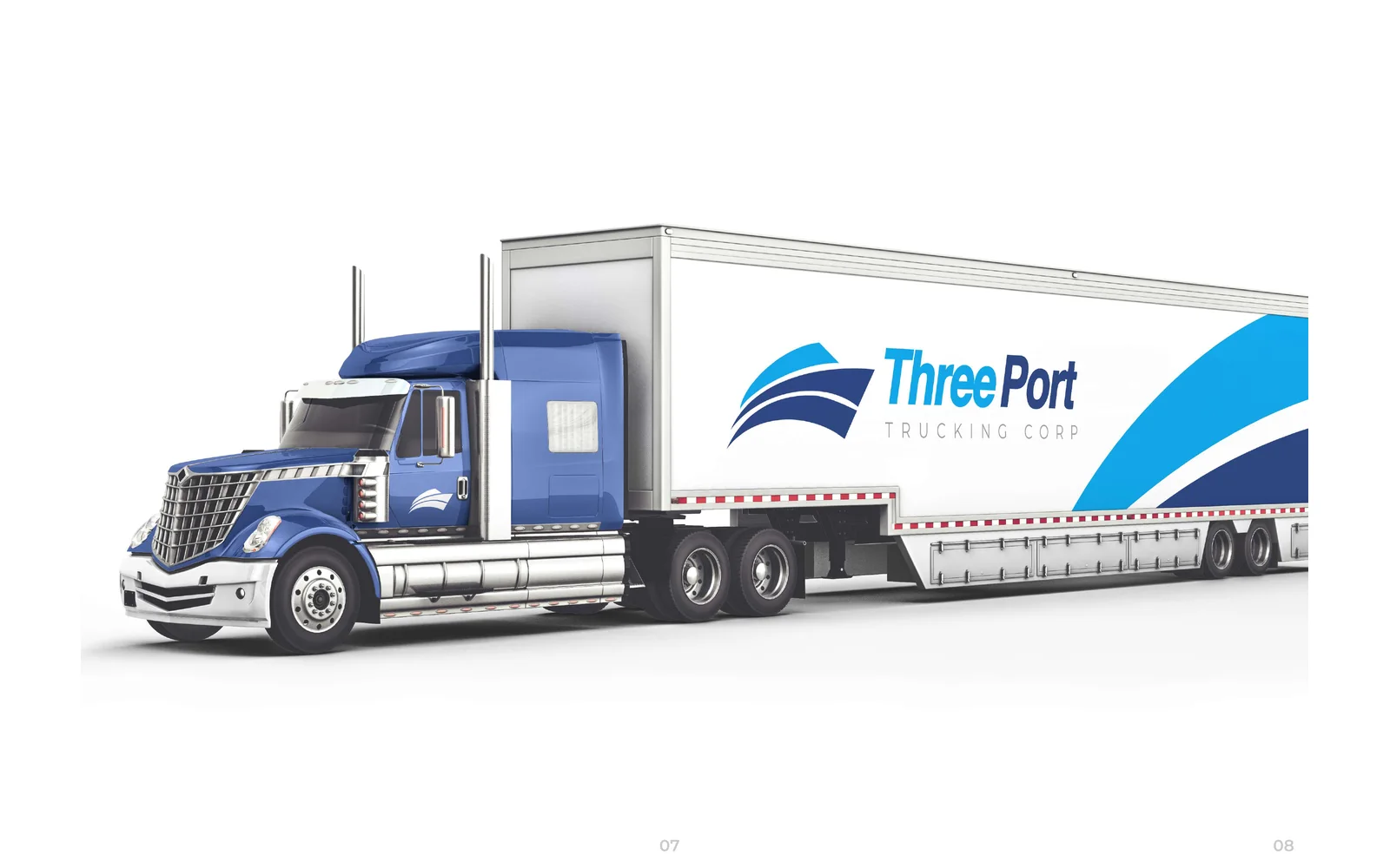


Three Port Trucking Corp
We designed the corporate identity for Three Port Trucking. The logo uses three swept, wave-like stripes, in navy, bright blue and sky blue. We also designed business cards, a letterhead, an envelope, a packaging box and the design for a truck and trailer.
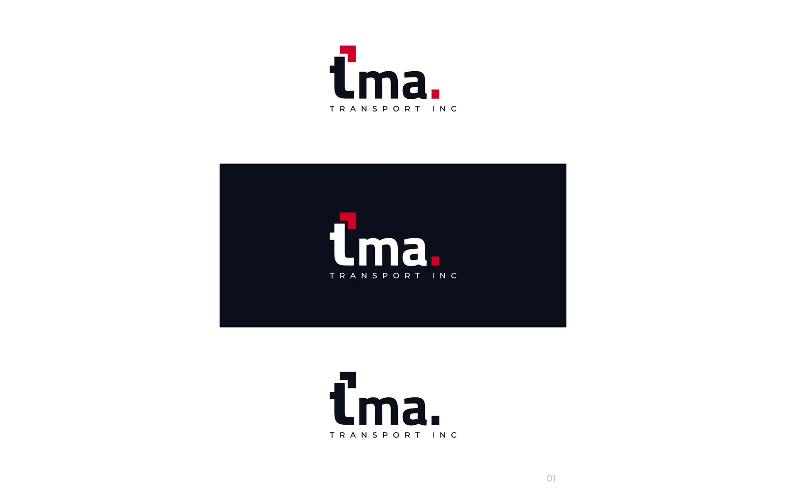
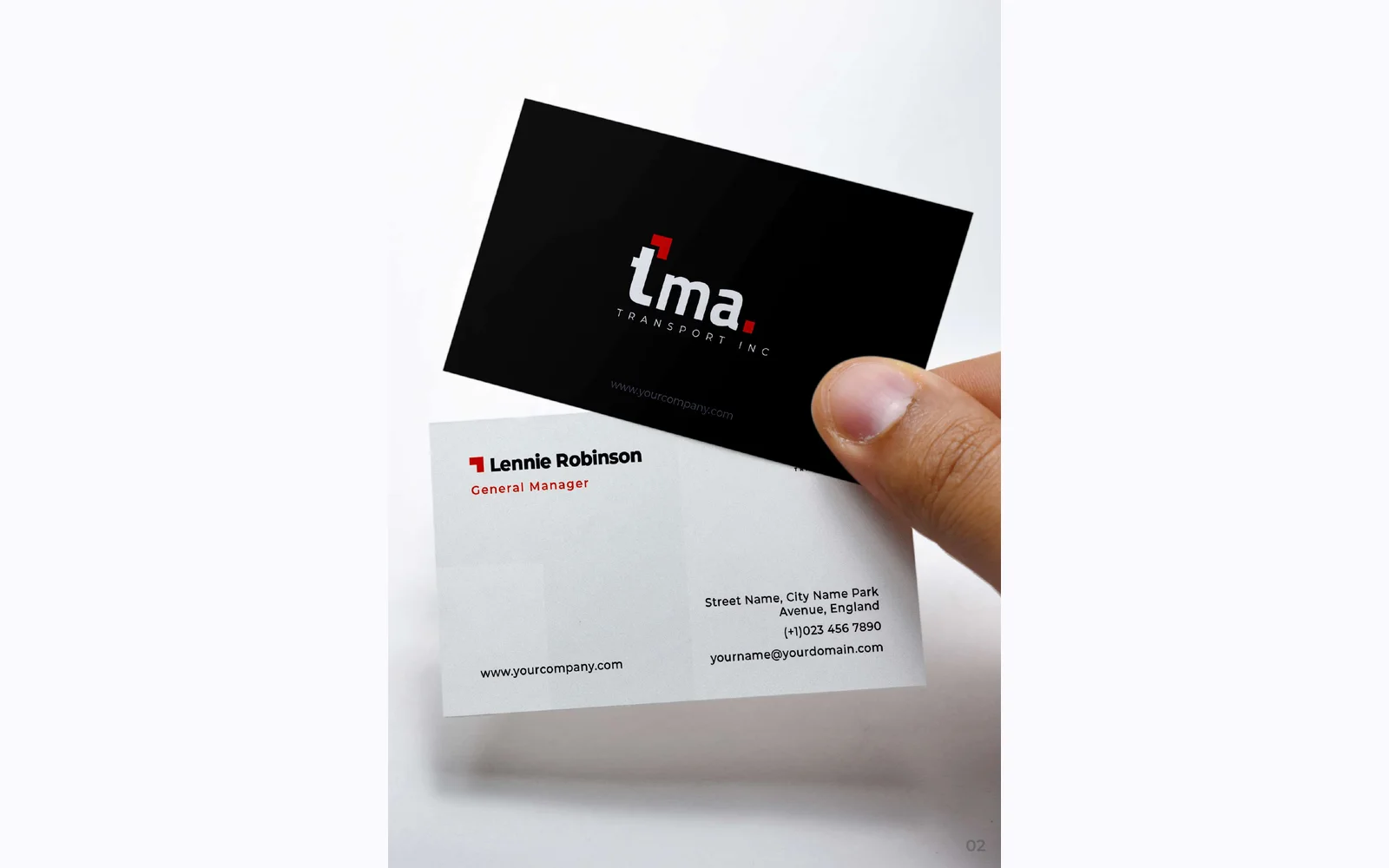
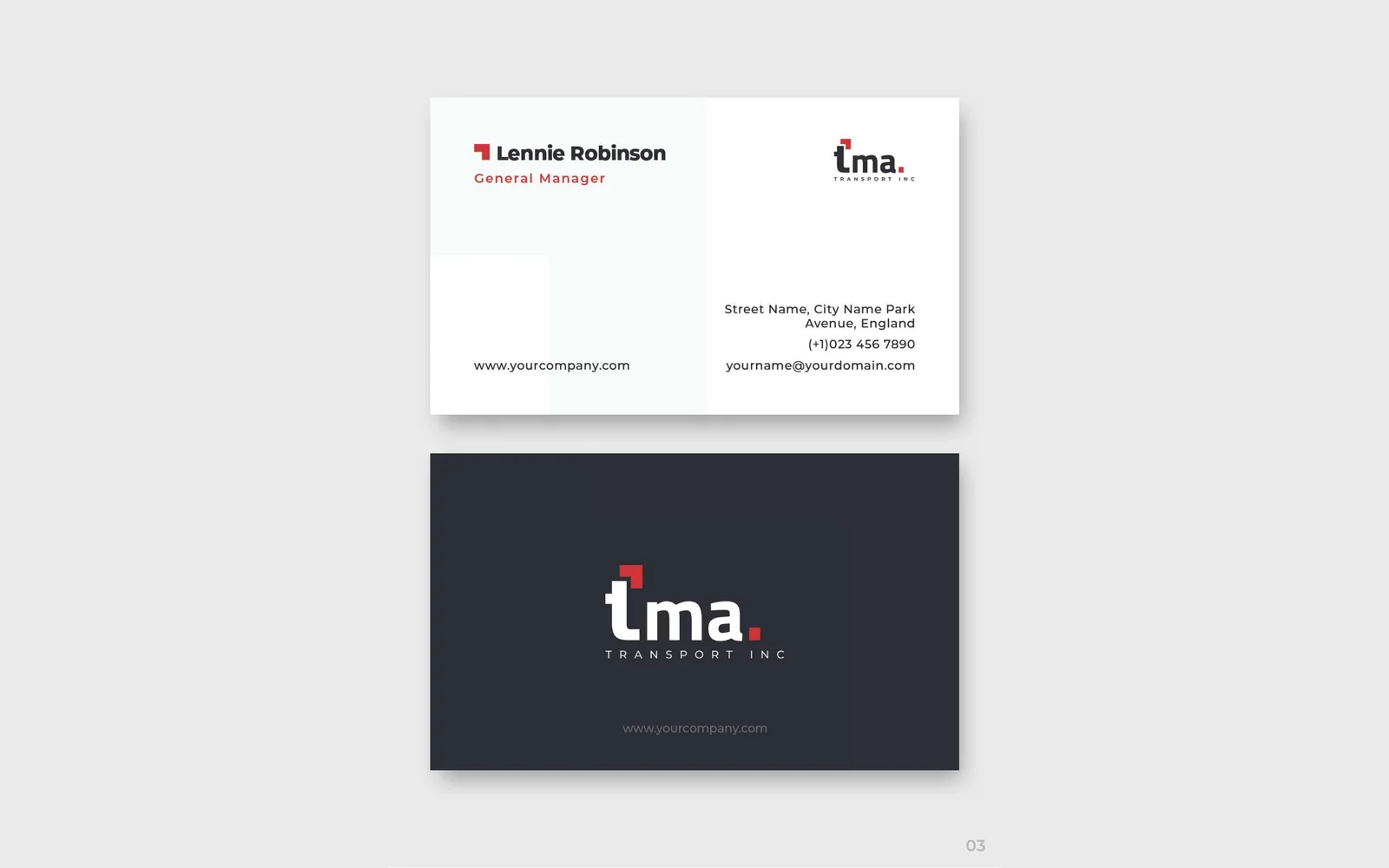
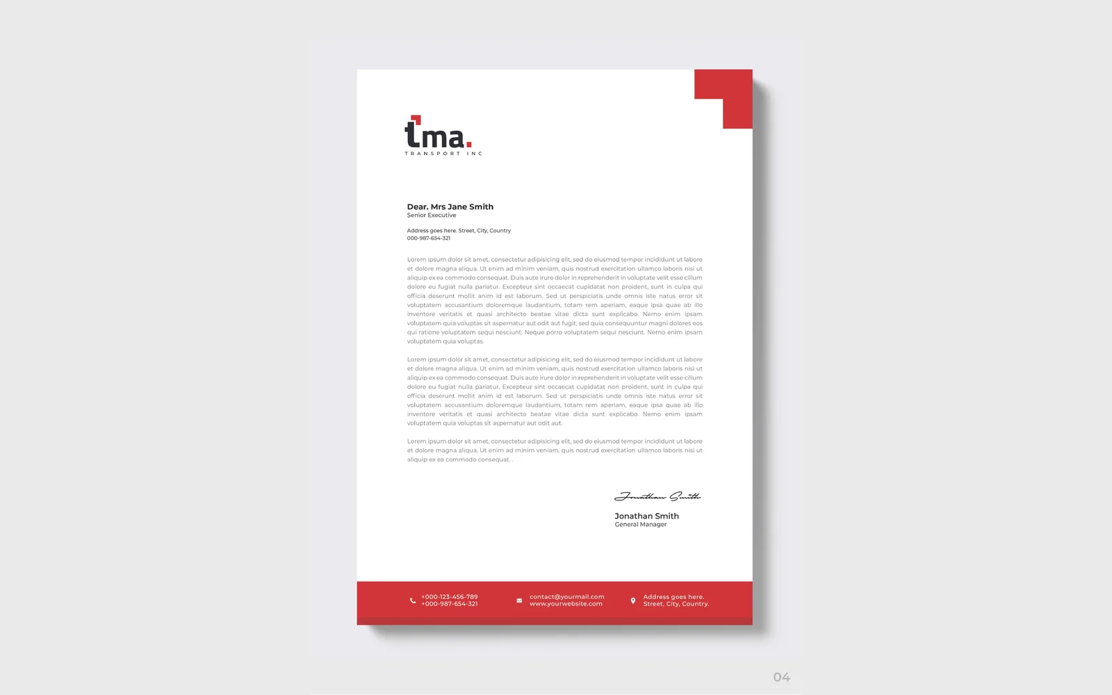
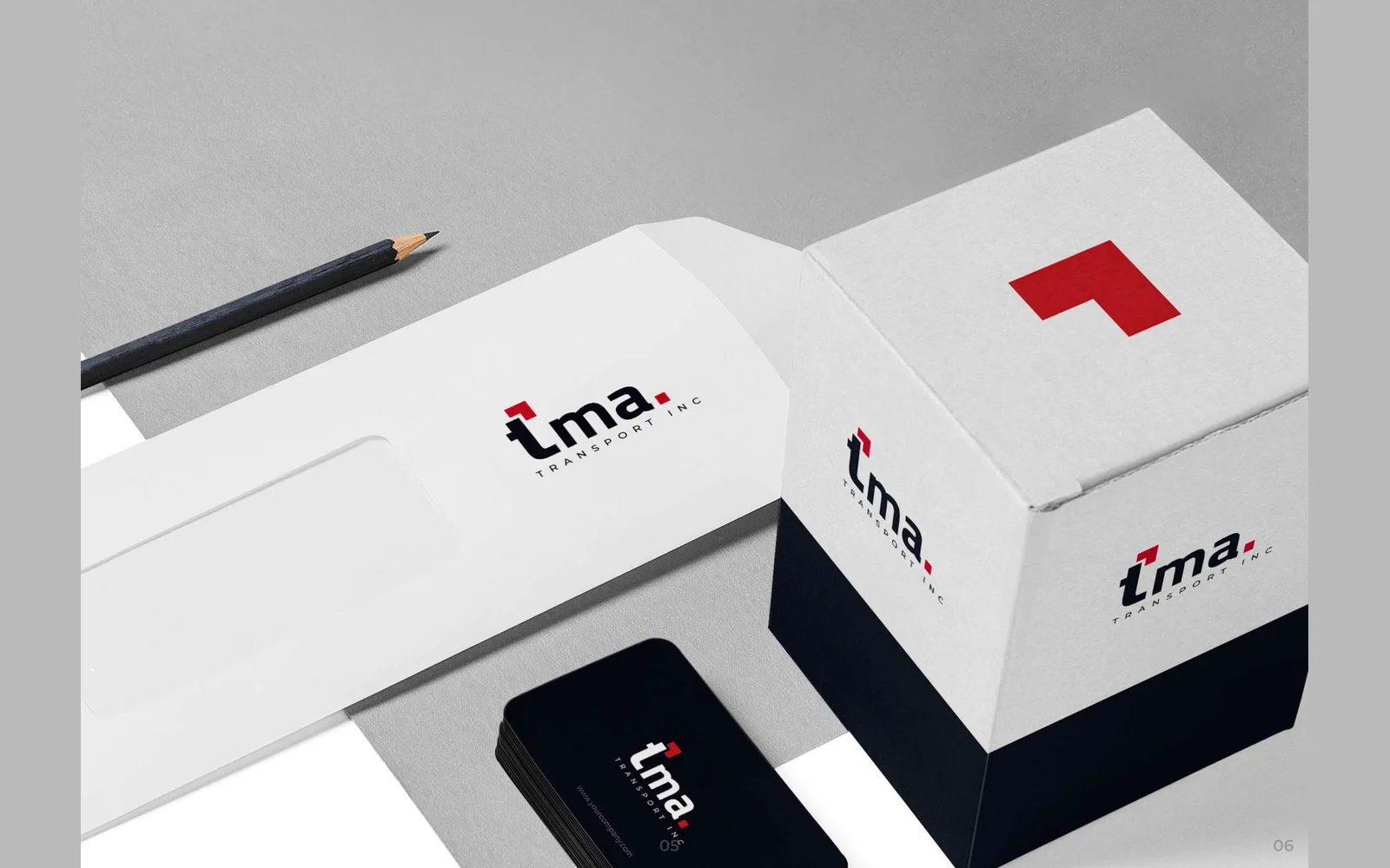


TMA Transport Inc
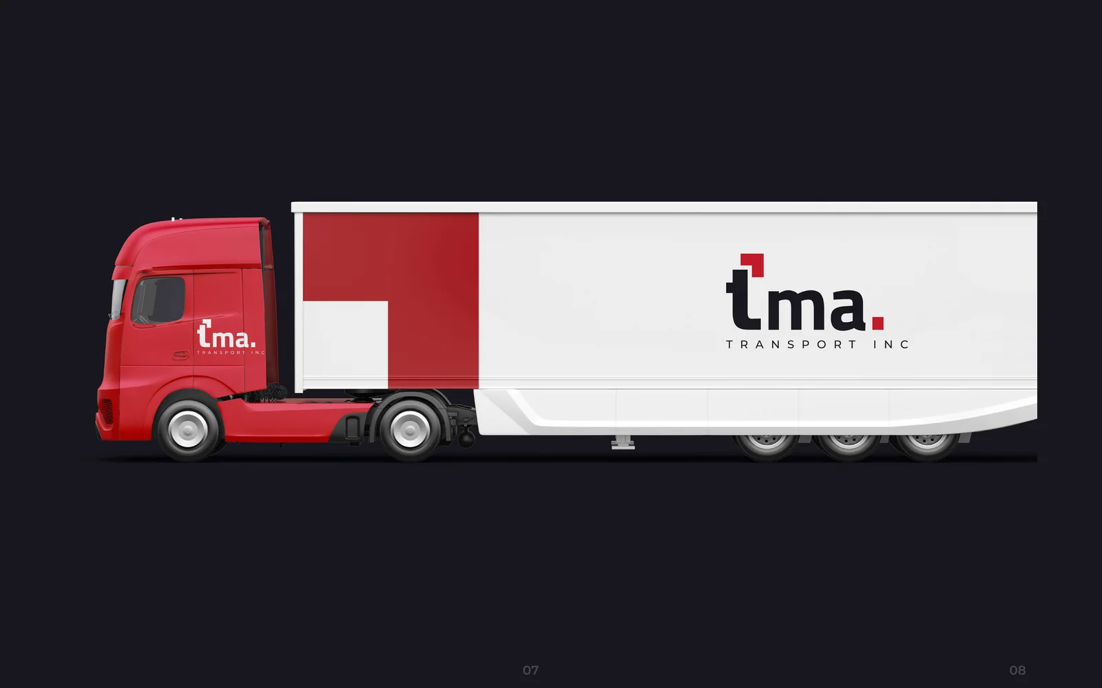
We designed the corporate identity for TMA Transport. The logo uses a red corner-bracket icon, in dark navy and red. We also designed business cards, a letterhead, an envelope, a packaging box and the design for a truck and trailer.

USA Xxpress Trucking Corp
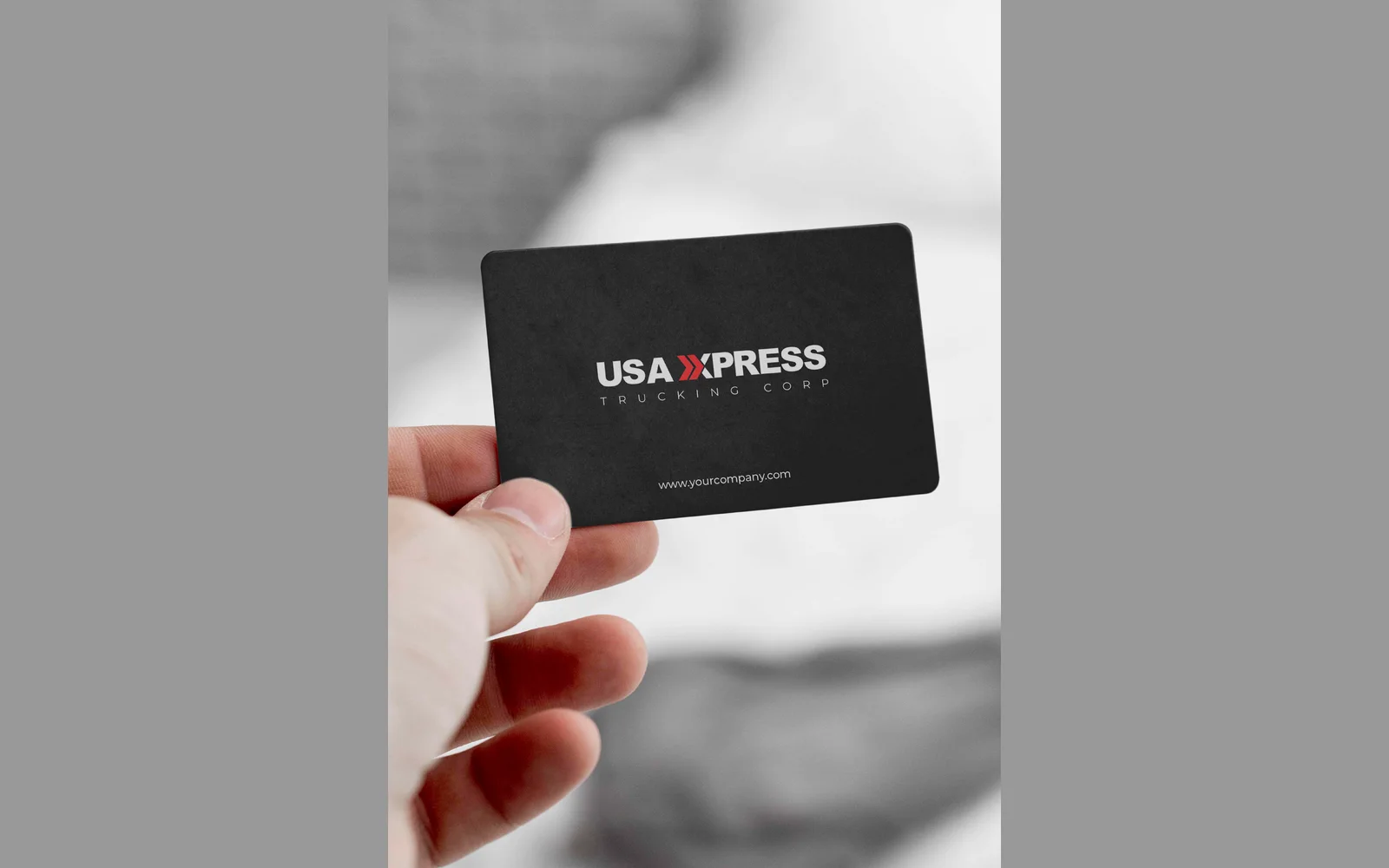
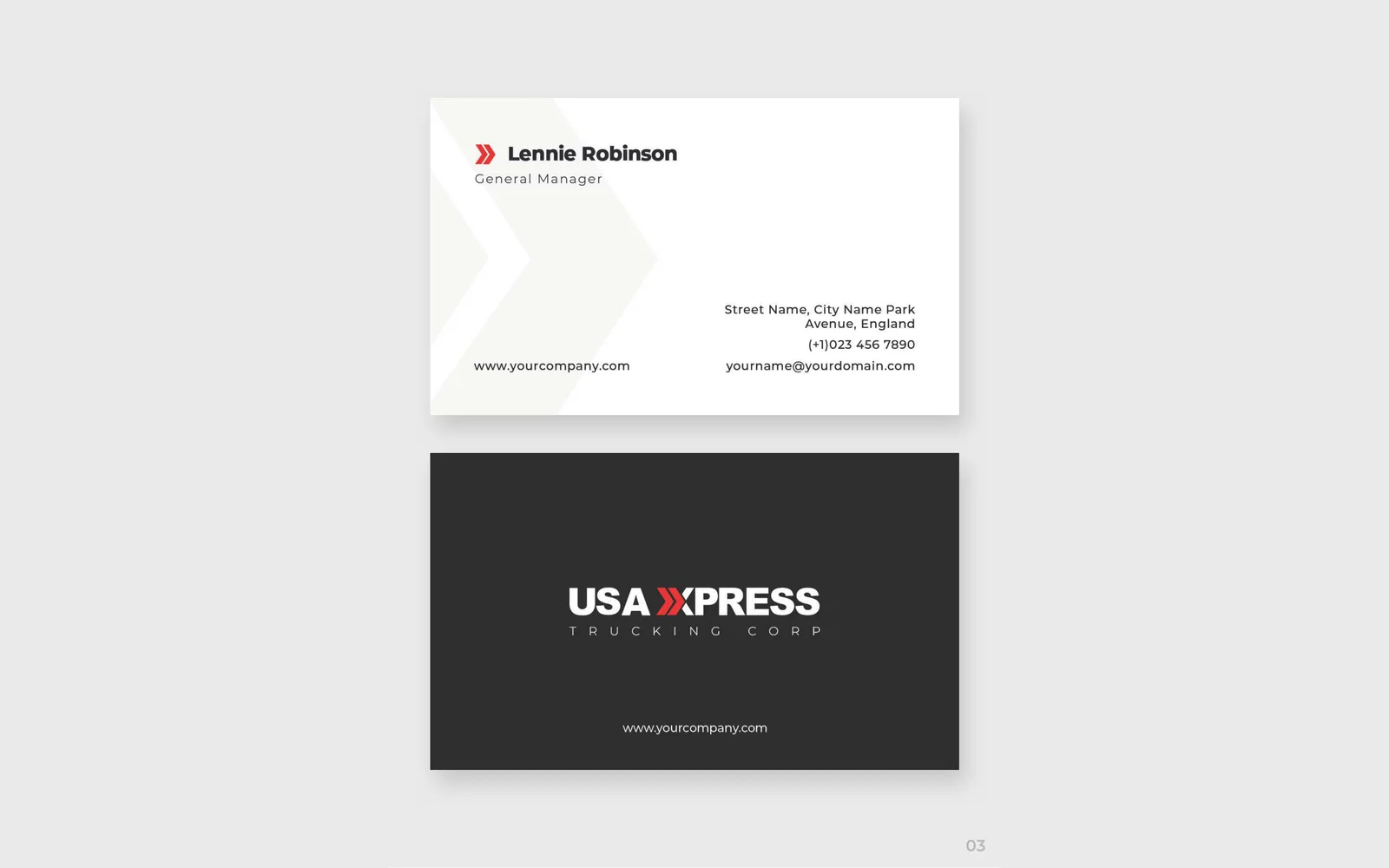
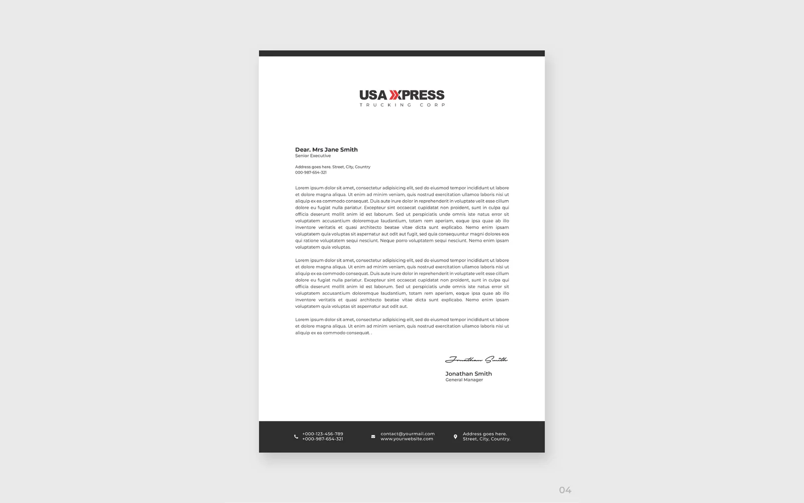
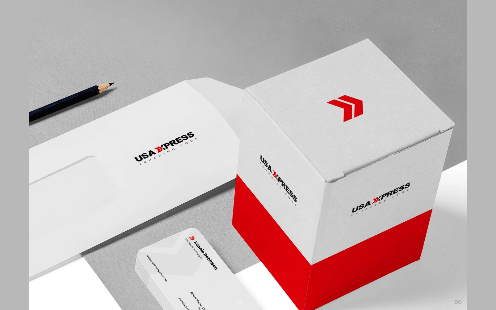
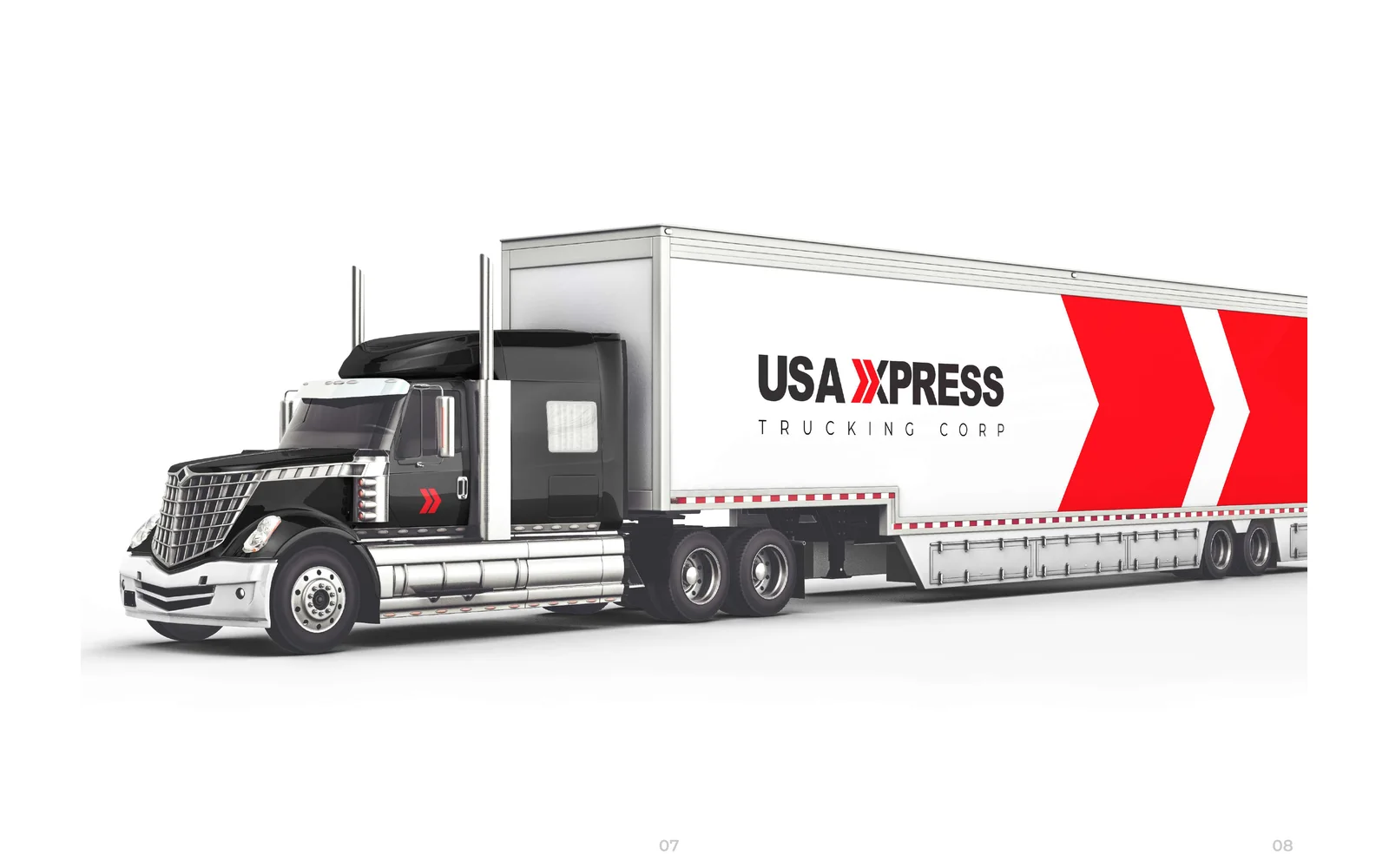
We designed the corporate identity for USA Xxpress Trucking. The logo uses a red double chevron that forms the X, in black and red. We also designed business cards, a letterhead, an envelope, a packaging box and the design for a truck and trailer.
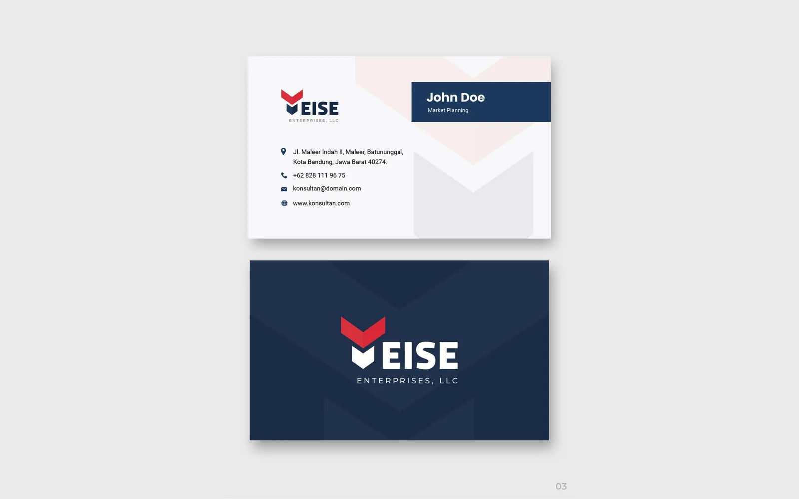
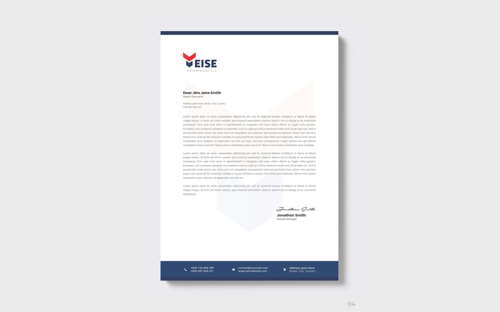
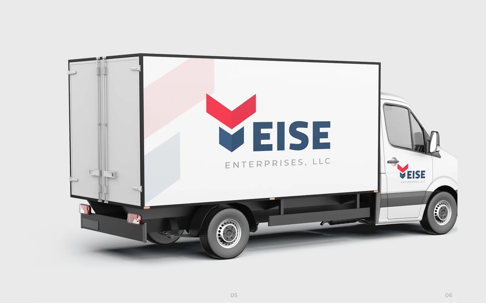
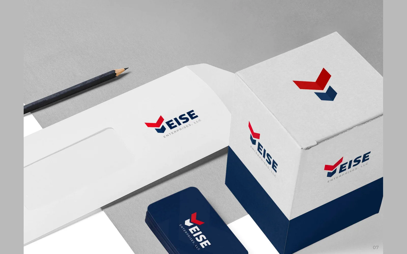

Yeise Enterprises LLC
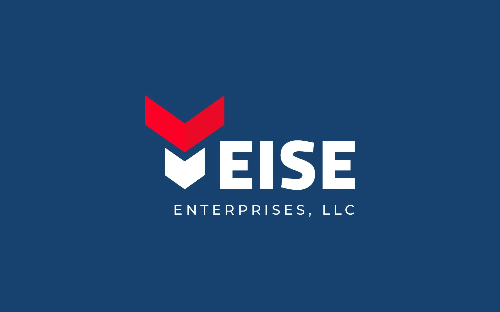
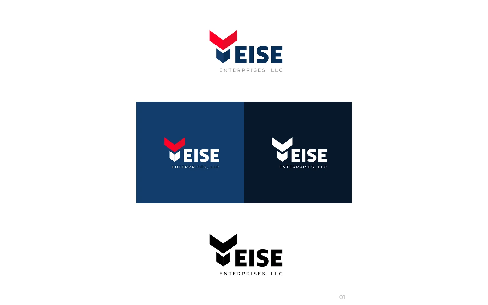
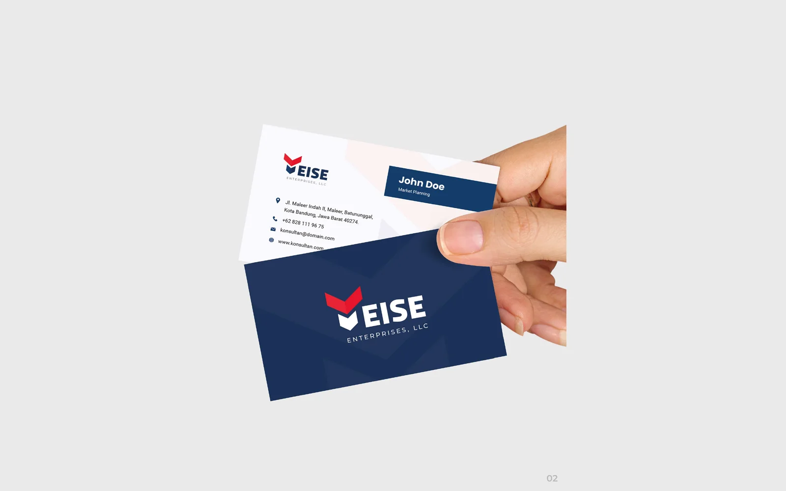
We designed the corporate identity for Yeise Enterprises. It has a chevron icon that forms the Y and navy and red colours. We also designed business cards, a letterhead, the graphics for a delivery van, an envelope and a packaging box.






No projects in this filter yet.
Showing 3 of 3
How to read these
What a case study here does and does not claim
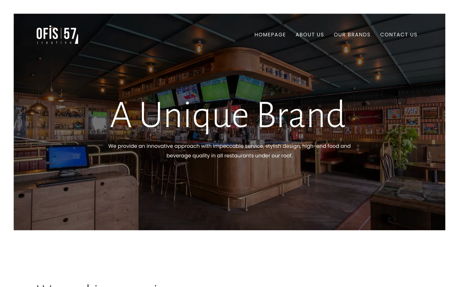
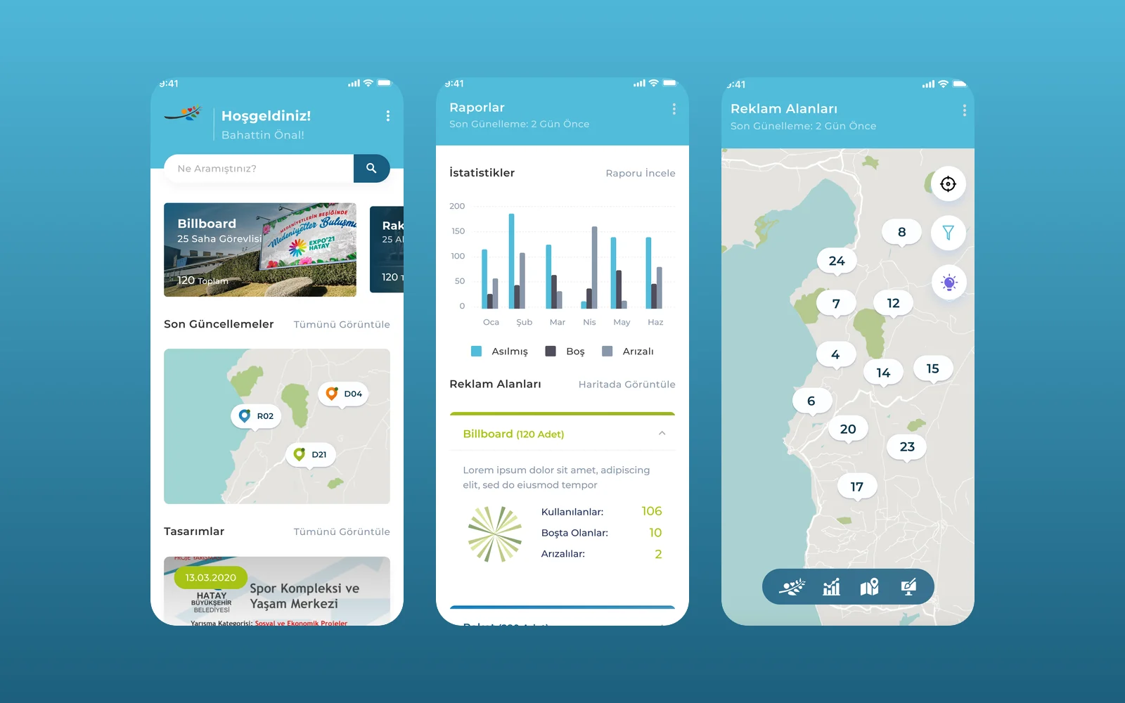
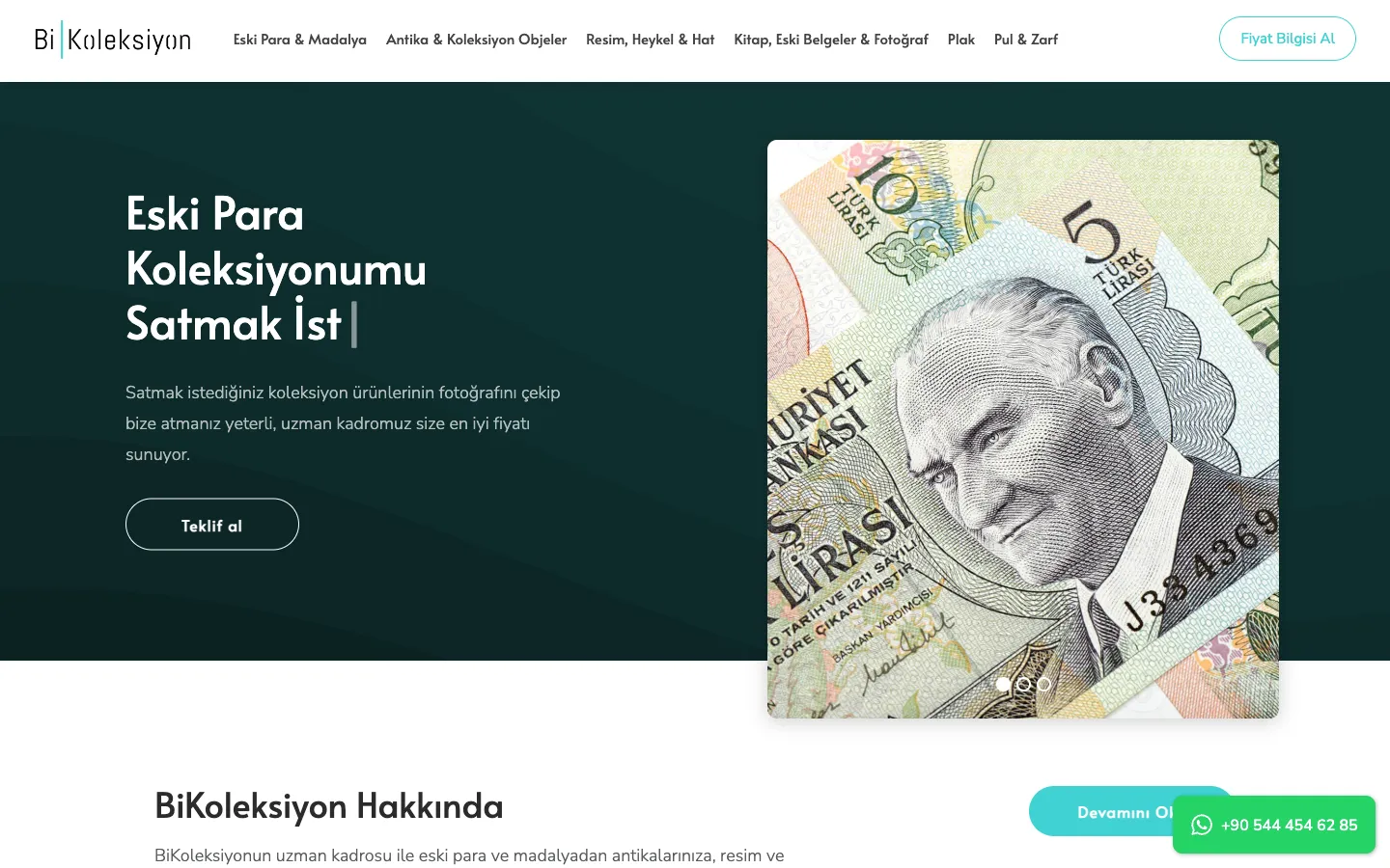
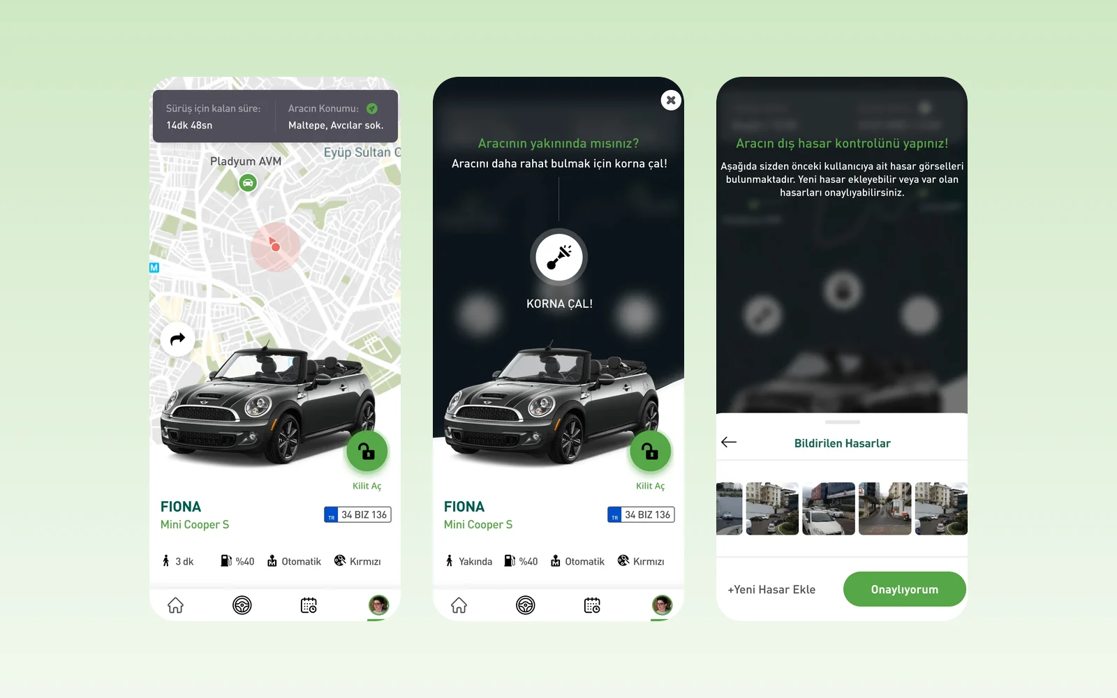
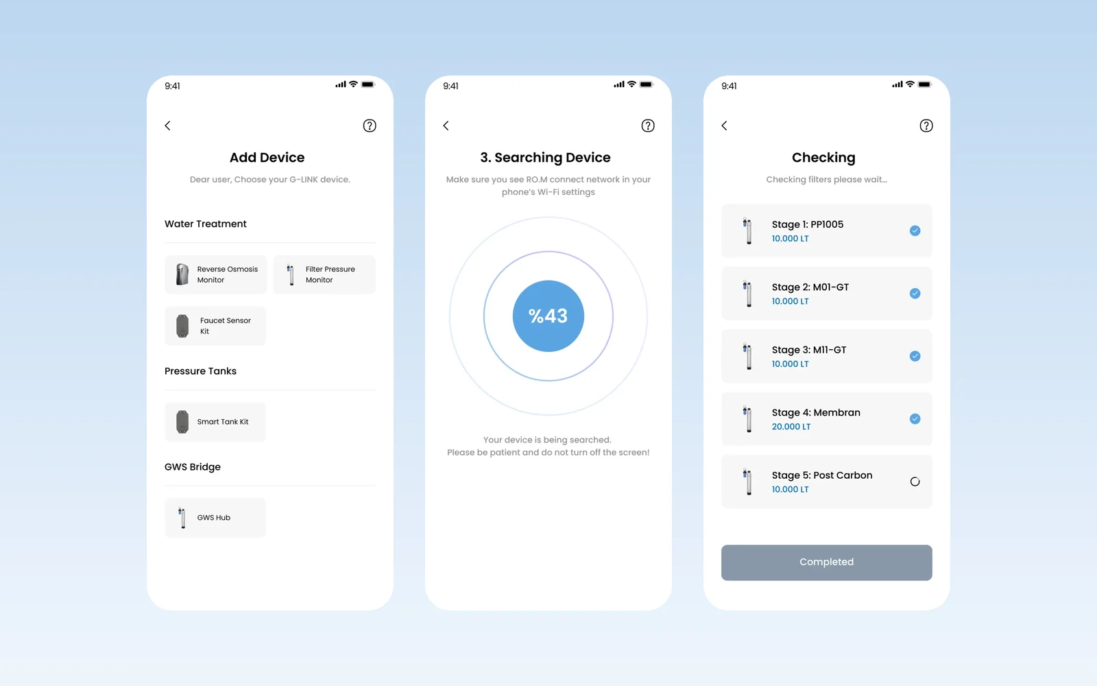
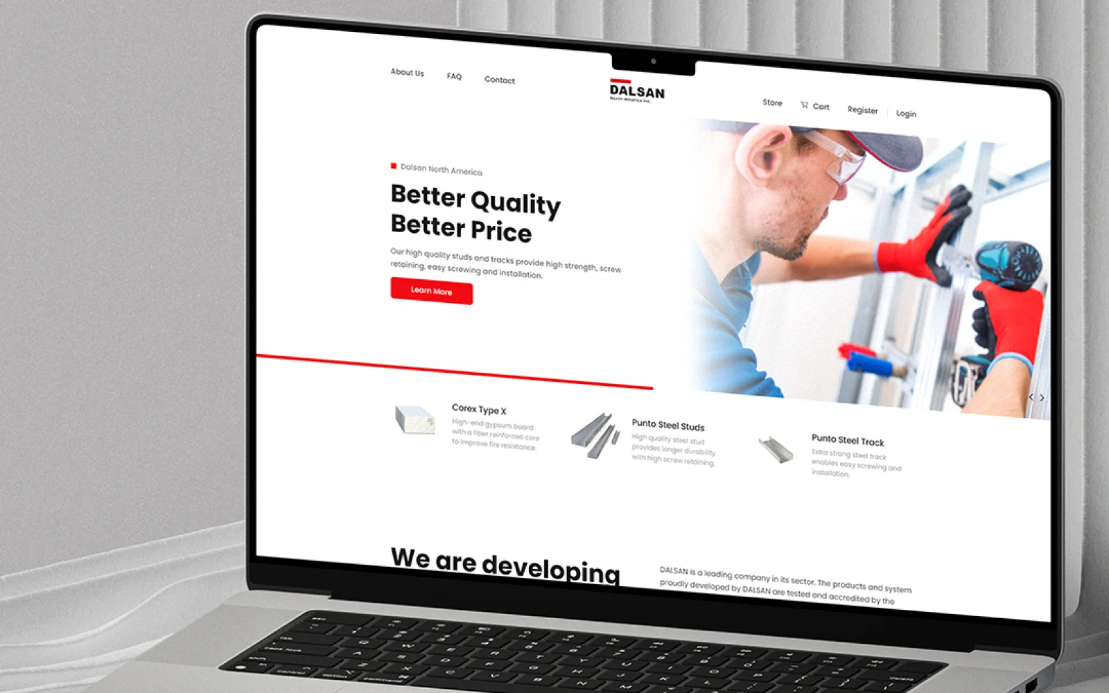
Every project here is real work for a real client, launched under their name. Some we still run every month; others were handed over to the client’s own team or another partner after launch, and a few have since been redesigned by someone else. Where a site or app is still online, the card links to it. Brand identity and app or website design (UI/UX) projects show the design work itself.
The numbers on a case study are the ones we can stand behind from our own part of the work: pages launched, sections built, systems connected. Where a result depends on the client’s own reporting we say whose figure it is, and where we cannot verify something we leave it out rather than round it up. What a project looks like today may differ from what we delivered.
Each write-up follows the same order — what the client had, what was actually wrong, what we built, and what happened afterwards. If a project is close to yours, the fastest next step is to book a technical call and ask what it cost and what it takes to run.