
Freenet: An App That Rewards Watching Ads With Free Mobile Data
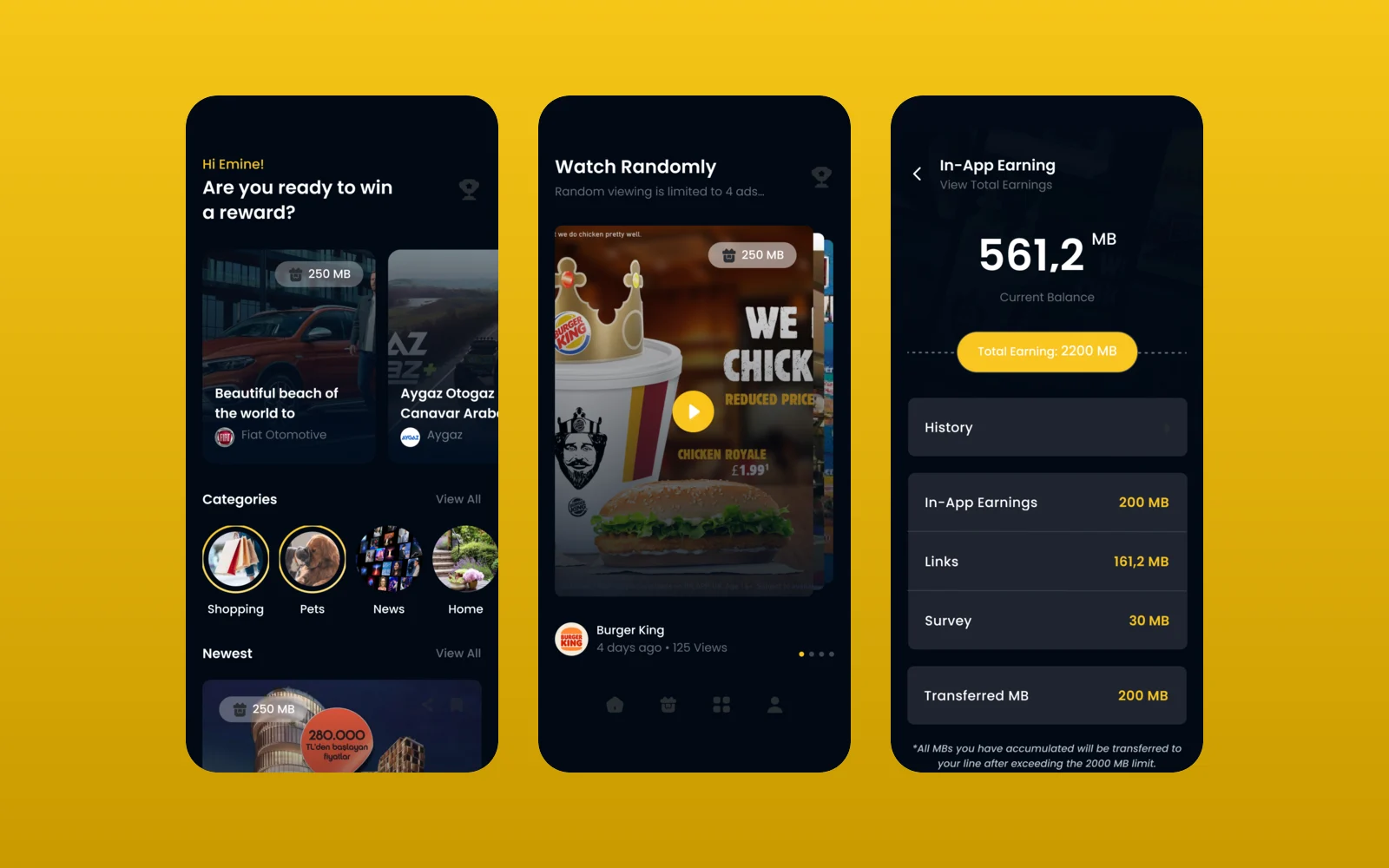
Freenet lets mobile users earn free data by watching brand videos and answering surveys. We designed the mobile app for our client through an agency partner.
- Project
- Mobile app
- Our role
- App UI/UX design via an agency partner
- Platform
- Mobile app
- Country
- Turkey
- Year
- 2019
The challenge
Ads people choose to watch
The client's brief described an app where each ad and survey carries a data gift in megabytes, shown to a chosen audience and location, with rules for random ordering, priority slots and view limits. Users had to see clearly what they could earn and what they had earned.
Our approach
Earning made visible
We designed a home feed of ad and survey cards, each labelled with its data reward, plus categories, search, "watch randomly", stories and in-video prompts to rate the ad or learn more. Total earnings break down into ads, links and surveys, with a history list.
Sign-up that helps target ads
Onboarding and sign-up collect the profile details the brief asked for, such as age and gender, so advertisers can reach their audience.
Screens
Inside Freenet
How we delivered
From brief to design handover
-
01
DiscoveryBrief and brand
We started from the client's brief and corporate identity: who the app is for, what it has to do and how the brand looks and speaks. Colours, type and tone of voice were set from the identity before the first screen was drawn.
Client briefCorporate identityUsers & goals -
02
Wireframes
WireframesLow-fidelity wireframes mapped every flow end to end, so structure and priorities were agreed before any visual design.
User flowsLow-fidelity screens -
03
App architecture
ArchitectureWe built the app's information architecture: navigation, the full screen map and every state a screen can be in, from empty and loading to error and success.
NavigationScreen mapStates -
04
Components
Design systemEvery component was designed end to end in Figma with its variants, on the brand's colours and typography, so screens are assembled from one consistent library.
ComponentsVariantsFigma -
05
Screens and UX writing
UI designWe designed the content screens and page layouts and wrote the UX copy for them: labels, buttons, empty states, errors and confirmations, in a voice that fits the brand.
Content screensLayoutsUX copy -
06
Prototyping
PrototypeThe finished screens were linked into a clickable prototype to walk through the flows with the client and refine them before handover.
Clickable prototypeReview rounds -
07
UI/UX file handover
HandoverWe delivered the complete Figma file with the component library, all screens, the prototype and exportable assets, ready for the development team.
Figma fileComponent libraryAssets
Results
What we delivered
An app ready to build
The project delivered the full app flow, from splash to earnings and profile, in one visual system.
More work
More design work
Kabin
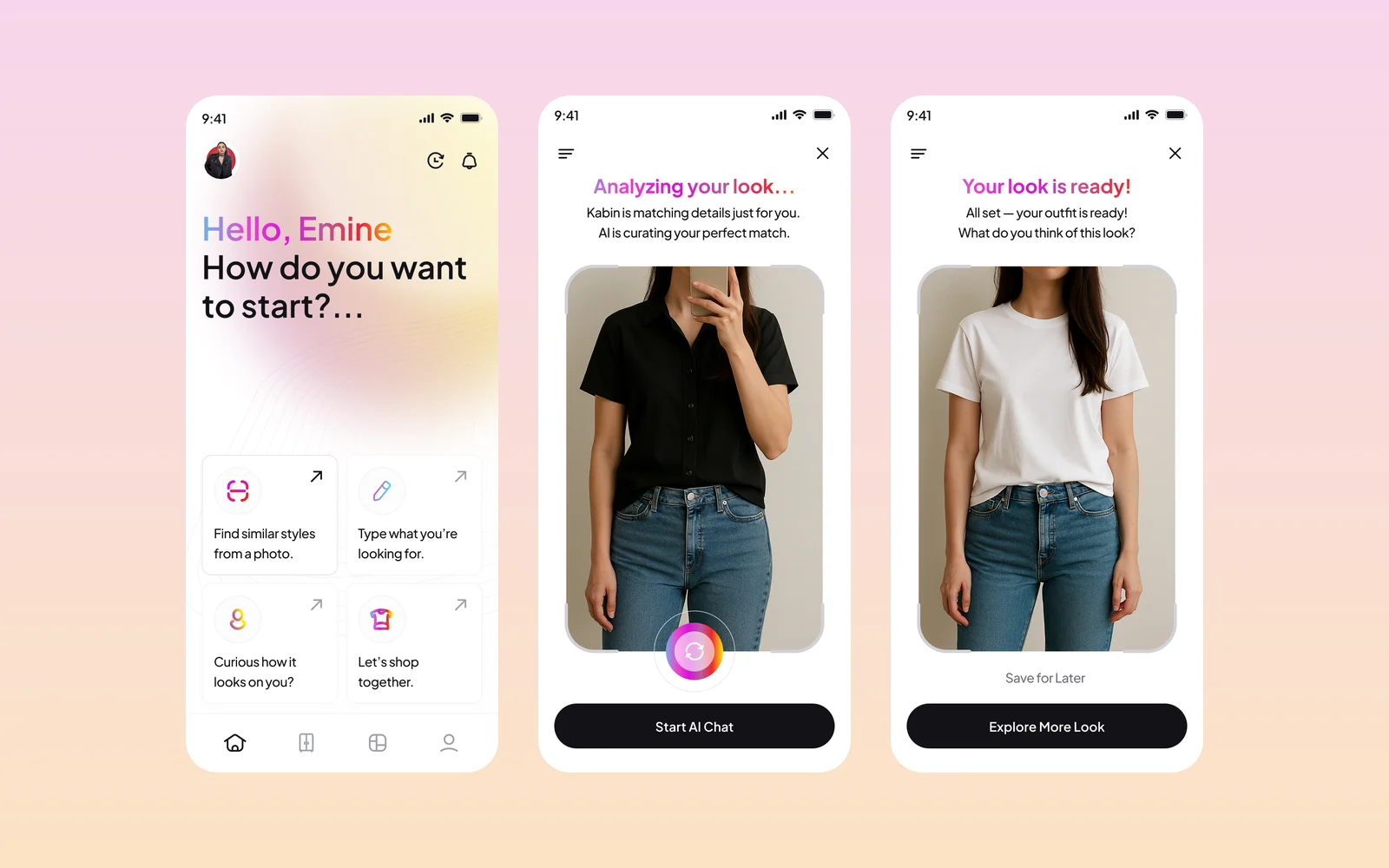
Kabin is an AI fashion app: upload or take a photo, and it finds matching outfits and similar pieces from brands, then shows how a new piece looks on you. We designed the app screens and created its brand identity and style guide.
Wise & Rise
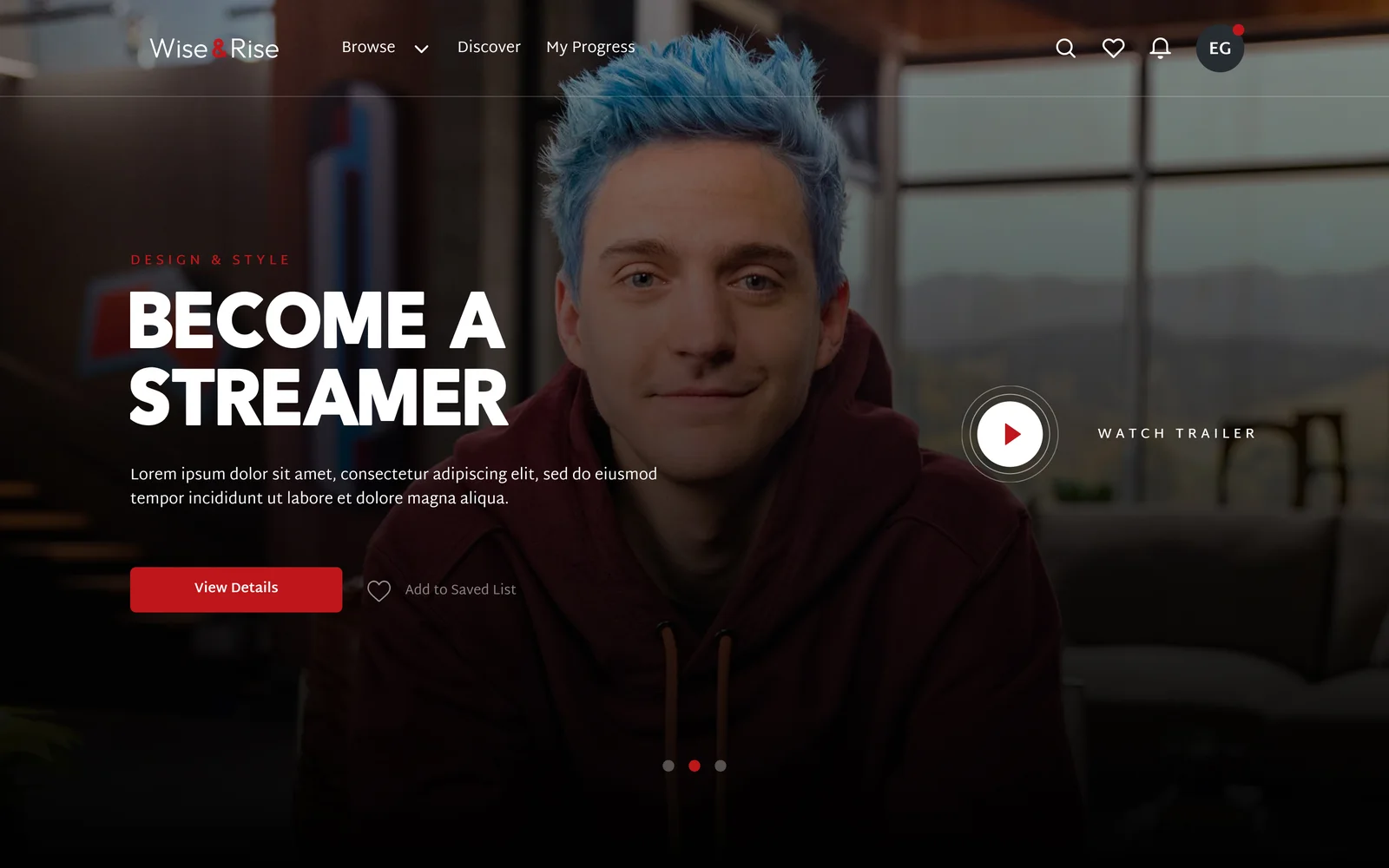
We designed the web platform for Wise & Rise, an online video class service, for our client through an agency partner. The design covers discovery, subscription plans, multi-profile accounts and the class pages.
Magic Break
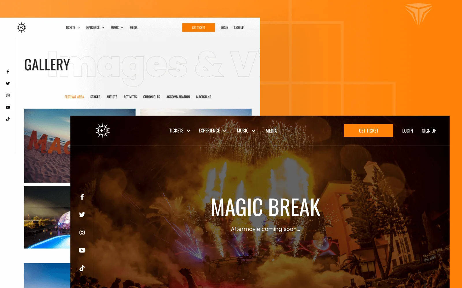
Magic Break is an electronic music festival held at the Pegasos hotels in Incekum, Antalya. We designed the interface and built a bilingual Laravel website where visitors pick a ticket type and hotel room, pay, and manage their reservations in their own account.