
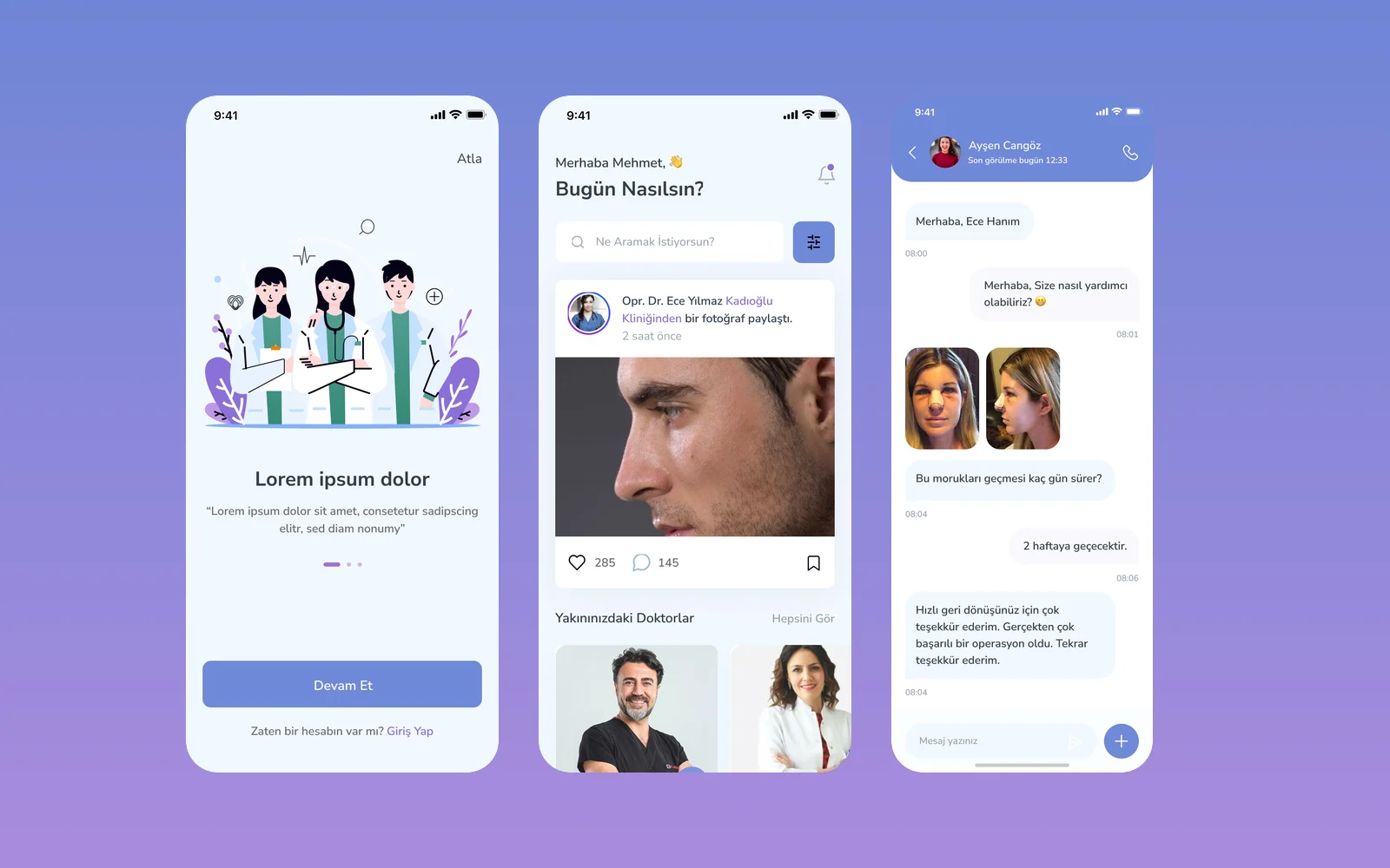
Primask: Mobile App Design for an Aesthetic Surgery Community
We designed Primask, a mobile app that connects people considering aesthetic procedures with surgeons, for our client through an agency partner. The app combines doctor profiles, direct messaging and a community forum organised by procedure.
- Project
- Mobile app
- Our role
- Mobile app UI/UX design via an agency partner
- Platform
- Mobile app
- Country
- Turkey
- Year
- 2022
The challenge
Trust before the first consultation
People researching a nose job or a brow lift want to see a surgeon's work and hear from other patients before they get in touch. The app had to bring doctors, patients and their questions into one place.
Our approach
Doctors, messages and a forum
We designed doctor listings and profiles with posts, references, about and contact tabs; one-to-one messaging with file attachments; and a forum with a "question of the day", stories and posts filtered by procedure.
Personalised from sign-up
New users choose between a doctor and a user account, pick their areas of interest (procedures such as brow lift, neck lift, eye and breast aesthetics) and get a home feed and notifications built around them.
Screens
Inside Primask
How we delivered
From brief to design handover
-
01
DiscoveryBrief and brand
We started from the client's brief and brand identity: who the app is for, what it must do, and how the brand looks and speaks. We set the colours, fonts and tone of voice from that identity before we drew the first screen.
Client briefCorporate identityUsers & goals -
02
Wireframes
WireframesSimple sketches of each screen (wireframes) showed every step of every flow. This way we agreed on structure and priorities before any visual design.
User flowsLow-fidelity screens -
03
App structure
ArchitectureWe planned how the app is organised: the menus, a map of all screens, and every state a screen can show, such as empty, loading, error and success.
NavigationScreen mapStates -
04
Components
Design systemWe designed every building block, such as buttons, cards and menus, in Sketch with all its versions, in the brand's colours and fonts. Every screen is then put together from this one shared library, so the whole app looks the same.
ComponentsVariantsSketch -
05
Screens and wording
UI designWe designed the content screens and page layouts. We also wrote the words on them: labels, buttons, empty screens, error messages and confirmations, in a voice that fits the brand.
Content screensLayoutsUX copy -
06
Prototyping
PrototypeWe linked the finished screens into a clickable prototype, a test version you can tap through. We walked through it with the client and improved it before handover.
Clickable prototypeReview rounds -
07
Design file handover
HandoverWe delivered the complete Sketch file: the component library, all screens, the prototype and images ready to export, ready for the development team.
Sketch fileComponent libraryAssets
Results
What we delivered
A full app flow in Sketch
The design covers the opening screen, the first-time guide (onboarding), sign-up and login, the home feed, doctor discovery, messaging, the forum, categories and notifications for both doctors and patients.
More work
More design work
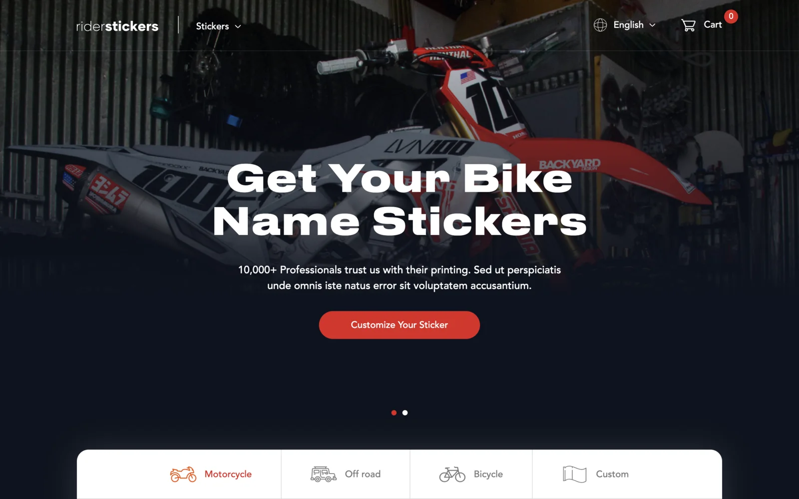
RiderSticker
An online shop for custom motorcycle, off-road and bicycle name stickers, based in Istanbul. Built on Laravel and Livewire with a live sticker designer on the homepage, English and Turkish versions, team discount codes, and iyzico card checkout.
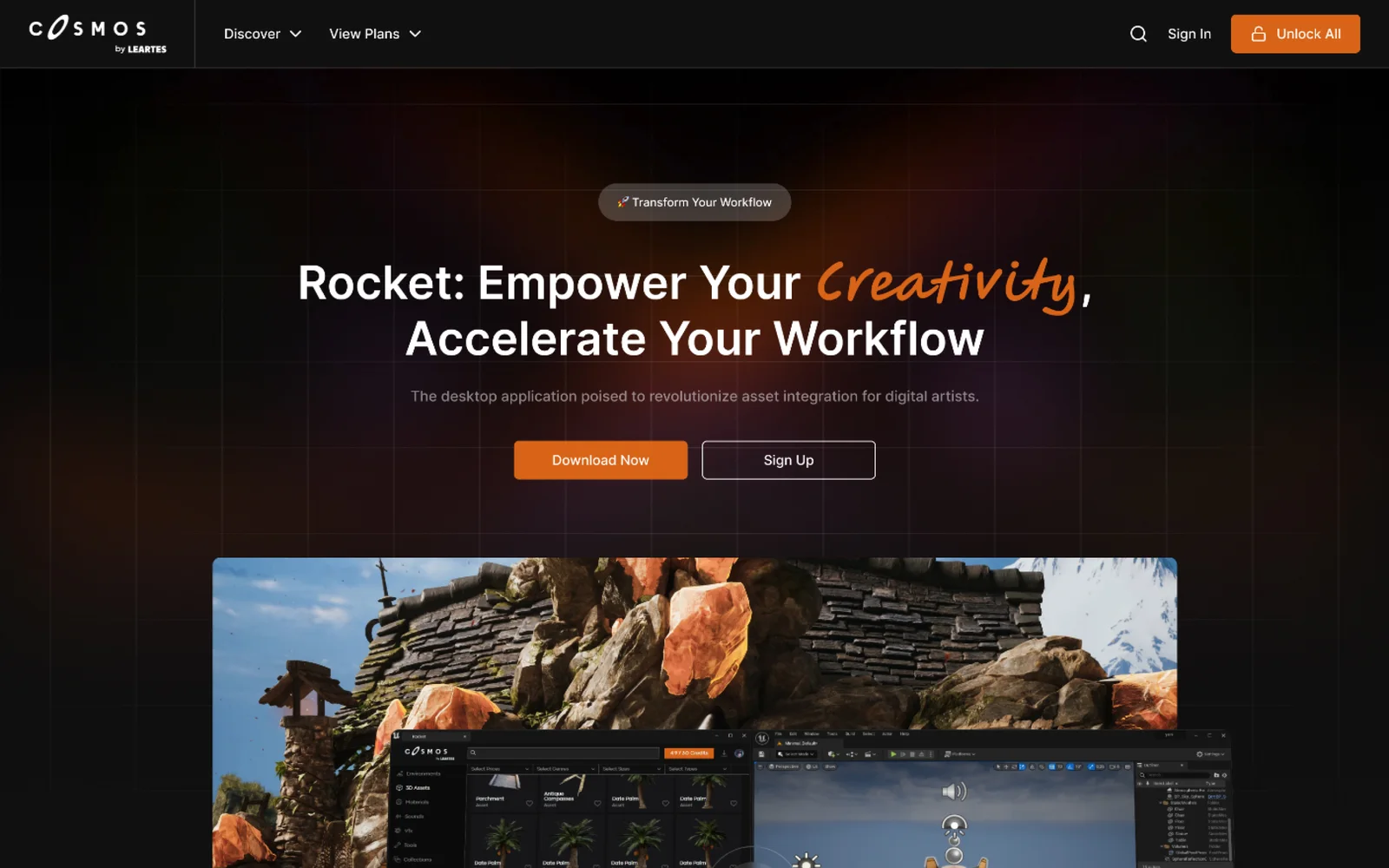
Cosmos by Leartes
Cosmos is Leartes Studios' marketplace of game-ready environments, 3D assets, materials, sounds and visual effects (VFX), and Rocket is its desktop app that drops those assets straight into a game engine. We designed the Cosmos store interface and the Rocket product site.
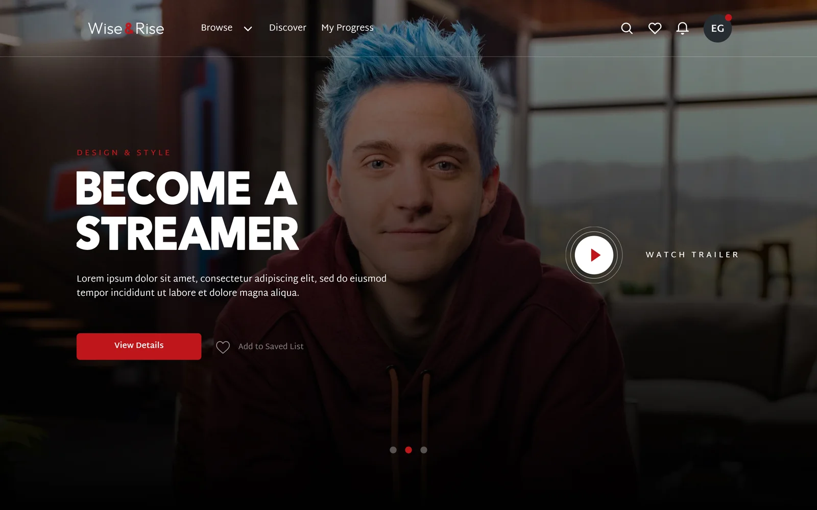
Wise & Rise
We designed the web platform for Wise & Rise, an online video class service, for our client through an agency partner. The design covers discovery, subscription plans, multi-profile accounts and the class pages.