Cdemly: UI/UX Design for a Clinical AI Assistant for Doctors
We designed Cdemly, a clinical AI assistant app for general practitioners, for our client. The work covers the design system, a sitemap of more than 168 screens and detailed screen designs for clinical support, calculators and patient consultation.
- Project
- Mobile app
- Our role
- Mobile app UI/UX design
- Platform
- Mobile app
- Country
- Turkey
- Year
- 2026
The challenge
An assistant doctors can use mid-shift
General practitioners in emergency rooms and family health centres need quick, sourced answers: a dose, a score, a referral letter. The app had to stay calm and readable under pressure, and keep the doctor in charge of every decision.
Our approach
Design system and sitemap first
We set up a design system: the shared rules for how the app looks. It is teal, uses the Manrope font and fixes the colours, text styles, corner shapes and shadows. A separate dark palette serves the emergency "red zone" mode. A sitemap of more than 168 screens covered every area: chat-style sign-up with doctor verification, home, clinical support, emergency, education, interesting cases and profile.
Clinical tools as focused screens
Detailed screen flows cover a clinical hub, AI case assessment, sample prescriptions and drug interactions. They also cover a forensic case alert and form, referral writing, and scoring calculators such as GCS and CURB-65. Others handle weight-based drug dosing and an AI-assisted patient consultation that builds the anamnesis (the patient's medical history). Every result screen notes that the final decision rests with the physician.
First drafts in code
We drafted the flows as HTML phone mockups and moved them into Figma. This let the team review screens in the browser, then refine them as reusable parts.
Screens
Inside Cdemly
How we delivered
From brief to design handover
-
01
DiscoveryBrief and brand
We started from the client's brief and brand identity: who the app is for, what it must do, and how the brand looks and speaks. We set the colours, fonts and tone of voice from that identity before we drew the first screen.
Client briefCorporate identityUsers & goals -
02
Wireframes
WireframesSimple sketches of each screen (wireframes) showed every step of every flow. This way we agreed on structure and priorities before any visual design.
User flowsLow-fidelity screens -
03
App structure
ArchitectureWe planned how the app is organised: the menus, a map of all screens, and every state a screen can show, such as empty, loading, error and success.
NavigationScreen mapStates -
04
Components
Design systemWe designed every building block, such as buttons, cards and menus, in Figma with all its versions, in the brand's colours and fonts. Every screen is then put together from this one shared library, so the whole app looks the same.
ComponentsVariantsFigma -
05
Screens and wording
UI designWe designed the content screens and page layouts. We also wrote the words on them: labels, buttons, empty screens, error messages and confirmations, in a voice that fits the brand.
Content screensLayoutsUX copy -
06
Prototyping
PrototypeWe linked the finished screens into a clickable prototype, a test version you can tap through. We walked through it with the client and improved it before handover.
Clickable prototypeReview rounds -
07
Design file handover
HandoverWe delivered the complete Figma file: the component library, all screens, the prototype and images ready to export, ready for the development team.
Figma fileComponent libraryAssets
Results
What we delivered
A mapped and designed product
The client received the design system, the full screen map and detailed screens for the clinical modules, ready for the build.
Clinic, education and profile
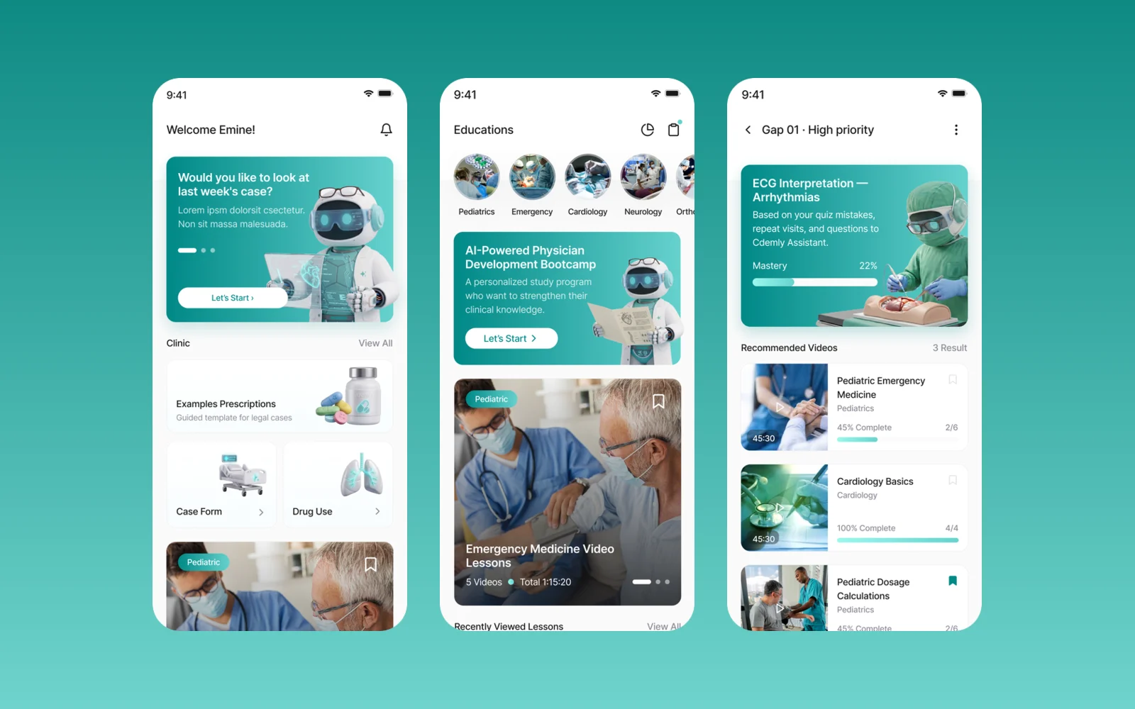
The finished screens cover a home with clinic shortcuts and prescription examples grouped by system, with their ICD-10 codes. There is an education area with specialty categories, video lessons and an AI-powered study programme. A learning gap view recommends lessons based on quiz mistakes and questions asked to the assistant. Doctors also get saved collections and a profile with progress and badges.
More work
More design work
Avis Filo Maestro
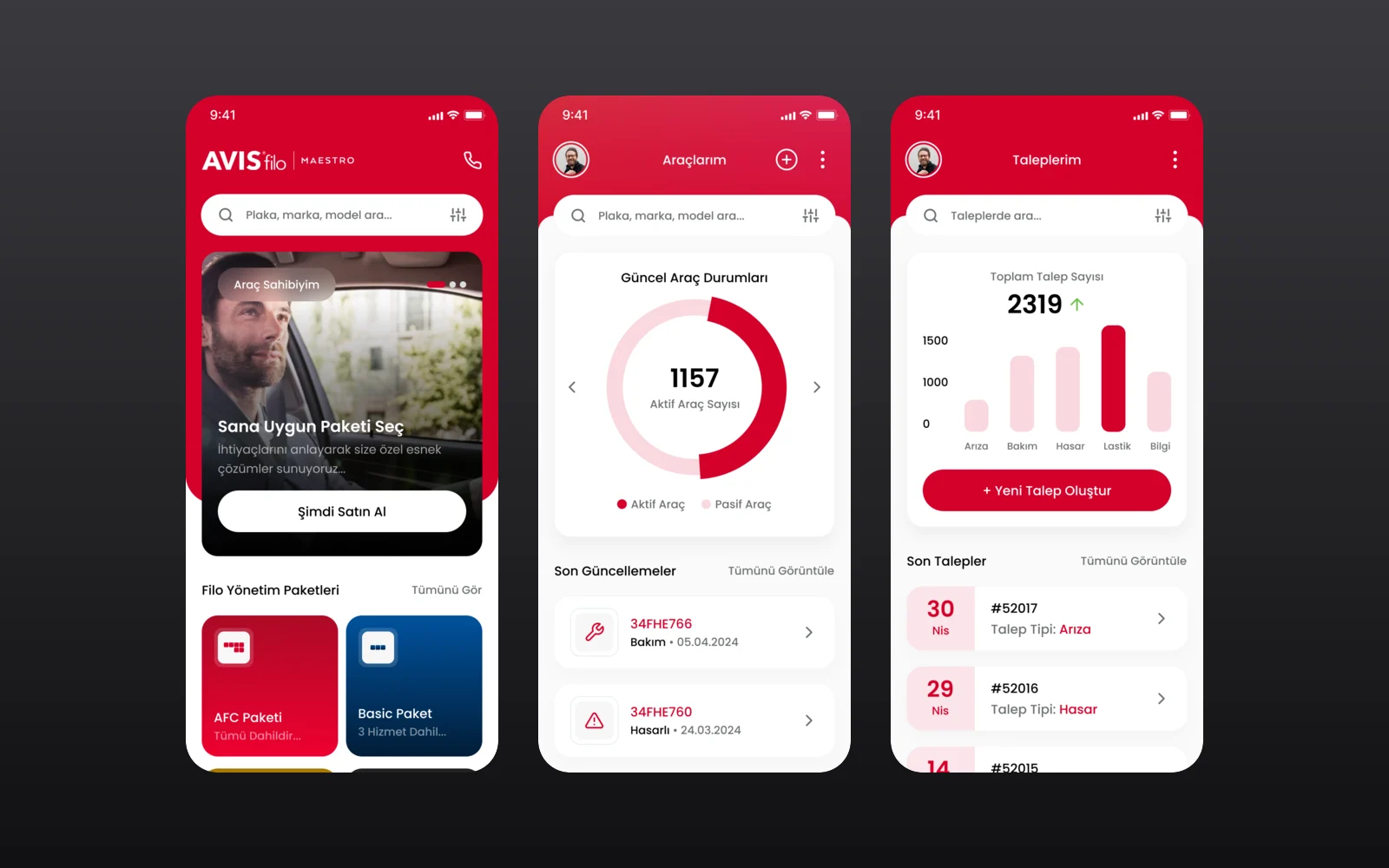
Avis Filo Maestro is the fleet management service of Avis Filo for corporate customers. We designed its mobile app through an agency partner: fleet packages and services, a vehicle overview, service requests and a one-tap support line.
Cosmos by Leartes
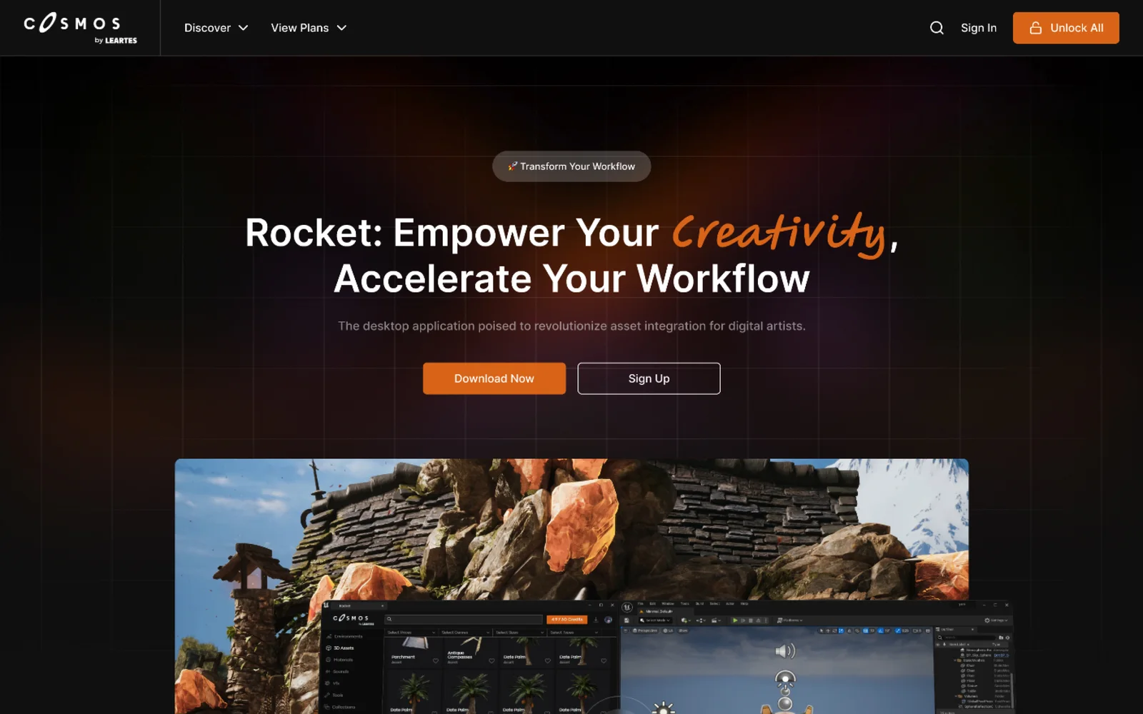
Cosmos is Leartes Studios' marketplace of game-ready environments, 3D assets, materials, sounds and visual effects (VFX), and Rocket is its desktop app that drops those assets straight into a game engine. We designed the Cosmos store interface and the Rocket product site.
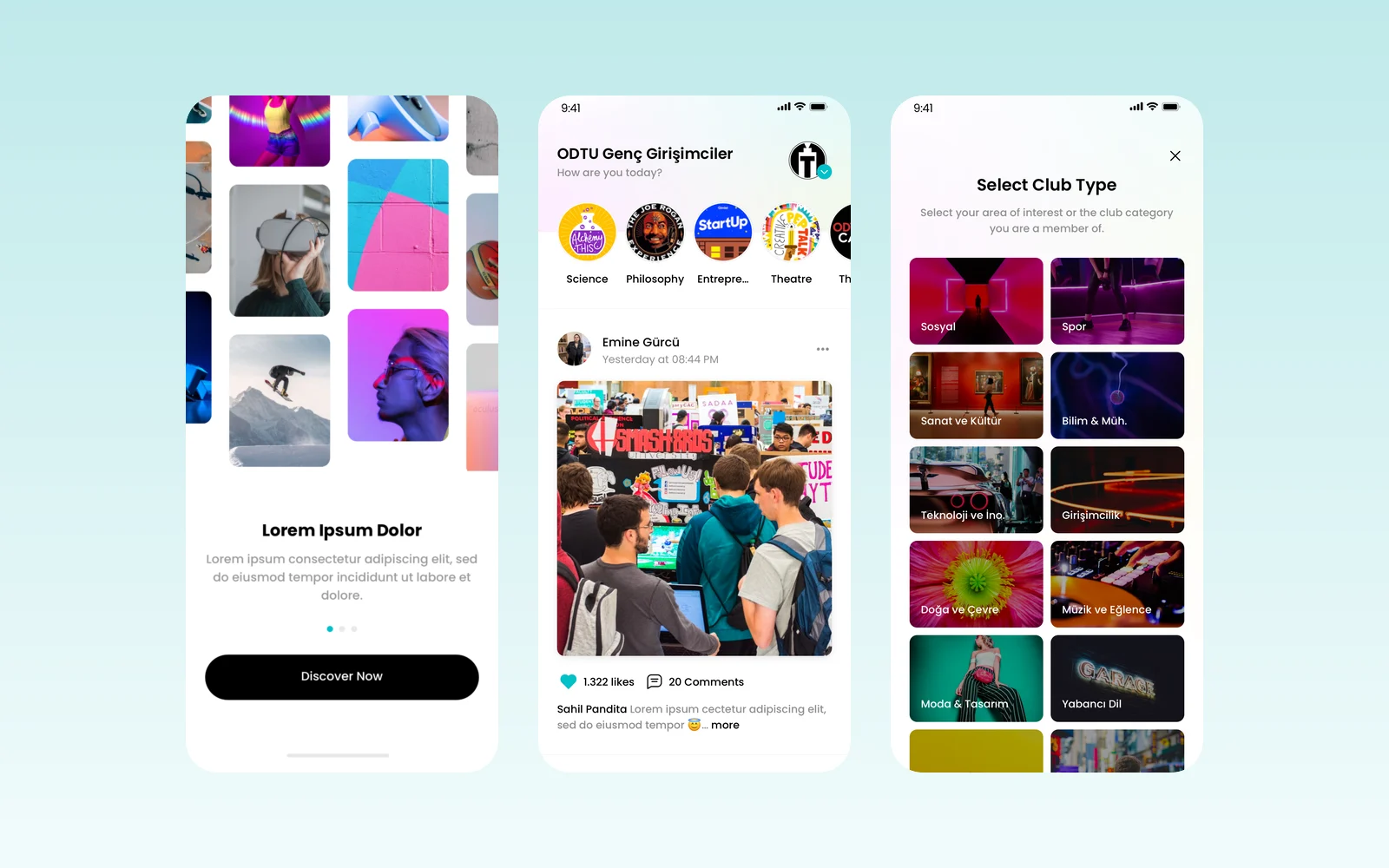
Öğrenci Kulüp
Öğrenci Kulüp is a mobile app for university student clubs: a shared feed, club events and member management in one place. We wrote the v1.0.0 analysis document, which sets out every screen and rule, designed the app in Figma and created its logo.