
Avis Filo Maestro: Fleet Management App Design
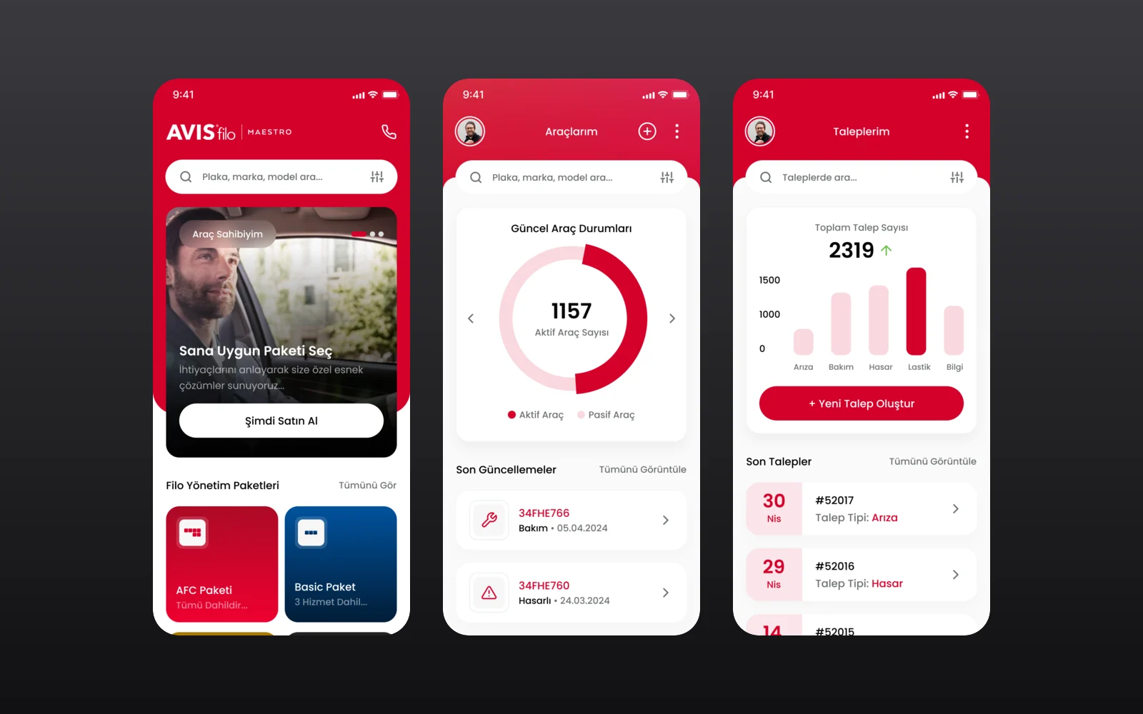
Avis Filo Maestro is the fleet management service of Avis Filo for corporate customers. We designed its mobile app through an agency partner: fleet packages and services, a vehicle overview, service requests and a one-tap support line.
- Project
- Mobile app design
- Our role
- App UI/UX design via an agency partner
- Platform
- Mobile app
- Country
- Türkiye
- Year
- 2024
The challenge
A whole fleet in one pocket
Fleet managers handle maintenance, damage, tyres and breakdowns for many vehicles at once. The app had to make packages and services easy to compare for new customers, and give existing customers one place to see their vehicles and open a request in a few taps.
Our approach
Packages and services up front
The home screen leads with a package picker and the fleet management packages (AFC, Basic, Gold and Premium). Below them come service cards for periodic maintenance, damage management, tyre storage and change, insurance follow-up, breakdown management and the full support line. Each service opens a detail page, and a single search covers packages, services and articles.
Vehicles and requests for customers
Signed-in customers see the current status of their fleet with active and passive vehicles, recent updates per plate and the services on each vehicle. A request flow starts by choosing the type (maintenance, breakdown, damage, tyres, information or the tyre form) and continues in two short steps. "My requests" charts the requests by type and lists the latest ones. A full-screen prompt promotes the 7/24 support line with a swipe to start a request.
Screens
Inside Avis Filo Maestro
How we delivered
From brief to design handover
-
01
DiscoveryBrief and brand
We started from the client's brief and brand identity: who the app is for, what it must do, and how the brand looks and speaks. We set the colours, fonts and tone of voice from that identity before we drew the first screen.
Client briefCorporate identityUsers & goals -
02
Wireframes
WireframesSimple sketches of each screen (wireframes) showed every step of every flow. This way we agreed on structure and priorities before any visual design.
User flowsLow-fidelity screens -
03
App structure
ArchitectureWe planned how the app is organised: the menus, a map of all screens, and every state a screen can show, such as empty, loading, error and success.
NavigationScreen mapStates -
04
Components
Design systemWe designed every building block, such as buttons, cards and menus, in Figma with all its versions, in the brand's colours and fonts. Every screen is then put together from this one shared library, so the whole app looks the same.
ComponentsVariantsFigma -
05
Screens and wording
UI designWe designed the content screens and page layouts. We also wrote the words on them: labels, buttons, empty screens, error messages and confirmations, in a voice that fits the brand.
Content screensLayoutsUX copy -
06
Prototyping
PrototypeWe linked the finished screens into a clickable prototype, a test version you can tap through. We walked through it with the client and improved it before handover.
Clickable prototypeReview rounds -
07
Design file handover
HandoverWe delivered the complete Figma file: the component library, all screens, the prototype and images ready to export, ready for the development team.
Figma fileComponent libraryAssets
Results
What we delivered
A complete app design
The project delivered the full app design in the Avis Filo brand: red headers, photo-led service cards and a five-tab navigation with a central profile button.
More work
More design work
RiderSticker
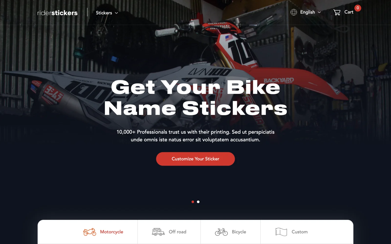
An online shop for custom motorcycle, off-road and bicycle name stickers, based in Istanbul. Built on Laravel and Livewire with a live sticker designer on the homepage, English and Turkish versions, team discount codes, and iyzico card checkout.
Magic Break
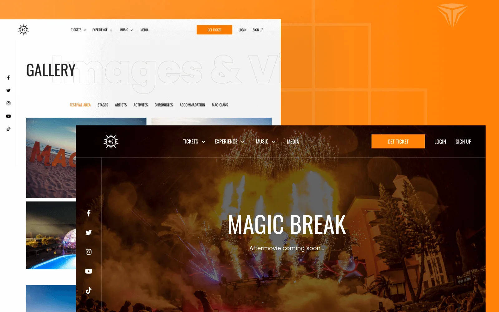
Magic Break is an electronic music festival held at the Pegasos hotels in Incekum, Antalya. We designed the interface and built a bilingual Laravel website where visitors pick a ticket type and hotel room, pay, and manage their reservations in their own account.
Wise & Rise
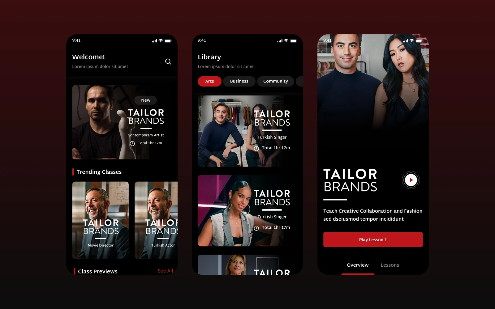
We designed the mobile app for Wise & Rise, an online video class service, for our client through an agency partner: a class library, featured teachers, class pages and a video player with notes and progress.