
Wise & Rise: Mobile App Design for Online Video Classes
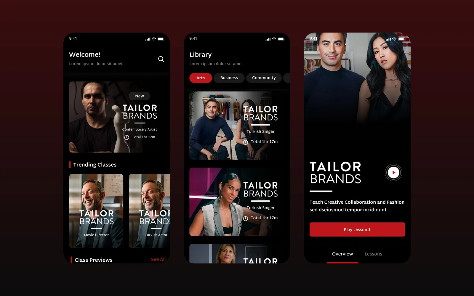
We designed the mobile app for Wise & Rise, an online video class service, for our client through an agency partner: a class library, featured teachers, class pages and a video player with notes and progress.
- Project
- Mobile app design
- Our role
- App UI/UX design via an agency partner
- Platform
- Mobile app
- Country
- Turkey
- Year
- 2023
The challenge
Classes that fit in a pocket
Members watch expert-led video classes on the phone. The app had to let them browse before signing up, then pick up where they left off, take notes and track what they had finished.
Our approach
Two states, one app
We designed a logged-out version with onboarding, featured teachers, a library by category and short previews, and a logged-in version with a personal home, trending classes, coming-soon classes and saved items.
Learning tools inside the player
A class page leads into lessons and a full-screen video player in portrait and landscape, with timestamped notes that can be added, edited and deleted. My Progress gathers continue watching, completed classes, certificates, followed teachers and all notes.
Screens
Inside Wise & Rise
How we delivered
From brief to design handover
-
01
DiscoveryBrief and brand
We started from the client's brief and corporate identity: who the app is for, what it has to do and how the brand looks and speaks. Colours, type and tone of voice were set from the identity before the first screen was drawn.
Client briefCorporate identityUsers & goals -
02
Wireframes
WireframesLow-fidelity wireframes mapped every flow end to end, so structure and priorities were agreed before any visual design.
User flowsLow-fidelity screens -
03
App architecture
ArchitectureWe built the app's information architecture: navigation, the full screen map and every state a screen can be in, from empty and loading to error and success.
NavigationScreen mapStates -
04
Components
Design systemEvery component was designed end to end in Figma with its variants, on the brand's colours and typography, so screens are assembled from one consistent library.
ComponentsVariantsFigma -
05
Screens and UX writing
UI designWe designed the content screens and page layouts and wrote the UX copy for them: labels, buttons, empty states, errors and confirmations, in a voice that fits the brand.
Content screensLayoutsUX copy -
06
Prototyping
PrototypeThe finished screens were linked into a clickable prototype to walk through the flows with the client and refine them before handover.
Clickable prototypeReview rounds -
07
UI/UX file handover
HandoverWe delivered the complete Figma file with the component library, all screens, the prototype and exportable assets, ready for the development team.
Figma fileComponent libraryAssets
Results
What we delivered
A complete app design
The project delivered the full mobile app design in Figma, with the same dark look and red accents as the web platform.
More work
More design work
Cdemly
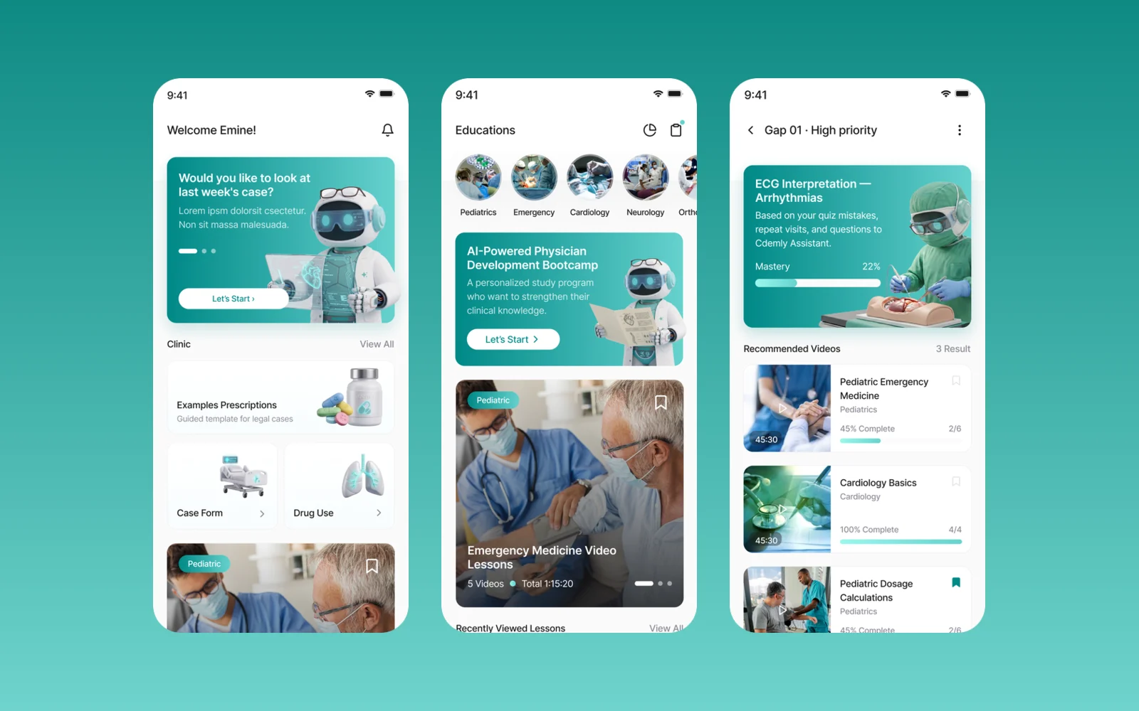
We designed Cdemly, a clinical AI assistant app for general practitioners, for our client. The work covers the design system, a sitemap of more than 168 screens and detailed screen designs for clinical support, calculators and patient consultation.
Kabin
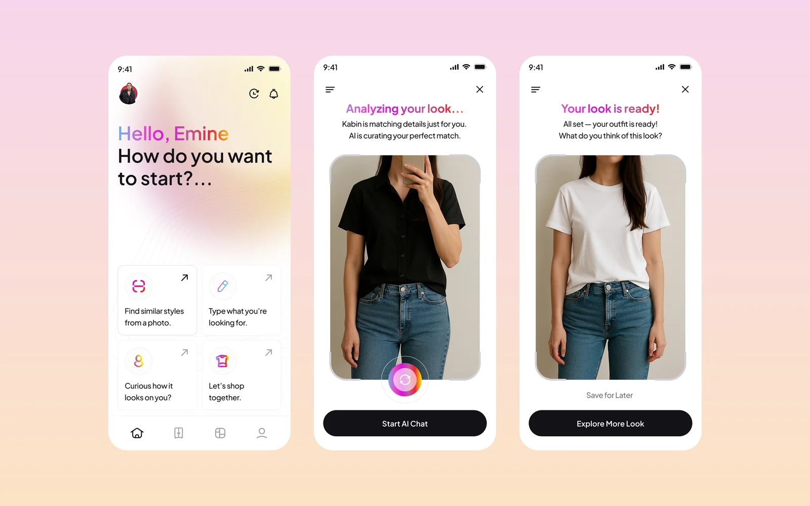
Kabin is an AI fashion app: upload or take a photo, and it finds matching outfits and similar pieces from brands, then shows how a new piece looks on you. We designed the app screens and created its brand identity and style guide.
RiderSticker
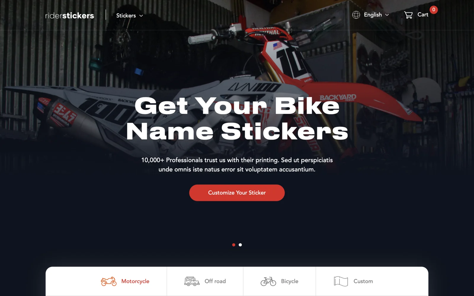
An online shop for custom motorcycle, off-road and bicycle name stickers, based in Istanbul. Built on Laravel and Livewire with a live sticker designer on the homepage, English and Turkish versions, team discount codes, and iyzico card checkout.