Öğrenci Kulüp: Analysis and App Design for University Student Clubs
Öğrenci Kulüp is a mobile app for university student clubs: a shared feed, club events and member management in one place. We wrote the v1.0.0 analysis document, which sets out every screen and rule, designed the app in Figma and created its logo.
- Project
- Mobile app
- Our role
- Product analysis, app UI/UX & logo design
- Platform
- Mobile app
- Country
- Turkey
- Year
- 2023
The challenge
Clubs run on scattered tools
Student clubs share posts, announce events and keep track of members in many separate places. The client wanted one app where each club has its own space. In it, the club management decides who becomes a member.
Our approach
Three roles, written down screen by screen
The analysis defines three roles (club management, club member and applicant) and what each can do. Everyone who signs up applies to a club. The management approves them from a waiting list before they can post. Only the management can post stories.
Feed, events and profiles
It describes an Instagram-style feed with stories, likes and comments. Events can be created with date, time, online or in-person format, capacity, speakers and sponsors. Each event page has a join button, a participant list to download and sharing to Instagram, LinkedIn and Twitter. Profiles show posts, events attended and a details tab the user can edit.
Sign-up and account rules
Sign-up asks for school, department, year and club. It checks that the email and phone are written correctly and that the account does not already exist. Login uses the phone number and an SMS code. The document also covers what happens with a wrong or expired code, a contact form that reaches the club management, KVKK consent (Turkey's data protection law) and account deletion.
Screens
Inside Öğrenci Kulüp
How we delivered
From brief to design handover
-
01
DiscoveryBrief and brand
We started from the client's brief and corporate identity: who the app is for, what it has to do, and how the brand looks and speaks. We set colours, fonts and tone of voice from the identity before we drew the first screen.
Client briefCorporate identityUsers & goals -
02
Wireframes
WireframesSimple screen sketches (wireframes) mapped every step of every flow. This way we agreed on structure and priorities before any visual design.
User flowsLow-fidelity screens -
03
App structure
ArchitectureWe planned how the app is organised: the menus, the full map of screens and every state a screen can be in, from empty and loading to error and success.
NavigationScreen mapStates -
04
Components
Design systemWe designed every component (the building blocks of a screen) in Figma, with all its versions. They use the brand's colours and fonts, so every screen is built from one shared library.
ComponentsVariantsFigma -
05
Screens and app text
UI designWe designed the content screens and page layouts and wrote the text on them: labels, buttons, empty screens, errors and confirmations. The words fit the brand's voice.
Content screensLayoutsUX copy -
06
Prototyping
PrototypeWe linked the finished screens into a clickable prototype (a test version you can tap through). We walked through it with the client and improved the flows before handover.
Clickable prototypeReview rounds -
07
UI/UX file handover
HandoverWe delivered the complete Figma file: the component library, all screens, the prototype and the assets ready to export. The development team can build from it.
Figma fileComponent libraryAssets
Results
What we delivered
App screens in Figma
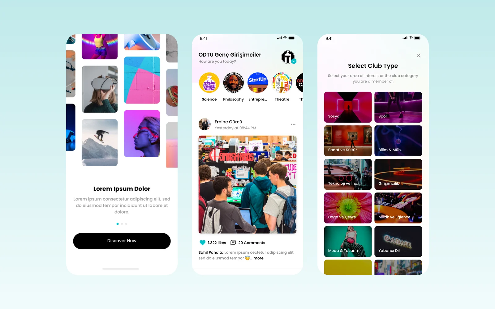
From the analysis we designed the app itself. It has a start screen with the logo, three welcome screens and a club type picker with twelve categories, from social and sport to entrepreneurship and careers. The home feed shows the club's next event and a row of clubs to discover. There are posts with photos, videos and comments, stories, post editing, and the screens for phone checks and sign-up.
A clear v1.0.0 plan to build from, and a logo
The client received the analysis document, the app design and the Öğrenci Kulüp logo, so a development team can build it screen by screen.
More work
More design work
Cdemly
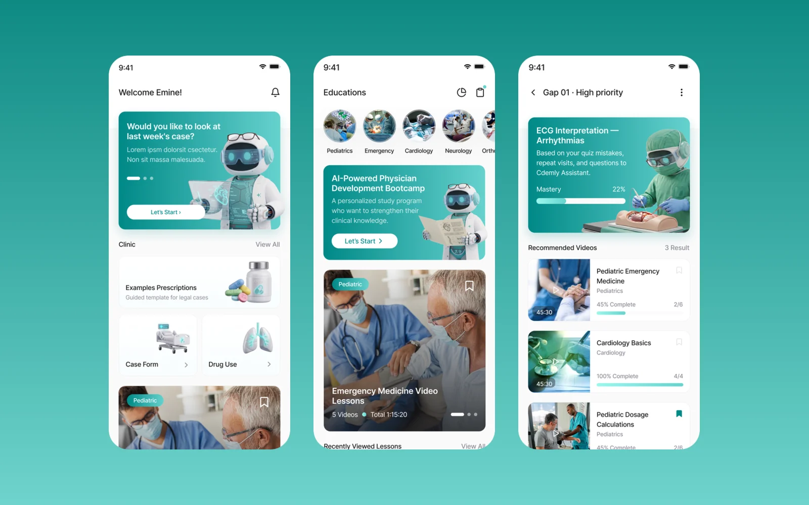
We designed Cdemly, a clinical AI assistant app for general practitioners, for our client. The work covers the design system, a sitemap of more than 168 screens and detailed screen designs for clinical support, calculators and patient consultation.
BM Mobil
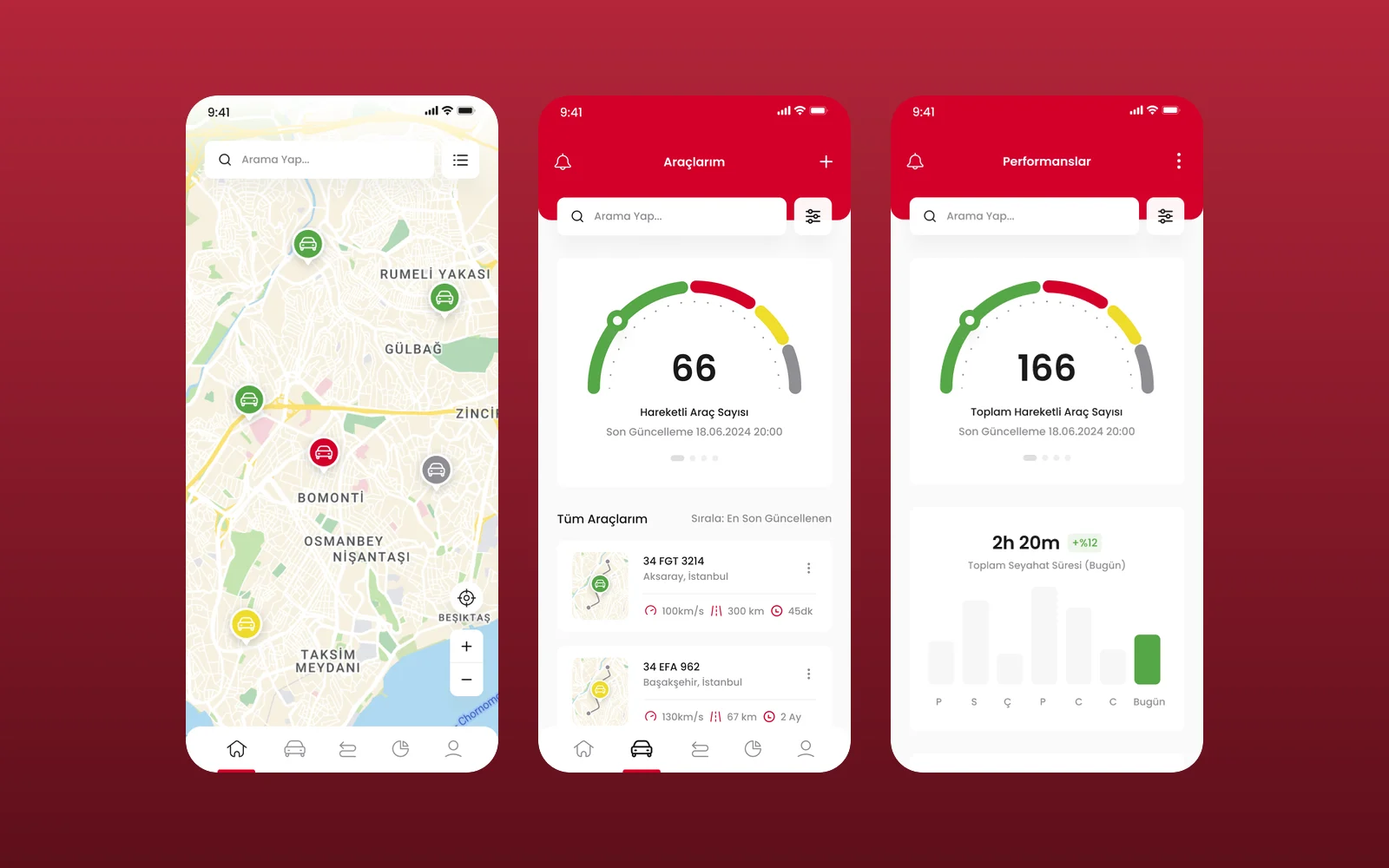
We designed the UI and UX of BM Mobil's vehicle tracking app in Figma: a live fleet map, a vehicle list, vehicle pages with live camera monitoring and a performance view. This was a design engagement, delivered as Figma screens.
Magic Break
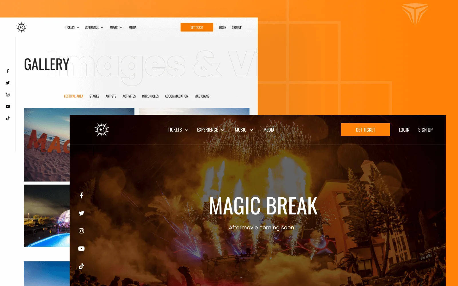
Magic Break is an electronic music festival held at the Pegasos hotels in Incekum, Antalya. We designed the interface and built a bilingual Laravel website where visitors pick a ticket type and hotel room, pay, and manage their reservations in their own account.