Hatay Metropolitan Municipality: A Mobile App for Tracking Billboards and Ad Spaces
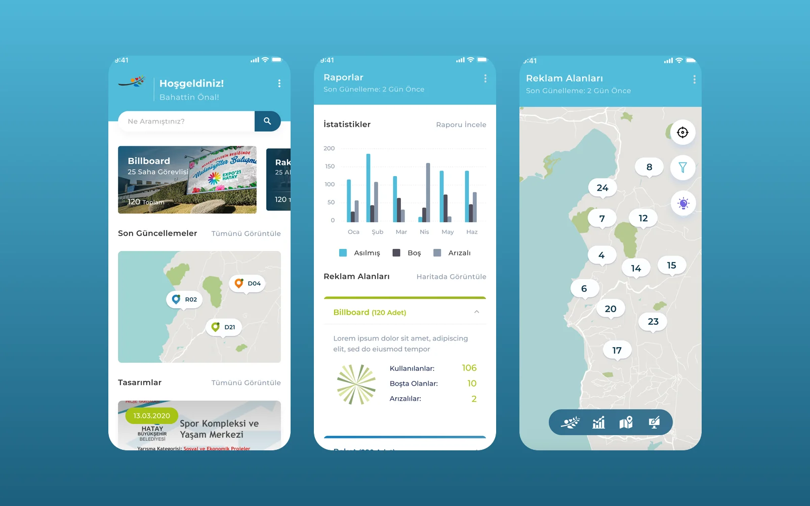
Hatay Metropolitan Municipality needed one place to manage its billboards, rackets and LED screens across the province. We designed a mobile app with a separate view for managers, designers and field crews. Every ad space is on a map, coloured by its status.
- Project
- Mobile app
- Our role
- Mobile app UI/UX design
- Platform
- Mobile app
- Country
- Turkey
- Year
- 2021
The challenge
Ad spaces spread across a whole province
The municipality's press office manages billboards, rackets (small street poster stands) and LED screens in every district of Hatay. Its brief asked for one system to find each space on a map and check its current poster and condition. It also had to give weekly, monthly and yearly reports.
Three kinds of user
Managers need reports and an overview, designers assign artwork to spaces, and field crews hang posters and report faults. Each role needed its own screens, behind a single login.
Our approach
One app, three views by role
We designed three views. Managers get statistics, a reports calendar and a map of ad spaces they can search. Designers upload artwork with tags and dates and assign it to spaces. Field crews pick a space, upload a photo of the hung poster or report a fault.
Status on the map
Following the brief, every space is a pin on the map with its status shown at a glance (current poster, outdated poster, empty, or awaiting repair). Tapping a pin opens the space's design, photo and history.
Screens
Inside Hatay Büyükşehir Belediyesi
How we delivered
From brief to design handover
-
01
DiscoveryBrief and brand
We started from the client's brief and corporate identity: who the app is for, what it has to do, and how the brand looks and speaks. We set colours, fonts and tone of voice from the identity before we drew the first screen.
Client briefCorporate identityUsers & goals -
02
Wireframes
WireframesSimple screen sketches (wireframes) mapped every step of every flow. This way we agreed on structure and priorities before any visual design.
User flowsLow-fidelity screens -
03
App structure
ArchitectureWe planned how the app is organised: the menus, the full map of screens and every state a screen can be in, from empty and loading to error and success.
NavigationScreen mapStates -
04
Components
Design systemWe designed every component (the building blocks of a screen) in Figma, with all its versions. They use the brand's colours and fonts, so every screen is built from one shared library.
ComponentsVariantsFigma -
05
Screens and app text
UI designWe designed the content screens and page layouts and wrote the text on them: labels, buttons, empty screens, errors and confirmations. The words fit the brand's voice.
Content screensLayoutsUX copy -
06
Prototyping
PrototypeWe linked the finished screens into a clickable prototype (a test version you can tap through). We walked through it with the client and improved the flows before handover.
Clickable prototypeReview rounds -
07
UI/UX file handover
HandoverWe delivered the complete Figma file: the component library, all screens, the prototype and the assets ready to export. The development team can build from it.
Figma fileComponent libraryAssets
Results
What we delivered
A complete design for all roles
The Figma file covers the manager, designer and field flows, from the welcome screens and login to reports, map views, design tracking and photo uploads, ready for development.
More work
More design work
Cdemly
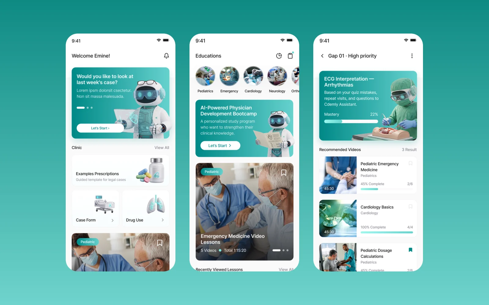
We designed Cdemly, a clinical AI assistant app for general practitioners, for our client. The work covers the design system, a sitemap of more than 168 screens and detailed screen designs for clinical support, calculators and patient consultation.
Kabin
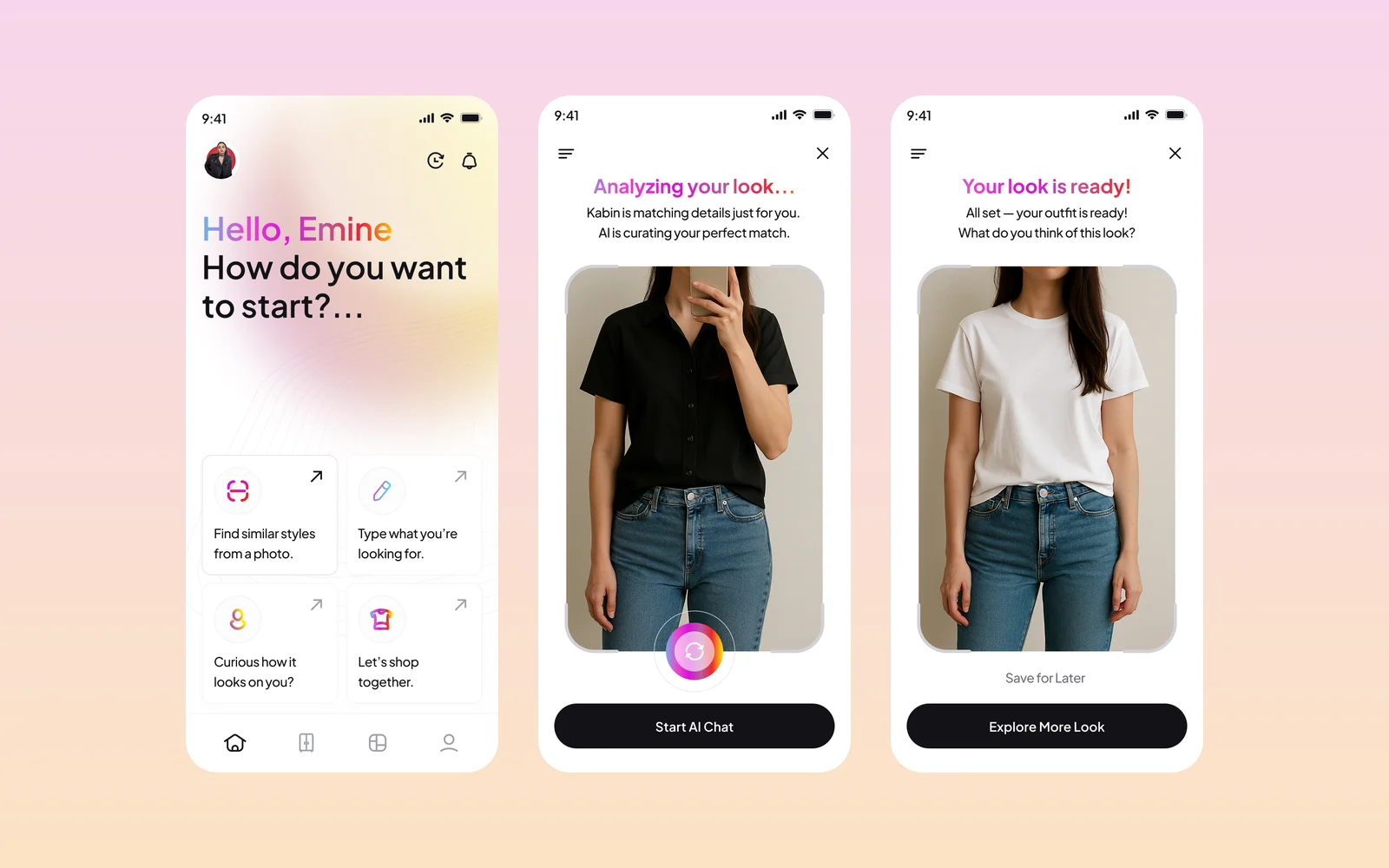
Kabin is an AI fashion app: upload or take a photo, and it finds matching outfits and similar pieces from brands, then shows how a new piece looks on you. We designed the app screens and created its brand identity and style guide.
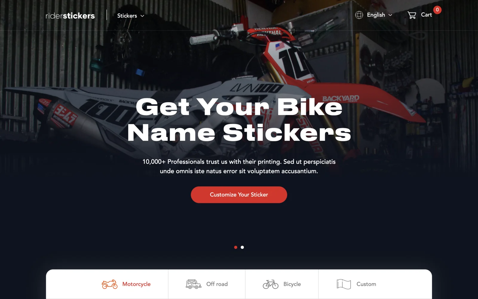
RiderSticker
An online shop for custom motorcycle, off-road and bicycle name stickers, based in Istanbul. Built on Laravel and Livewire with a live sticker designer on the homepage, English and Turkish versions, team discount codes, and iyzico card checkout.