Parea: A Corporate Identity and Logo System
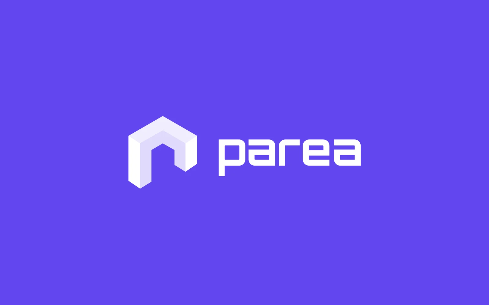
We designed Parea's corporate identity: a logo built on an isometric (3D-looking) block icon, a purple, mint and navy palette, Poppins as the font, and the stationery set. Everything is gathered in a brand guideline document and a one-page style guide.
- Project
- Corporate identity
- Our role
- Corporate identity & logo
- Platform
- Branding
- Year
- 2022
The challenge
A new name with no visual identity
Parea needed a logo and a consistent look that would work on screen and on paper, from a favicon (the small icon in a browser tab) to a letterhead.
Finding the right mark
A short name like Parea can go in many directions. So the logo had to be chosen from a real range of options, not a single proposal.
Our approach
Twelve directions, side by side
We explored twelve logo directions. Some used only the letters of the name, others paired an icon with the name. We showed each one on a light and a dark background so they could be compared fairly.
An isometric icon with a geometric name
The chosen logo pairs a three-dimensional block icon, shaded from purple into mint, with the name in rounded geometric letters. We set the main colours (#6146EE purple, #0EFF96 mint, #262262 navy) with their RGB and CMYK values (the colour codes for screen and print). We chose Poppins in all weights as the font.
A guideline the team can follow
The brand guideline covers the introduction, logo variations, colours, typography, business card, letterhead and envelope, with a sample image of each item.
Screens
Inside Parea
How we delivered
From brief to design handover
-
01
DesignLogo exploration
Explored twelve logo directions and tested each on light and dark backgrounds.
12 directionsLight & dark tests -
02
Identity system
DesignRefined the chosen logo and set the colours and font.
Isometric icon3 primary coloursPoppins -
03
Stationery
ContentApplied the identity to print stationery and a favicon set.
Business cardLetterheadEnvelopeFavicon -
04
Brand guideline
LaunchGathered the rules and sample images in a brand guideline and a one-page style guide.
13-page guidelineStyle guide
Results
What we delivered
A complete identity kit
Parea received the logo in colour, black and white, a favicon set in three versions, print-ready business card, letterhead and envelope files, a 13-page brand guideline and a one-page style guide.
Consistent from screen to paper
Because the colours, fonts and logo versions are set in one place, every new item can follow the same rules.
More work
More design work
Nordaurai
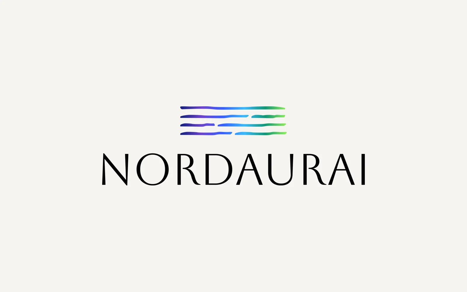
Nordaurai is a Helsinki company that makes workplace wellbeing games based on positive psychology. We designed its brand identity: a mark of flowing gradient lines, a capital serif wordmark, a six-colour palette and a full logo kit in colour, black and white.
Kabin
We created the brand identity for Kabin, an AI fashion app. It has a K mark built from three colours, a gradient palette, a type system and the items the brand appears on, from business cards and letterhead to email templates and social banners.
Hexagon Studio
Corporate branding and a company presentation for Hexagon Studio, an Istanbul engineering and design company working on vehicles, marine, rail and agricultural machines since 2005. We designed the presentation in dark and light versions from the client's company brief.