Nordaurai: A Brand Identity for a Gamified Workplace Wellbeing Company
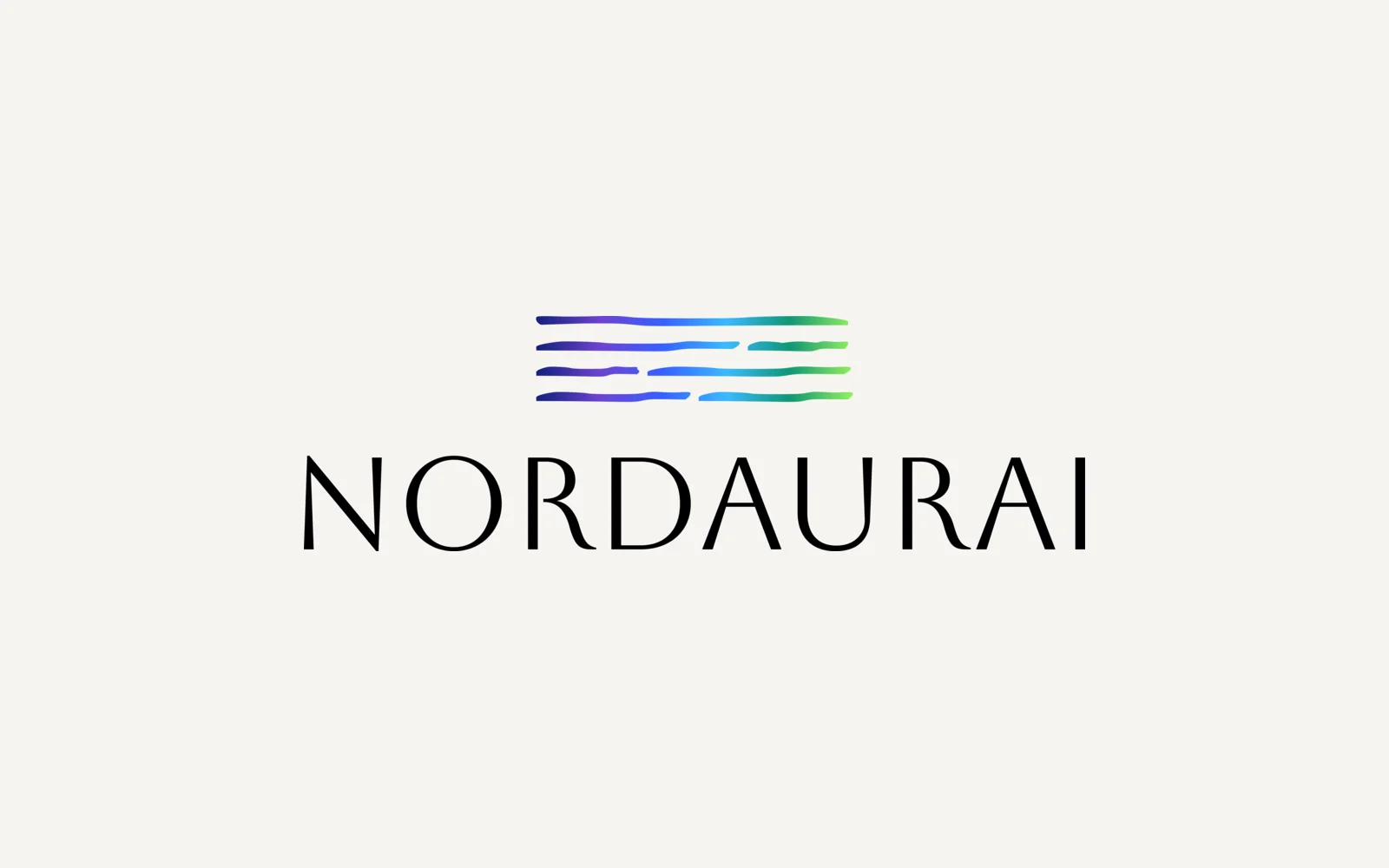
Nordaurai is a Helsinki company that makes workplace wellbeing games based on positive psychology. We designed its brand identity: a mark of flowing gradient lines, a capital serif wordmark, a six-colour palette and a full logo kit in colour, black and white.
- Project
- Brand identity
- Our role
- Brand identity
- Platform
- Branding
- Country
- Finland
- Year
- 2025
The challenge
Wellbeing that should not look clinical
Nordaurai turns workplace wellbeing into board games and guided workshops. The identity had to feel calm and Nordic, yet playful enough for a games company that works with organisations.
One logo, many places
The brand needed to work on a website header, as a favicon, on dark and light backgrounds and in print, so it had to hold up from a tiny icon to a large logo.
Our approach
A mark of moving light
The symbol is four stacked, hand-drawn horizontal strokes that run through a gradient from deep navy and violet to bright blue, teal and green, evoking northern light over water. Placed above a light, flared wordmark in capitals, it forms the main logo.
A system, not a single file
We delivered square, horizontal and text-only logo versions plus a favicon mark (the small icon in a browser tab), each in colour, black and white, as SVG and as PNG at 1x, 2x and 3x. The six gradient colours (#11217A, #3761FF, #6D43D0, #3BB9FF, #109573, #95F05F) form the palette.
Screens
Inside Nordaurai
How we delivered
From brief to design handover
-
01
DesignConcept & mark
Developed the flowing-line symbol and paired it with a capital serif wordmark.
ReferencesGradient linesWordmark -
02
Colour palette
DesignSet the six colours that make up the mark's gradient as the brand palette.
Navy to green6 coloursGradient -
03
Logo kit
DeliveryExported every logo version in colour, black and white, as SVG and PNG at three sizes.
Square / horizontal / textFaviconSVG + PNG
Results
What we delivered
In use on the company's own channels
Nordaurai uses the white wordmark in its website header and the colour mark as its favicon.
Ready for any medium
With vector files and three colour versions of every logo, the team can place the brand on screens, game materials and print without asking for new exports.
More work
More design work
Kabin
We created the brand identity for Kabin, an AI fashion app. It has a K mark built from three colours, a gradient palette, a type system and the items the brand appears on, from business cards and letterhead to email templates and social banners.
Parea
We designed Parea's corporate identity: a logo built on an isometric (3D-looking) block icon, a purple, mint and navy palette, Poppins as the font, and the stationery set. Everything is gathered in a brand guideline document and a one-page style guide.
Hexagon Studio
Corporate branding and a company presentation for Hexagon Studio, an Istanbul engineering and design company working on vehicles, marine, rail and agricultural machines since 2005. We designed the presentation in dark and light versions from the client's company brief.