Kabin: Brand Identity for an AI Fashion App
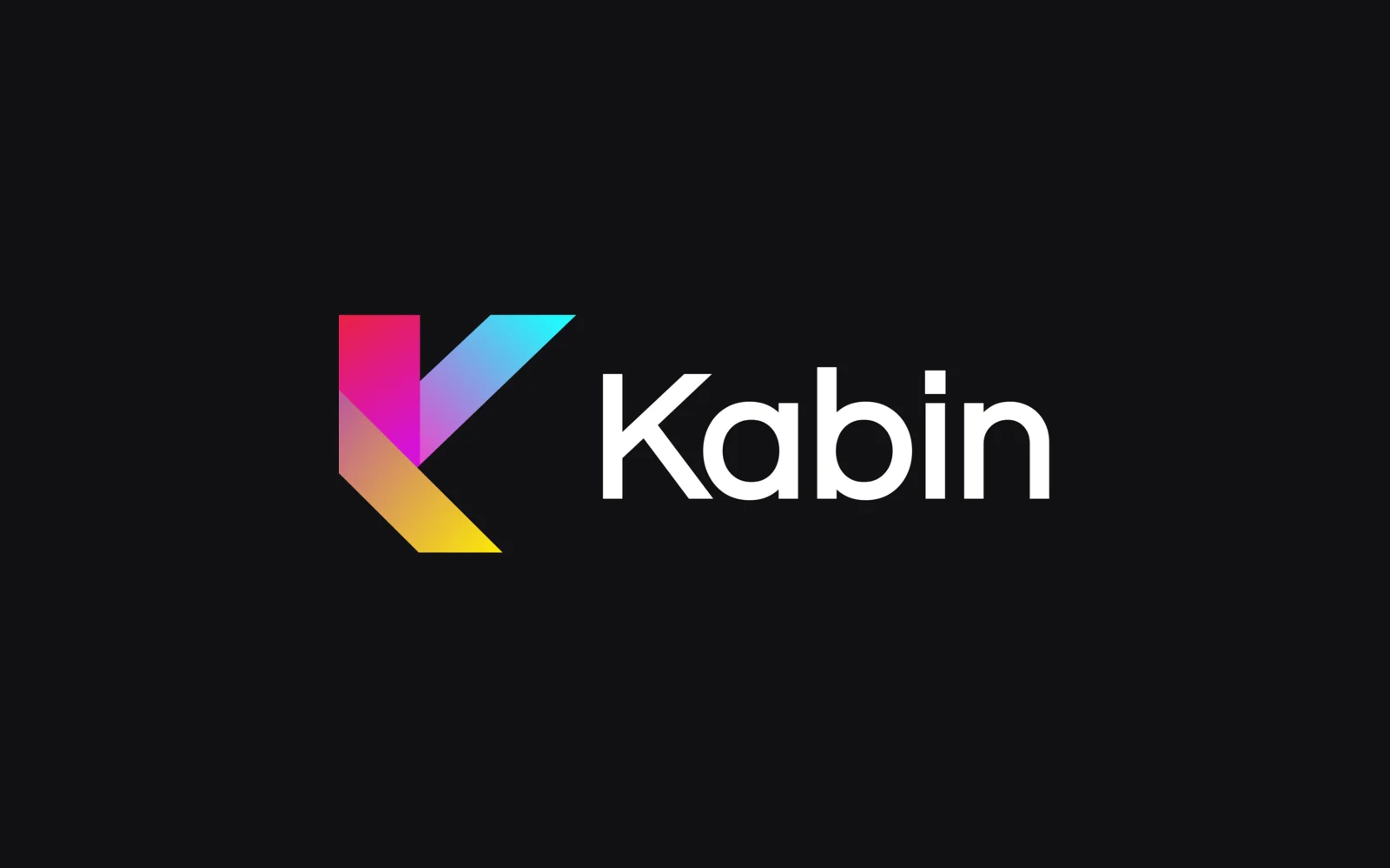
We created the brand identity for Kabin, an AI fashion app. It has a K mark built from three colours, a gradient palette, a type system and the items the brand appears on, from business cards and letterhead to email templates and social banners.
- Project
- Corporate identity
- Our role
- Corporate identity
- Platform
- Branding
- Country
- Turkey
- Year
- 2025
The challenge
Fashion that reads as technology
Kabin needed an identity that felt like fashion but read as a dependable technology product, and stayed friendly and approachable across the app, its emails and its social channels.
Our approach
A K mark in three colours
After several logo studies we settled on a K built from magenta for fashion, blue for technology and yellow for accessibility, shown in colourful, dark and light versions with matching favicons. A gradient that runs through all three colours carries the mark onto wallpapers and banners.
A style guide and its applications
The style guide sets the logo rules, the main, neutral and support colours and the type scale (the set of text sizes). We applied it to business cards, an A4 letterhead and cover, email signatures, templates for the emails the app sends automatically, LinkedIn and YouTube banners and a desktop wallpaper.
Screens
Inside Kabin
How we delivered
From brief to design handover
-
01
BrandLogo studies
Explored logo directions and finalised a three-colour K mark in colourful, dark and light versions.
K markFavicons -
02
Style guide
BrandSet the colours, gradient and text sizes in one style guide.
ColoursTypography -
03
Applications
BrandApplied the identity to cards, letterhead, signatures, emails, banners and wallpaper.
StationeryEmailsBanners
Results
What we delivered
One identity, ready to use
Kabin received the complete logo kit, the style guide and every application file, so the app, its emails and its social channels share one look.
More work
More design work
Nordaurai
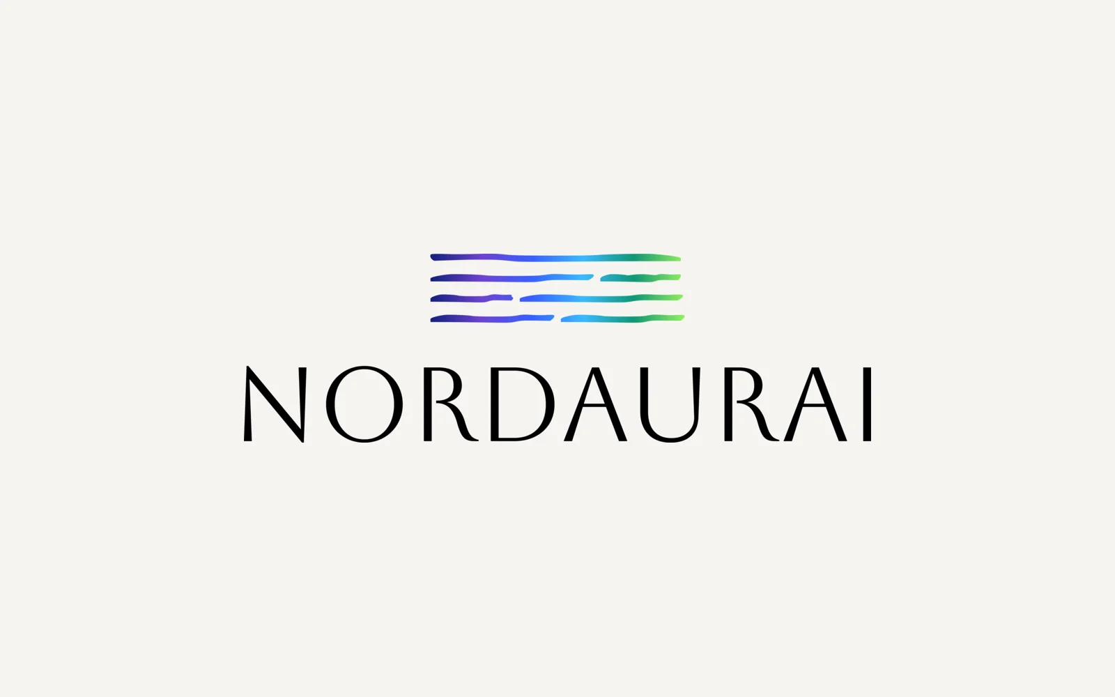
Nordaurai is a Helsinki company that makes workplace wellbeing games based on positive psychology. We designed its brand identity: a mark of flowing gradient lines, a capital serif wordmark, a six-colour palette and a full logo kit in colour, black and white.
Parea
We designed Parea's corporate identity: a logo built on an isometric (3D-looking) block icon, a purple, mint and navy palette, Poppins as the font, and the stationery set. Everything is gathered in a brand guideline document and a one-page style guide.
Hexagon Studio
Corporate branding and a company presentation for Hexagon Studio, an Istanbul engineering and design company working on vehicles, marine, rail and agricultural machines since 2005. We designed the presentation in dark and light versions from the client's company brief.