
Outdoora: Mobile App Design for Outdoor Events and Camps
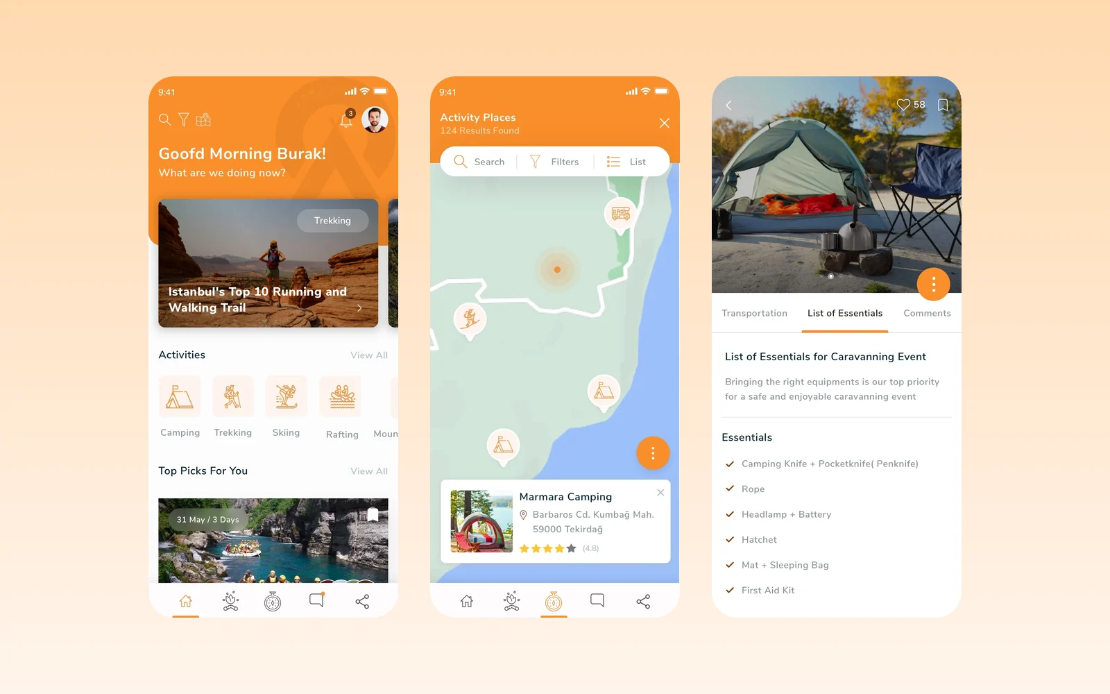
Alongside the Outdoora marketplace we designed its mobile app: activities and picks on the home screen, a map of activity places, event pages with an essentials list, member profiles and group chats for every event.
- Project
- Mobile app design
- Our role
- App UI/UX design (Figma)
- Platform
- Mobile app
- Country
- Türkiye
The challenge
Outdoor plans live on the phone
Campers, trekkers and rafters decide on the move. The app had to show what is happening nearby, what to bring and who is going, and keep each group talking in one place.
Our approach
Discover by activity and place
The home screen greets the member, lists activities such as camping, trekking, skiing and rafting, and suggests top picks with dates and duration. A map shows activity places with category pins and a card for each spot with its address and rating.
Everything about an event in one page
Event pages carry the details, participants and transportation in tabs, a list of essentials to bring, and Maybe and Join actions. Member profiles show followers, organised and attended events and a feed, and every event has its own group chat with photos.
Screens
Inside Outdoora
How we delivered
From brief to design handover
-
01
DiscoveryBrief and brand
We started from the client's brief and corporate identity: who the app is for, what it has to do and how the brand looks and speaks. Colours, type and tone of voice were set from the identity before the first screen was drawn.
Client briefCorporate identityUsers & goals -
02
Wireframes
WireframesSimple sketch layouts (wireframes) mapped every path through the app from start to finish. This way structure and priorities were agreed before any visual design.
User flowsLow-fidelity screens -
03
App structure
ArchitectureWe planned the app's structure: navigation, the full map of screens and every state a screen can be in, from empty and loading to error and success.
NavigationScreen mapStates -
04
Components
Design systemEvery component was fully designed in Figma with its variants, using the brand's colours and fonts. So screens are built from one consistent library.
ComponentsVariantsFigma -
05
Screens and UX writing
UI designWe designed the content screens and page layouts and wrote the text for them: labels, buttons, empty states, errors and confirmations, in a voice that fits the brand.
Content screensLayoutsUX copy -
06
Prototyping
PrototypeThe finished screens were linked into a clickable prototype to walk through the flows with the client and refine them before handover.
Clickable prototypeReview rounds -
07
UI/UX file handover
HandoverWe delivered the complete Figma file with the component library, all screens, the prototype and exportable assets, ready for the development team.
Figma fileComponent libraryAssets
Results
What we delivered
A complete app design
The screens were designed in Figma as one orange, photo-led visual system that matches the Outdoora marketplace.
More work
More design work
BM Mobil
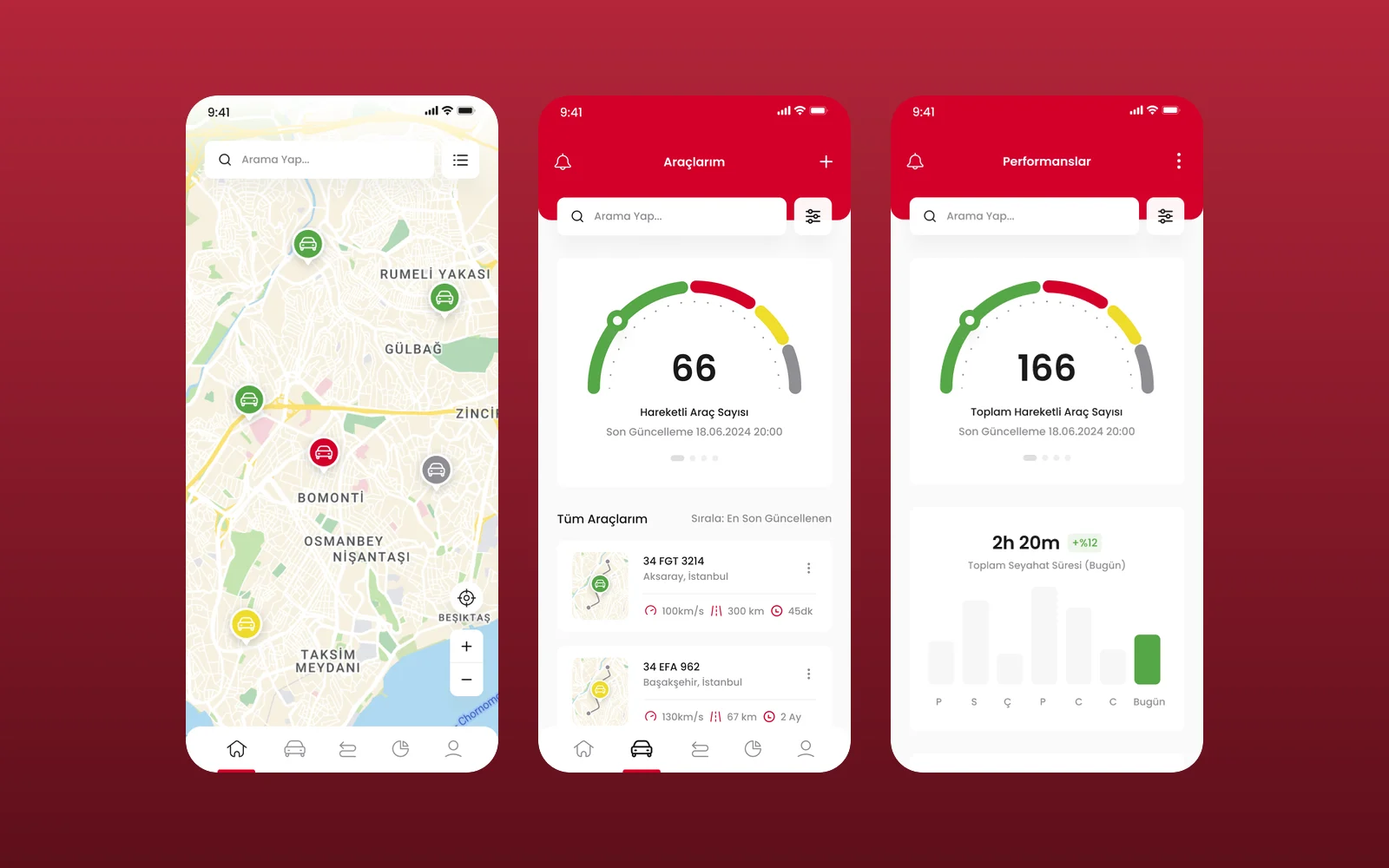
We designed the UI and UX of BM Mobil's vehicle tracking app in Figma: a live fleet map, a vehicle list, vehicle pages with live camera monitoring and a performance view. This was a design engagement, delivered as Figma screens.
Cosmos by Leartes
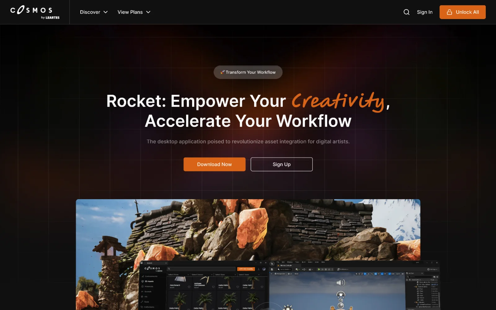
Cosmos is Leartes Studios' marketplace of game-ready environments, 3D assets, materials, sounds and visual effects (VFX), and Rocket is its desktop app that drops those assets straight into a game engine. We designed the Cosmos store interface and the Rocket product site.
Avis Filo Maestro
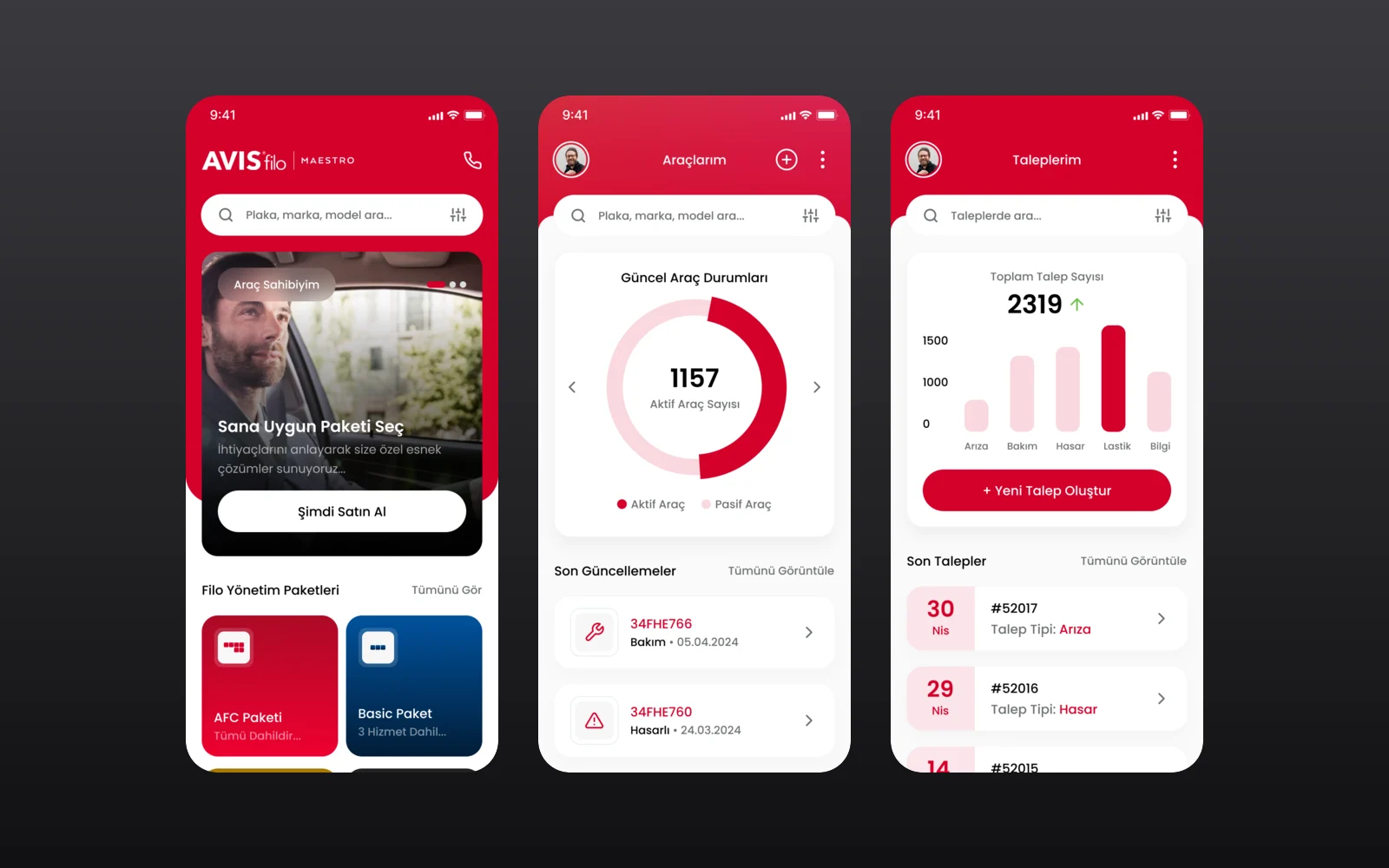
Avis Filo Maestro is the fleet management service of Avis Filo for corporate customers. We designed its mobile app through an agency partner: fleet packages and services, a vehicle overview, service requests and a one-tap support line.