
Zipcar Türkiye: Mobile App Design for Car Sharing
Zipcar is a car sharing alternative to owning a car: members book a car on demand by the hour or by the day. We designed the mobile app screens for Zipcar Türkiye through an agency partner.
- Project
- Mobile app
- Our role
- UI/UX design via an agency partner
- Platform
- iOS & Android
- Country
- Türkiye
The challenge
Booking a car in a few taps
A car sharing member decides on the street: which car is closest, what it costs for the next hours and whether it is free. The app had to answer those three questions before anything else.
Our approach
Map first, then the car
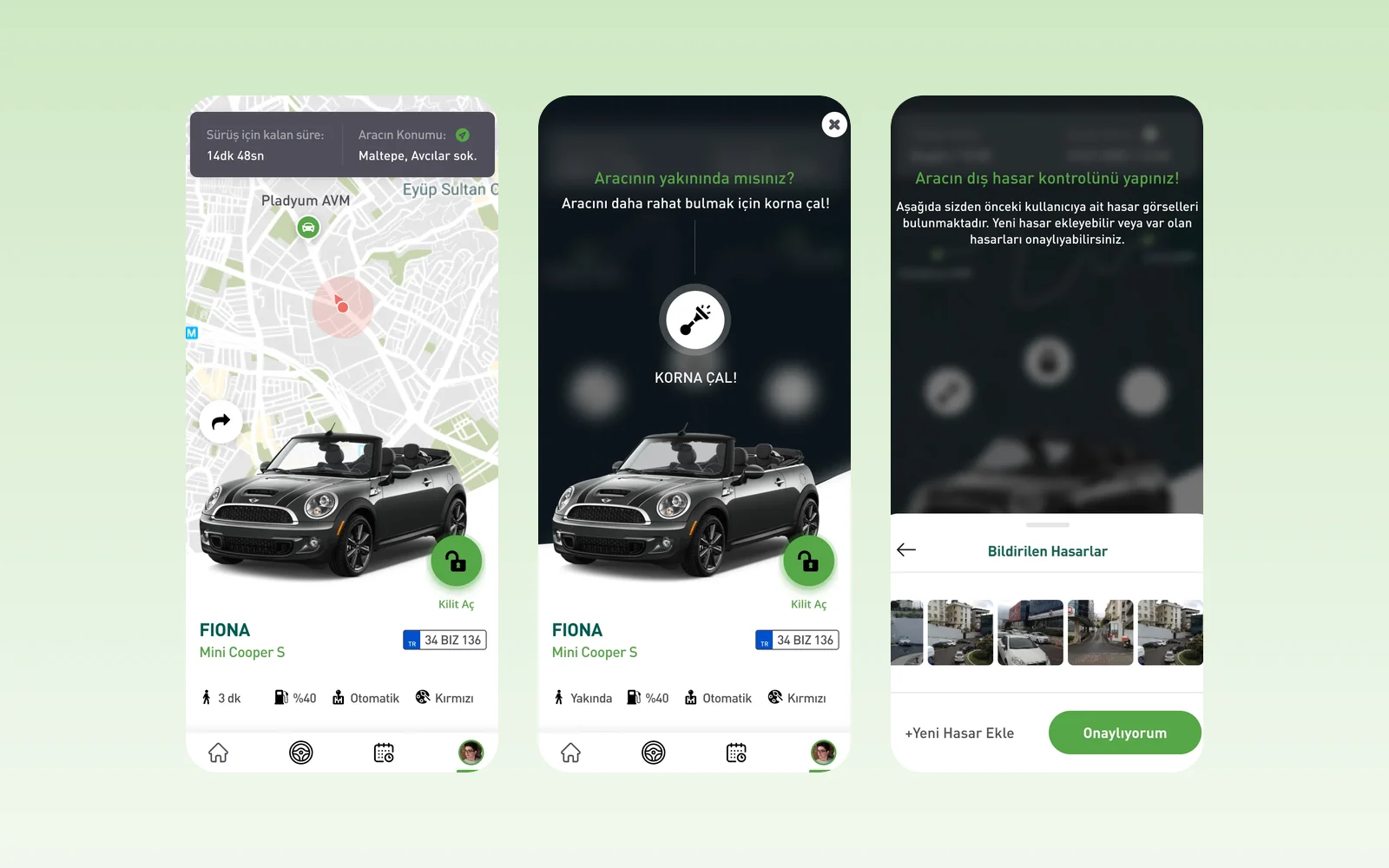
The design opens on a map of nearby cars. Choosing one shows the car, its location and the price for the chosen time, with the booking action kept at the bottom of the screen.
At the car
Next to the car the member unlocks it from the phone, and can sound the horn to find it in a car park. Before driving, the app shows the damage reported by the previous member: confirm it, or mark a new dent on a top-down drawing of the car and add a photo.
Ending the trip
Ending a trip asks for a confirmation, then shows a summary with time, distance, fuel level and the total, followed by the check and parking steps.
Screens
Inside Zipcar Türkiye
How we delivered
From brief to design handover
-
01
DiscoveryBrief and brand
We started from the client's brief and brand identity: who the app is for, what it must do, and how the brand looks and speaks. We set the colours, fonts and tone of voice from that identity before we drew the first screen.
Client briefCorporate identityUsers & goals -
02
Wireframes
WireframesSimple sketches of each screen (wireframes) showed every step of every flow. This way we agreed on structure and priorities before any visual design.
User flowsLow-fidelity screens -
03
App structure
ArchitectureWe planned how the app is organised: the menus, a map of all screens, and every state a screen can show, such as empty, loading, error and success.
NavigationScreen mapStates -
04
Components
Design systemWe designed every building block, such as buttons, cards and menus, in Sketch with all its versions, in the brand's colours and fonts. Every screen is then put together from this one shared library, so the whole app looks the same.
ComponentsVariantsSketch -
05
Screens and wording
UI designWe designed the content screens and page layouts. We also wrote the words on them: labels, buttons, empty screens, error messages and confirmations, in a voice that fits the brand.
Content screensLayoutsUX copy -
06
Prototyping
PrototypeWe linked the finished screens into a clickable prototype, a test version you can tap through. We walked through it with the client and improved it before handover.
Clickable prototypeReview rounds -
07
Design file handover
HandoverWe delivered the complete Sketch file: the component library, all screens, the prototype and images ready to export, ready for the development team.
Sketch fileComponent libraryAssets
Results
What we delivered
A full app design
The screens were handed over as a complete mobile design for the Zipcar Türkiye app.
More work
More design work
BM Mobil
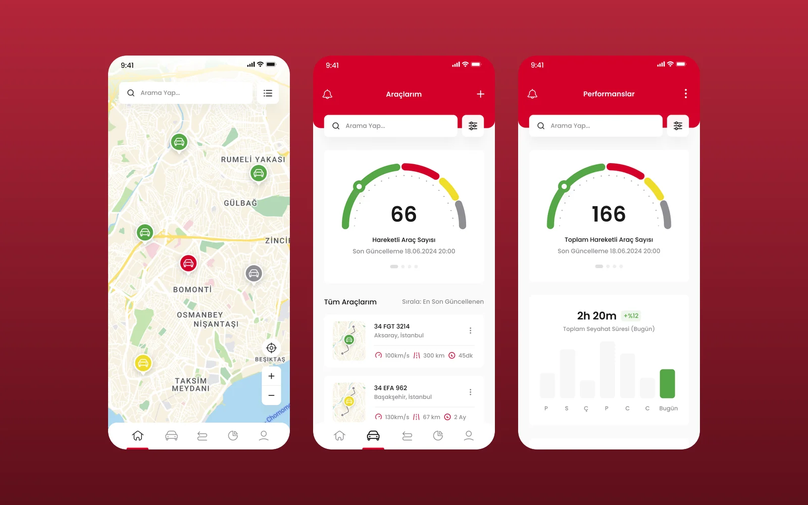
We designed the UI and UX of BM Mobil's vehicle tracking app in Figma: a live fleet map, a vehicle list, vehicle pages with live camera monitoring and a performance view. This was a design engagement, delivered as Figma screens.
Kabin
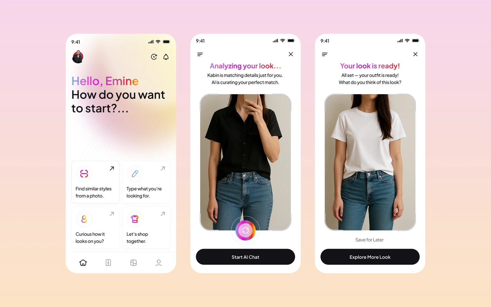
Kabin is an AI fashion app: upload or take a photo, and it finds matching outfits and similar pieces from brands, then shows how a new piece looks on you. We designed the app screens and created its brand identity and style guide.
Avis Filo Maestro
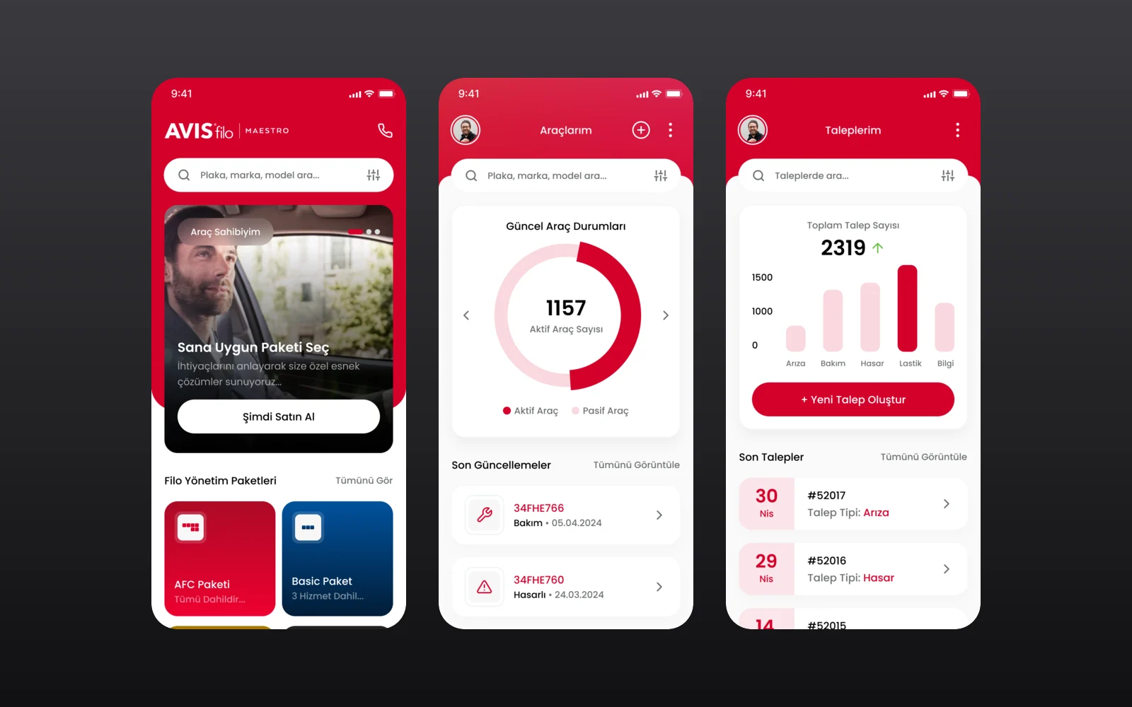
Avis Filo Maestro is the fleet management service of Avis Filo for corporate customers. We designed its mobile app through an agency partner: fleet packages and services, a vehicle overview, service requests and a one-tap support line.