
Hero headers are maybe one of the most important parts of our websites. Let’s take a quick look at what’s a hero header. Then we can discuss what makes a hero header awesome!
“Make it simple, but significant.” — Don Draper, fictional character on Mad Men
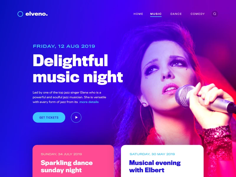
Hero header is the first and oversized part of your websites. They could be in different types such as only images, sliders, background videos or just big and bold text, etc.
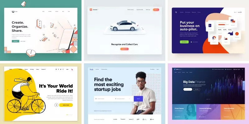
Credits: vadimdrut, wnek, filipjustic, urancd, gruev, louisdesign
When a visitor or a client comes to your website most likely (unless there is an interruption by pop-ups or modals) the first thing that they will encounter your hero header and its elements. And as a web user when we enter a website we usually scan according to F or Z patterns.
It takes 2.6 seconds for a user’s eyes to land on the area of a website that most influences their first impression
According to that, firstly our subconscious mind will get the message from background media (as a whole image) and we will look for a logo (left-top), then we will go for navigations and after that our eyes will scan for the texts or other messages.
…
Now we can look at the fundamentals of designing beautiful, powerful and eye-catching hero headers. First, let’s talk about the main elements: Background media, logo, navigation, texts, CTA(Call to Action) buttons.
1) Background Media (Images, Slides or Videos)
On a hero header, we can use a single image, image sliders or videos as a background. And regardless of the media type, every media has its spirit and each one of them gives a different message to our visitors. The communication starts from the beginning. But it takes some time to understand the meaning of the context.
It takes about 50 milliseconds (that’s 0.05 seconds) for users to form an opinion about your website that determines whether they like your site or not, whether they’ll stay or leave.
So while we are choosing our background the first thing that we need to focus on the message/the vibe that the media pass on to the user.
Here is a good example below. It’s an architecture company website and when we focus on the background media, a very well designed, cozy and luxury villa is welcoming us. Everybody wants to call that place as home. So maybe we should work with that company!!!
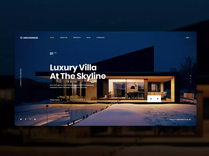
Credits Kaixapham
As you figured out from the example, the next important thing is that you should always use high-quality media.
Here are some free high-quality image resources
And for the background media, the next thing is to be aware of the color usages. Colors have different symbolism and psychological effects on our brains. They send different messages and it’s important to consider this while choosing the background media. You can find a beneficial guideline about color psychology here
And below there is an example of one of our works. Our client is from the logistics sector, in this case, we focused on blue colors on the hero header because blue is the color of trust, responsibility, honesty, and loyalty.
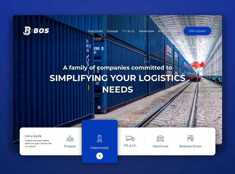
BOS Group Website — Credits @yergunes
Some Background Tips
- Always use high-quality media.
- Choose a proper media to give the right message.
- If it’s not disrupting the visual integrity of your website (or your brand guidelines) don’t afraid to use high contrasted, light and highly saturated images.
- If your texts are not easily readable, you can use part of blurred images or you can add an overlay filter.
2) Logo & Branding
Let’s look at the second element “The Company Logo”.
Most of the companies have brand guidelines and they have some limitations about the logo, colors and font usages. So most of the time we don’t have too many options for logo usage. But if we have variations for the logo like Linkedin’s logo below. We need to choose one of them that creates a good contrast with background media.
Credit sensible
Tips
- Make sure the logo is visible and big enough but not oversized.
- If you don’t have different logo variations you should select background media according to your logo design.
- You can consider to give some space around your logo and separate them from other elements.
3) Main Navigation
Time to face with navigation…Like book indexes, our navigations are also indexing the content of our website regardless of the one-page website or multiple pages.
Like we mentioned before when we enter a website first, we see the background media and logo, then we look for the navigation to see what are we going to find on that website. So for the better user experience your navigation should be visible and also self-explanatory.
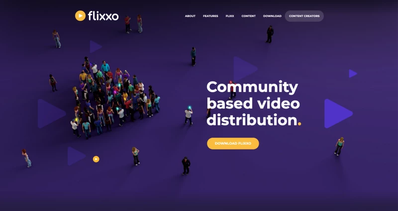
Credits: Flixxo
Here some tips for navigations
- Give clear names to your menu elements.
- Don’t use too many items on your menu. If its really necessary consider using submenus.
- Don’t hide your navigation under the hamburger menu, except on mobile devices. (for the user-experience)
4) A Catchy Slogan & Texts
Now, it’s time to give the real message. The message is everything!
The best practice for the slogans is using big, bold and eye-catching texts. And supporting them with a little paragraph and call to action button for balancing the view.
You can see a clear example of the messages, text areas below.
Credits: realvjy
Some Tips
- If you are using white-dominated media, white or light texts will be unreadable. You can use a color overlay or blurred parts on the background media.
- If you can’t increase contrast enough, you can also try to add some text-shadow (but be careful about to not using too much)
- If you are using a slogan and some other texts on the hero header, make sure that using different sizes, colors, fonts or font weights. Creating a visual hierarchy is important!
- The character limit is too important. Avoid using long sentences as slogans and too long paragraphs for explanatory texts.
5) Call To Action Buttons (CTA)
Now all the elements in place except the most important one. The element for getting attractions from our visitors…Call to action buttons…
There are lots of stuff to discuss for designing a good call to action button. But for now just choose a shiny, glamorous color. Make sure the button is pop-out and it has a clear definition of the action. (maybe I will write about it too later)
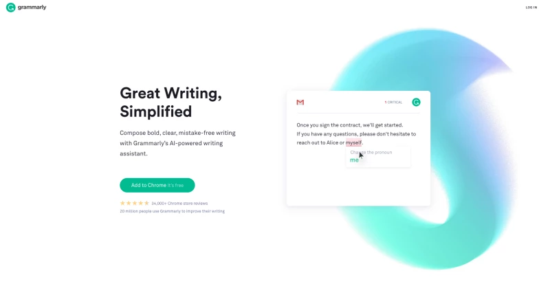
Credits: Grammarly
Some Tips
- Make sure CTA buttons look like buttons and avoid using more than two call to action buttons on the header area.
- If you need more than one button, you can use ghost buttons, text links with underlines or secondary colors for the second one.
- Create a good contrast with the background.
- Use the colors that drive users to click and engage.
Additional Notes
Before finishing my article I would like to add some additional notes.
Most of my client requests to add more texts, more sliders and more videos on the hero header…They believe that adding 5 images on a slider makes the sell.
When it comes to reality most users won’t even stick for long for the seeing third slider. They want to dive into action and see what’s you/your website is offering to them. So avoid using too many sliders or long videos too.
Only 1% of people actually click on a slider, which almost always was the first slide.
Conclusion
There lots of variables on designing a good hero header. Practicing and getting inspired from other designers works, make it perfect!
Thank you!

